Printable worksheets
Start on web, finish on paper.
Printables for a better week. Customize online, download a clean PDF, and carry your plan into the real week. Build from browser. Print when it matters.
Browse the catalog
Find the sheet you need.
Category
Planning
Landscape · 1 page
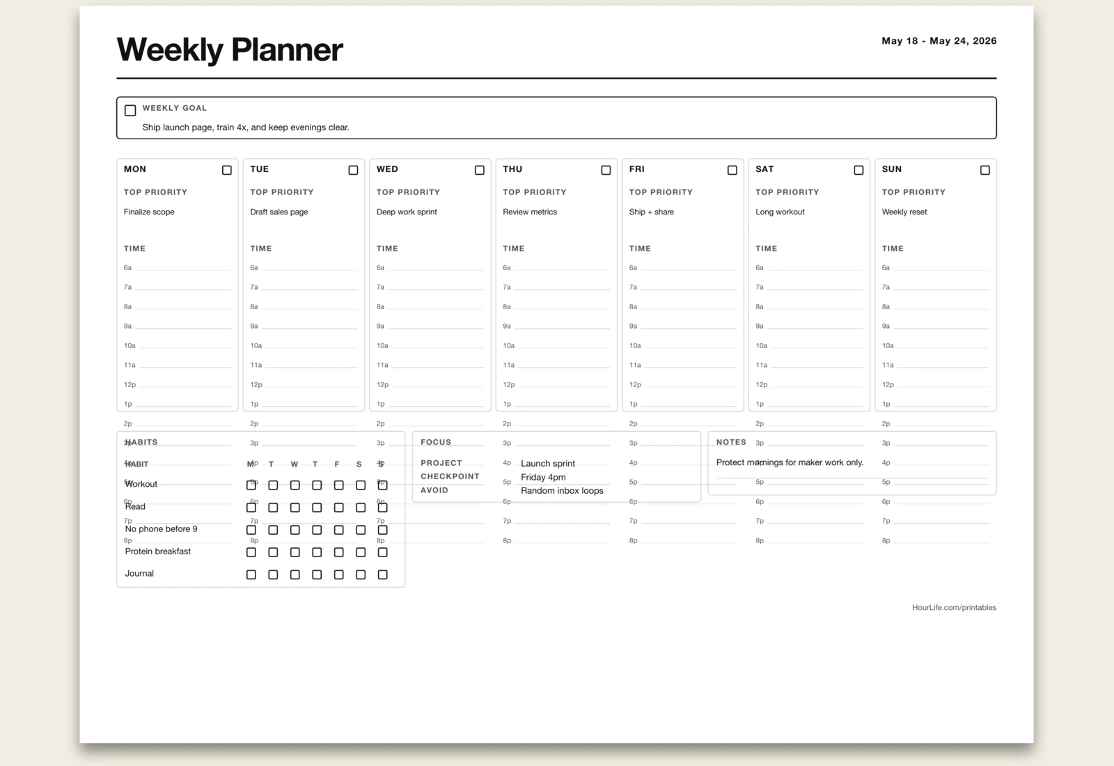
Weekly Planner
A Monday-Sunday planning spread with time blocks, top priorities, weekly goal, and notes.
Best for
Resetting a week before it gets chaotic.
Landscape · 1 page
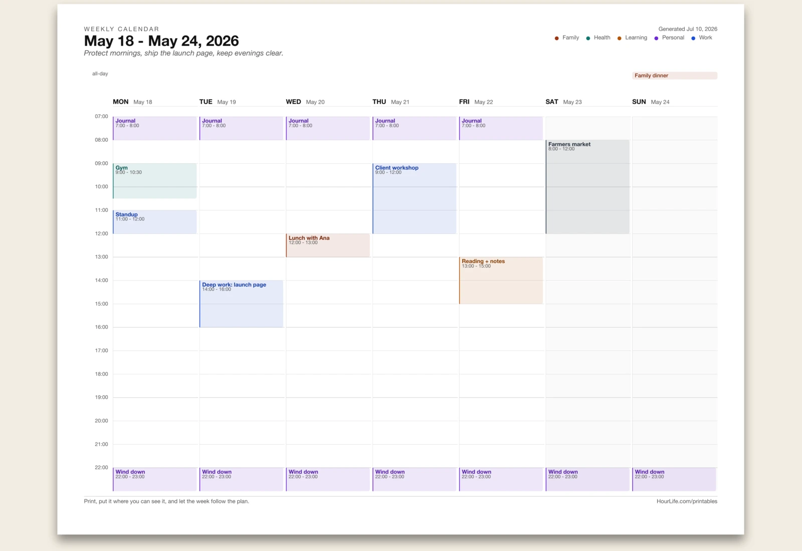
Weekly Calendar
Type your week in plain lines and get a filled, color-coded calendar with events placed on a time grid.
Best for
Seeing the actual shape of your week before it starts.
Portrait · 1 page
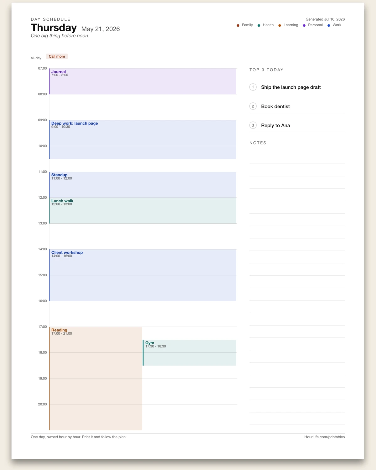
Day Schedule
Type your day in plain lines and get an hour-by-hour schedule with a top-3 rail and space for notes.
Best for
Owning one important day, hour by hour.
Landscape · 1 page
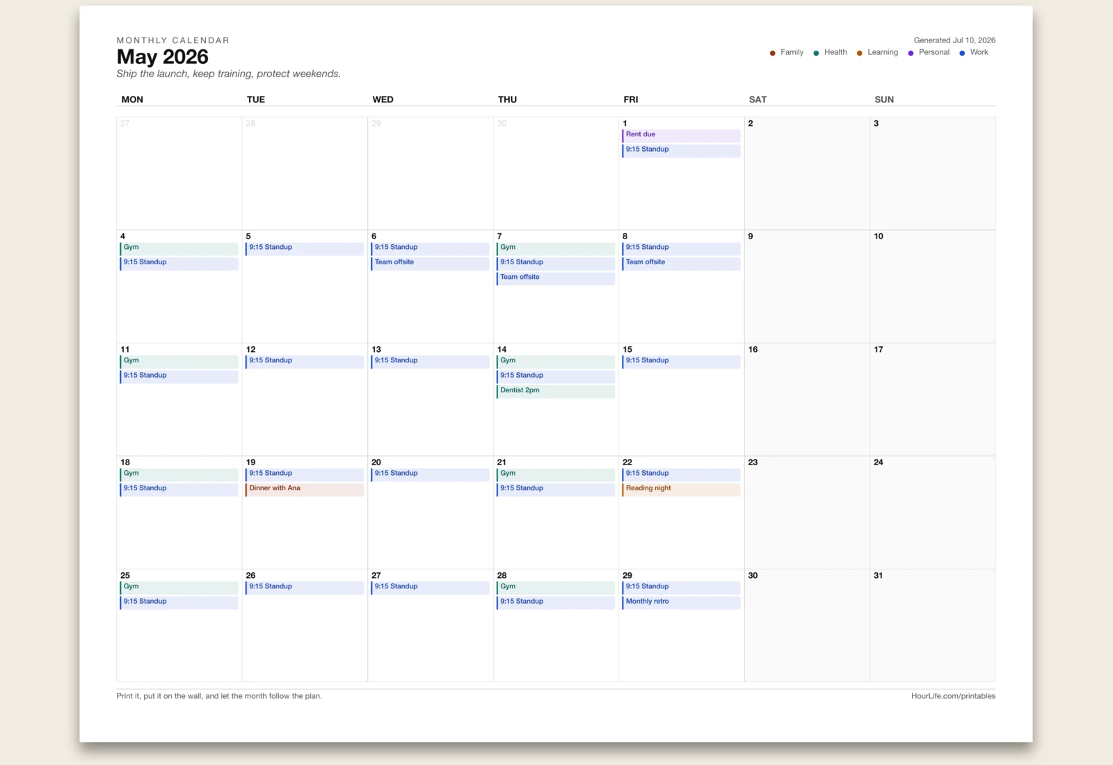
Monthly Calendar
Type your month in plain lines — dates, weekdays, or recurring commitments — and get a filled, color-coded month grid.
Best for
Seeing the whole month on one wall-ready page.
Landscape · 1 page
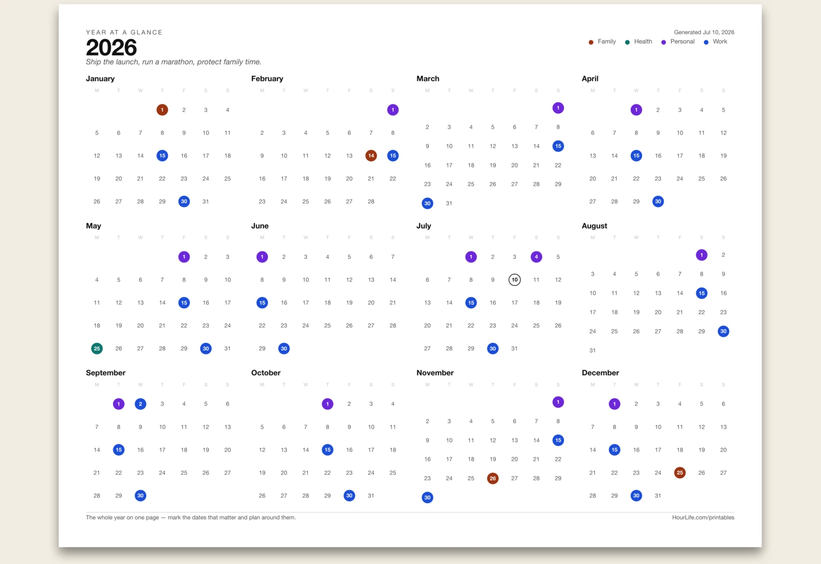
Yearly Calendar
Type the dates that matter — holidays, birthdays, deadlines, paydays — and get the whole year on one page as color-coded dots.
Best for
Seeing all twelve months at once to plan the year ahead.
Landscape · 1 page
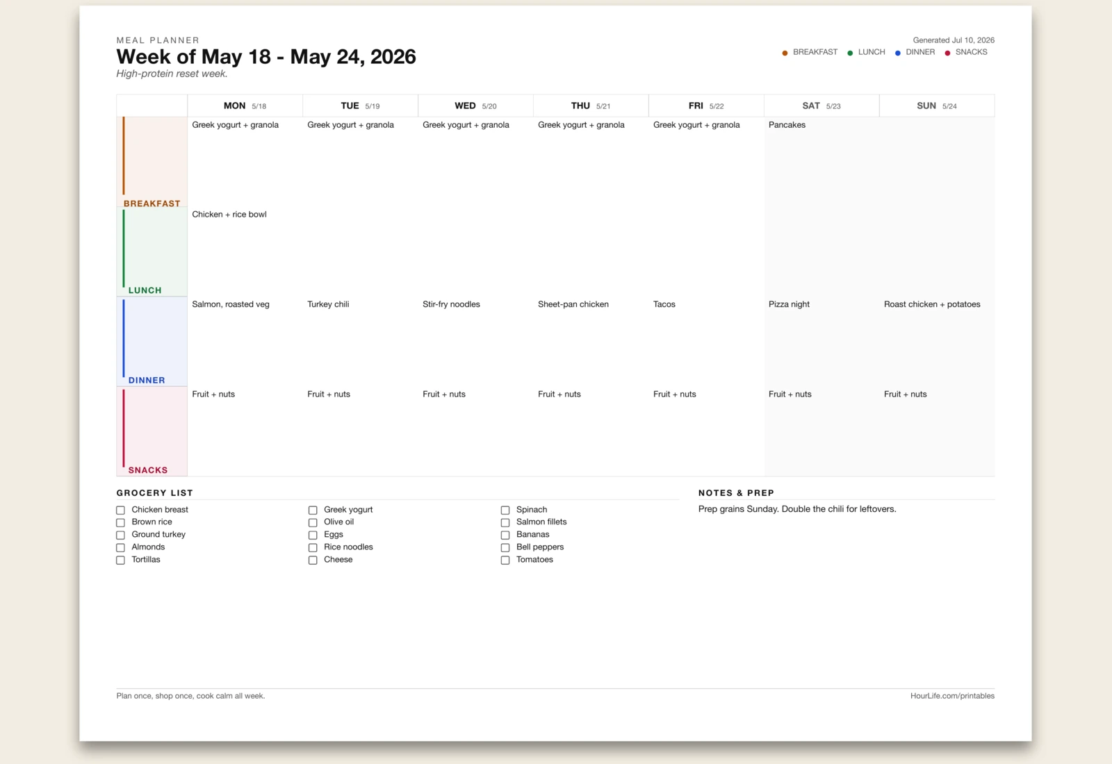
Meal Planner
Type your meals in plain lines and get a filled week grid — breakfast to dinner — with a grocery checklist and prep notes.
Best for
Planning the week's food once so cooking stays calm.
Landscape · 1 page
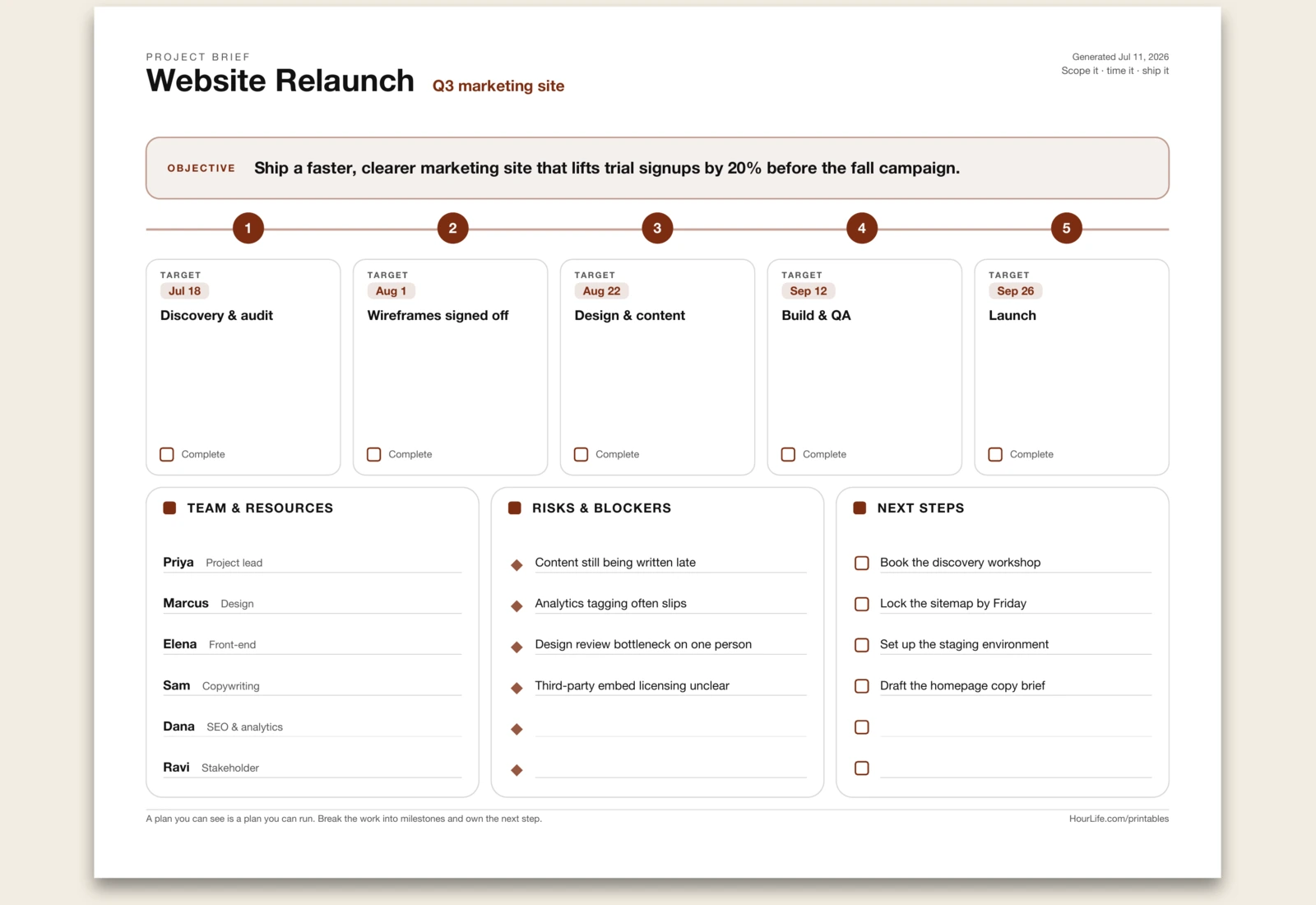
Project Planner
A one-page project brief: state the objective, lay up to five milestones on a horizontal timeline with target dates, and capture the team, the risks, and the next steps. A plan you can see is a plan you can run. Leave anything blank to fill in by hand.
Best for
Kicking off a project on one page the whole team can see.
Portrait · 1 page
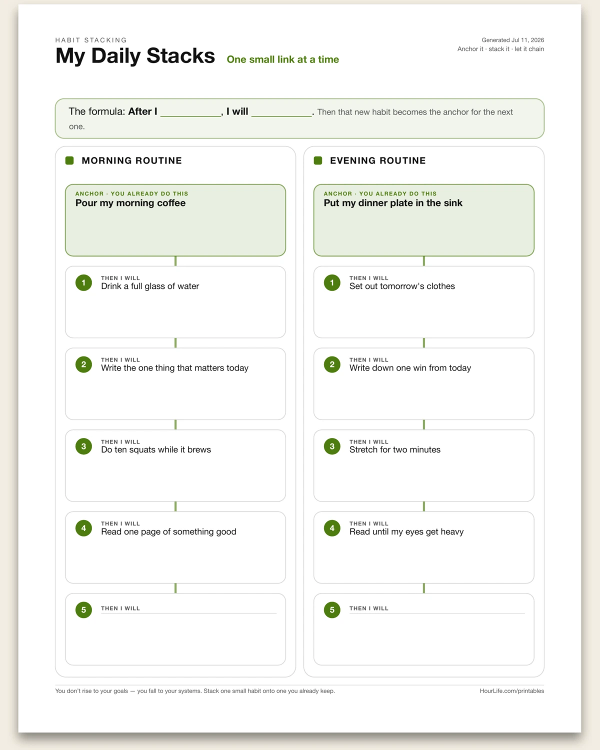
Routine Builder
Design a morning and an evening routine by habit stacking — start each chain with an anchor you already do, then stack up to five small habits on top, one per line. You don't rise to your goals; you fall to your systems. Leave lines blank to build the chain by hand.
Best for
Bolting new habits onto ones you already keep so they actually stick.
Portrait · 1 page
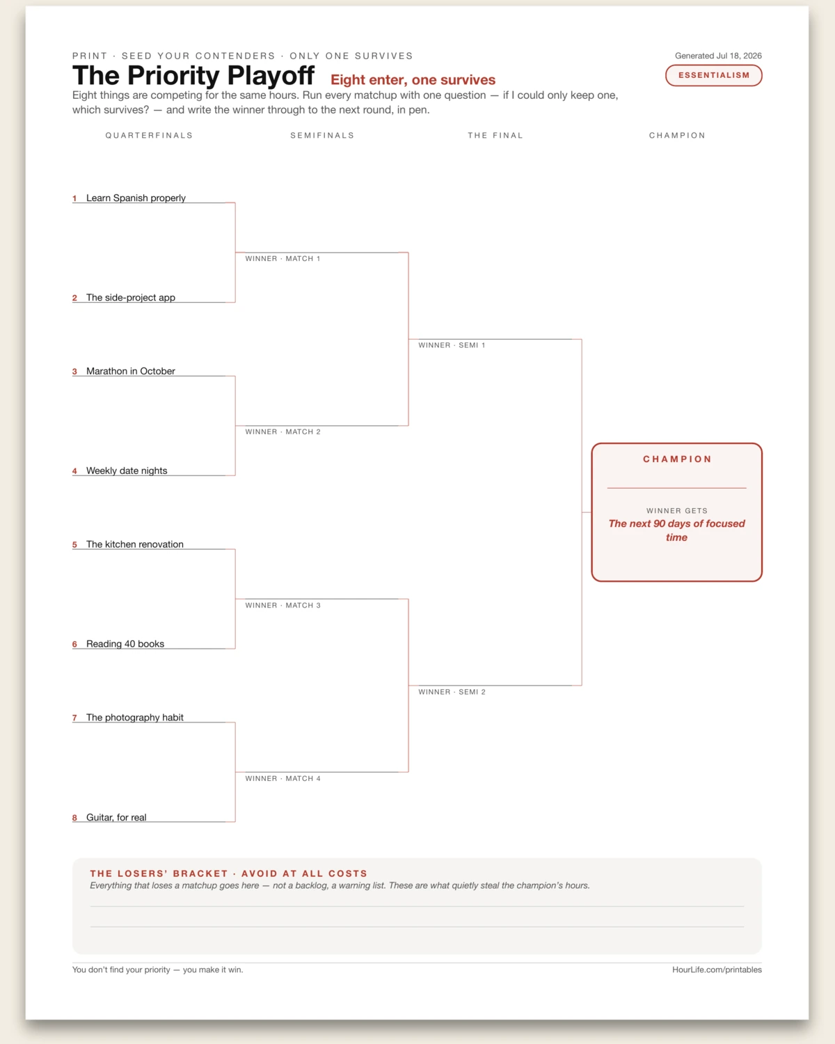
The Priority Playoff
A single-elimination tournament bracket for deciding what actually matters. Seed up to eight contenders — goals, projects, commitments, anything competing for the same hours — into the quarterfinals, then run the matchups in pen with one question: if I could only keep one, which survives? Winners advance through handwritten semifinals and a final to a champion box with a winner-gets stakes line. Everything that loses a matchup goes on the losers' strip — Buffett's avoid-at-all-costs list, the things that quietly steal the champion's hours. You don't find your priority; you make it win.
Best for
Forcing a real decision between eight things that all feel important — one honest matchup at a time.
Portrait · 1 page
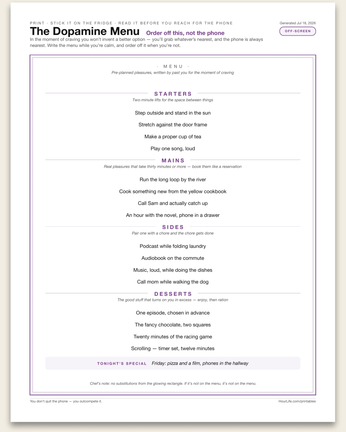
The Dopamine Menu
A restaurant-style menu of pre-planned pleasures, written by past you for the moment of craving. Four courses: starters are two-minute lifts for the space between things, mains are real pleasures that take thirty minutes or more, sides pair with a chore to make it worth doing, and desserts are the treats that turn on you in excess — enjoyed, then rationed. A tonight's-special band holds the one pleasure you want to actually schedule this week. In the moment of craving you won't invent a better option — you'll grab whatever's nearest, and the phone is always nearest. Write the menu while you're calm, stick it on the fridge, and order off it when you're not.
Best for
Outcompeting the phone with a fridge-door menu of better options you already chose.
Portrait · 1 page
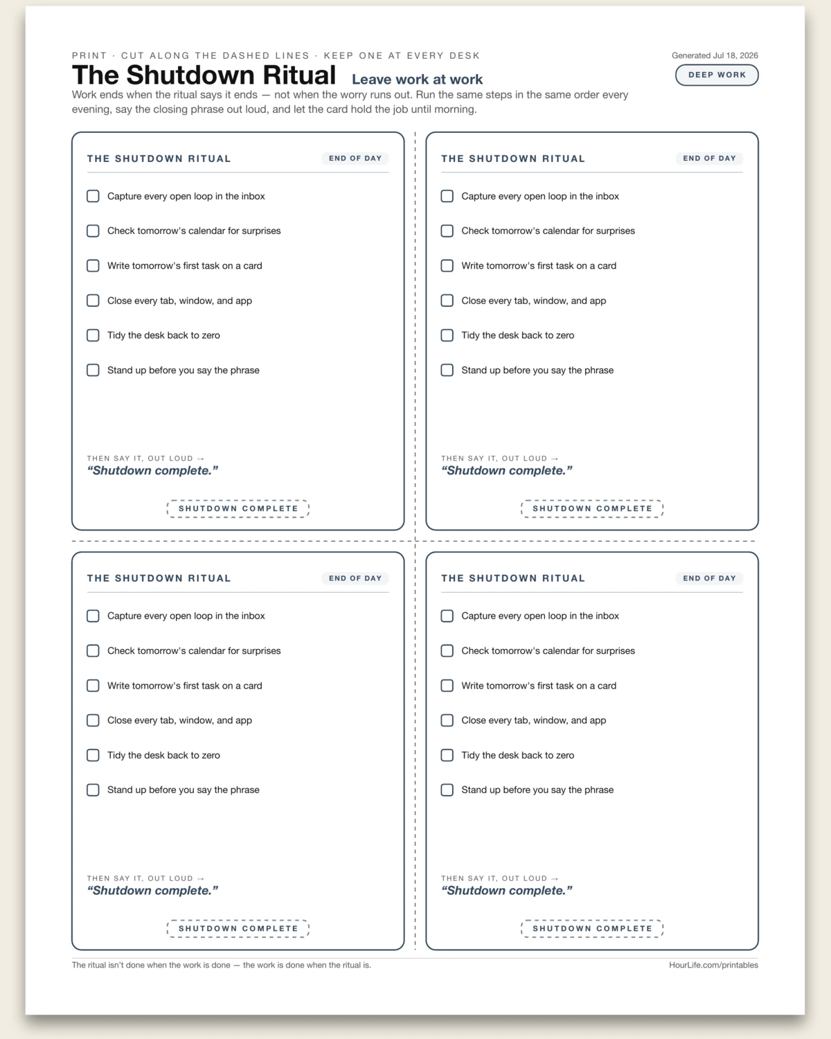
The Shutdown Ritual Card
Cal Newport's end-of-workday shutdown ritual from Deep Work, printed as four identical pocket-size cards on one page with dashed cut lines between them. Each card carries your closing moves as a checklist — capture open loops, check tomorrow's calendar, close every tab — plus the closing phrase you say out loud and a SHUTDOWN COMPLETE stamp. Script up to six steps and your phrase, then print, cut, and keep one at every desk you work from. Work ends when the ritual says it ends, not when the worry runs out.
Best for
Ending the workday cleanly with a fixed ritual instead of letting work bleed into the evening.
Portrait · 1 page
The Big Rocks Jar
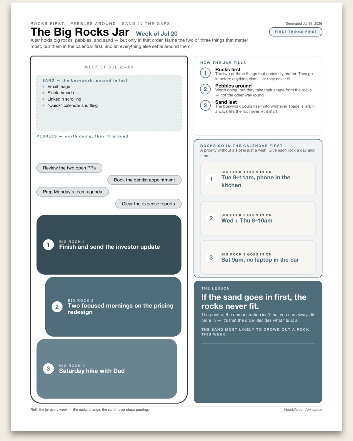
Stephen Covey's first-things-first demonstration, drawn as an actual jar. A professor filled a jar with big rocks and asked if it was full — then poured in the pebbles, then the sand, and it all fit because of the order. The sheet fills the jar the only way that works: up to three big rocks at the bottom (they went in first), pebbles settled around them, sand poured over the top. Name the two or three things that genuinely matter this week, and give each rock a concrete calendar slot — because a priority without a slot is just a wish. Being honest about the sand is half the exercise: the busywork pours itself into whatever space is left, and if it goes in first, the rocks never fit. Fill it in for the week ahead, or print it blank and load the jar by hand.
Best for
Planning a week around the two or three things that matter most — before the busywork fills every gap.
Portrait · 1 page
WOOP
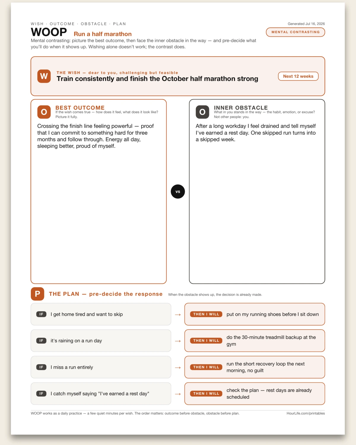
Gabriele Oettingen's mental-contrasting method — Wish, Outcome, Obstacle, Plan — on one page. Positive thinking alone doesn't move people; twenty years of motivation research behind WOOP show the engine is the contrast. Name a wish that's dear to you and feasible in your timeframe, dwell on the best outcome until you can feel it, then face the inner obstacle in the way — the habit, emotion, or excuse in you, not other people. The sheet sets outcome and obstacle literally face to face, then turns the contrast into steering: up to four if-then plans that pre-decide your response, so when the obstacle shows up the decision is already made. The order matters — outcome before obstacle, obstacle before plan. Fill it in for a wish you're working on now, or print it blank and WOOP by hand as a daily practice.
Best for
Turning a wish into an executable plan by facing the inner obstacle and pre-deciding the if-then response.
Portrait · 1 page
Net Worth Statement
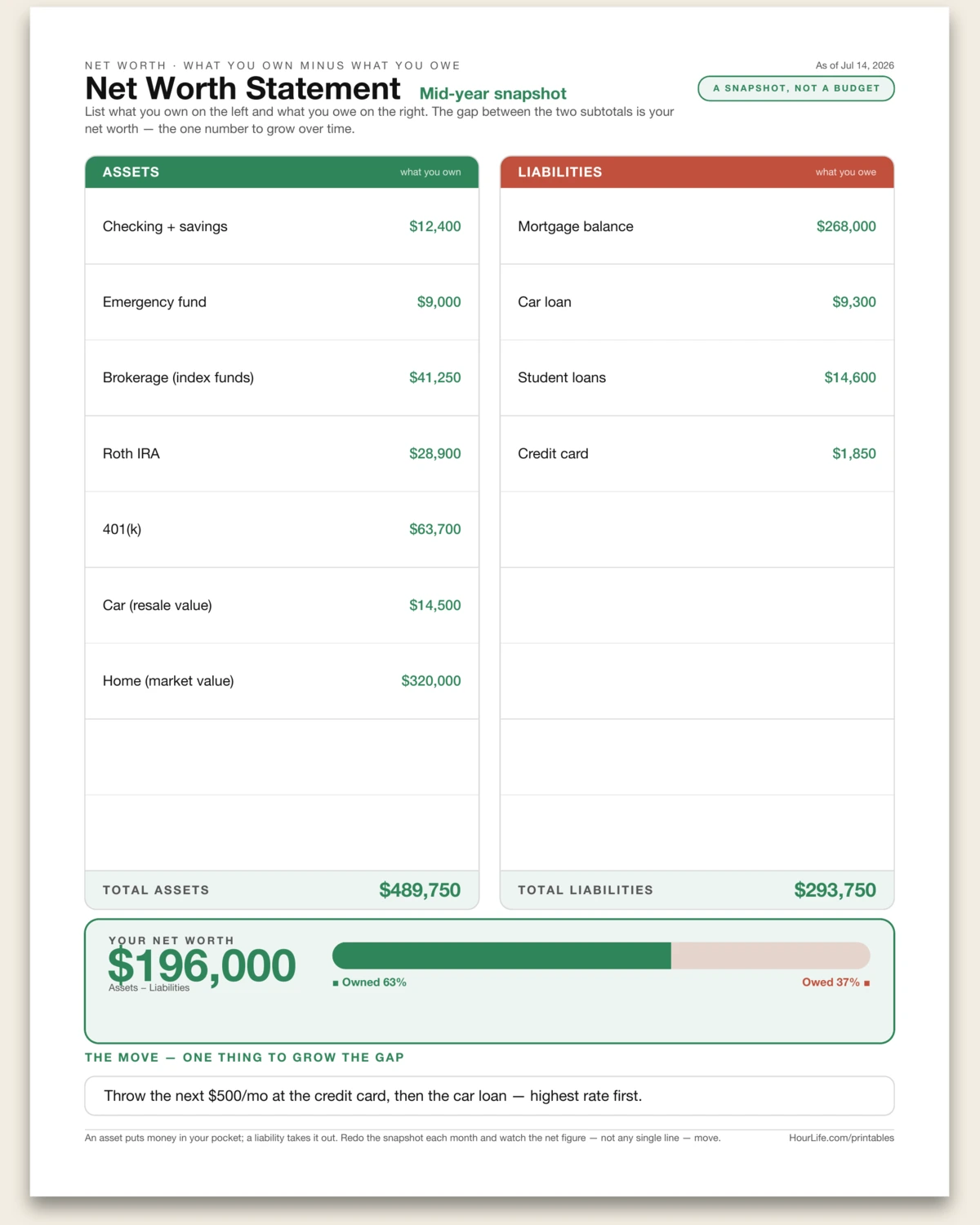
A one-page personal balance sheet — the single number that tells you where you actually stand. List everything you own down the left (assets: cash, investments, retirement accounts, the car, the house at market value) and everything you owe down the right (liabilities: the mortgage, car loan, student loans, credit-card balances), one line each as a label and an amount. The two columns foot to subtotals and net against each other into one figure: your net worth, what would be left if you sold everything and paid off everything. A bar beneath shows how much of the picture you own outright versus how much you still owe. It's the distinction at the heart of Rich Dad Poor Dad — an asset puts money in your pocket, a liability takes it out — made concrete in a number you can watch move. Redo the snapshot each month and track the net figure, not any single line. Fill it in to see exactly where you are, or print it blank and total it up by hand.
Best for
Seeing your true financial position in one number — and watching net worth grow as assets rise and debts fall.
Landscape · 1 page
Gantt Chart
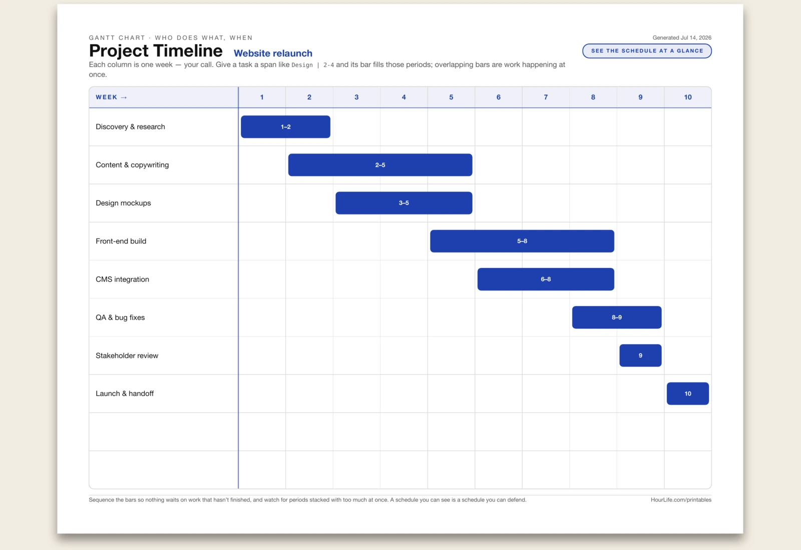
A Gantt chart schedules a project the way a to-do list never can — tasks down the left, time across the top, and each task drawn as a bar spanning the periods it runs. Name the project, then list up to ten tasks as "name | start-end"; give a task a span like 2-4 and its bar fills those periods on a shared ten-column axis. Seeing the bars laid over one another is the whole point: it shows what happens at once, where the crunch weeks stack up, and what's waiting on work that hasn't finished yet. A column is whatever unit you name — a week, a sprint, a day — so the same sheet plans a launch, a build, or a term. Sequence the bars so nothing depends on something that ends after it starts, and a period buried under too many bars is your warning to spread the load. Fill it in to pressure-test a plan, or print it blank and draw the bars by hand on the grid.
Best for
Turning a list of tasks into a schedule you can see — spotting what overlaps, what's overloaded, and what waits on what, before the plan meets reality.
Landscape · 1 page
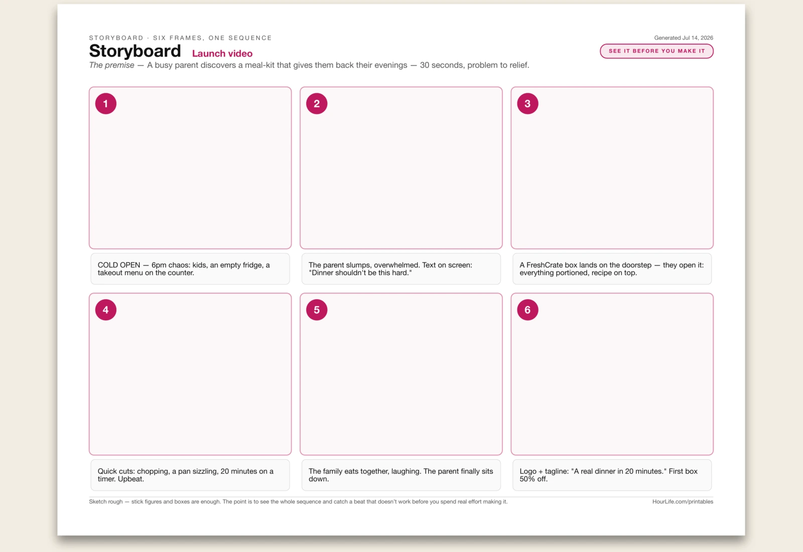
Storyboard
A storyboard maps a sequence — a launch video, a pitch, a presentation flow, a user journey, a story — as six frames before you spend real effort making it. You write a one-line premise for the whole thing, then a caption for each beat, and sketch a rough picture in each of the six numbered panels. Laid out in a row, the sequence shows you what a script or a slide deck can't: where the story drags, where it jumps a step, where it loses the thread — while it's still cheap to fix. Draw rough; stick figures and boxes are enough, because you're checking the flow of beats, not the art. And if a frame is hard to caption, that's usually the beat that isn't working. Fill in the captions to plan on screen, or print it blank and sketch the whole sequence by hand.
Best for
Planning anything that unfolds in a sequence — a video, a pitch, a talk, a flow — by seeing all six beats at once and catching the weak one before you build it.
Landscape · 1 page
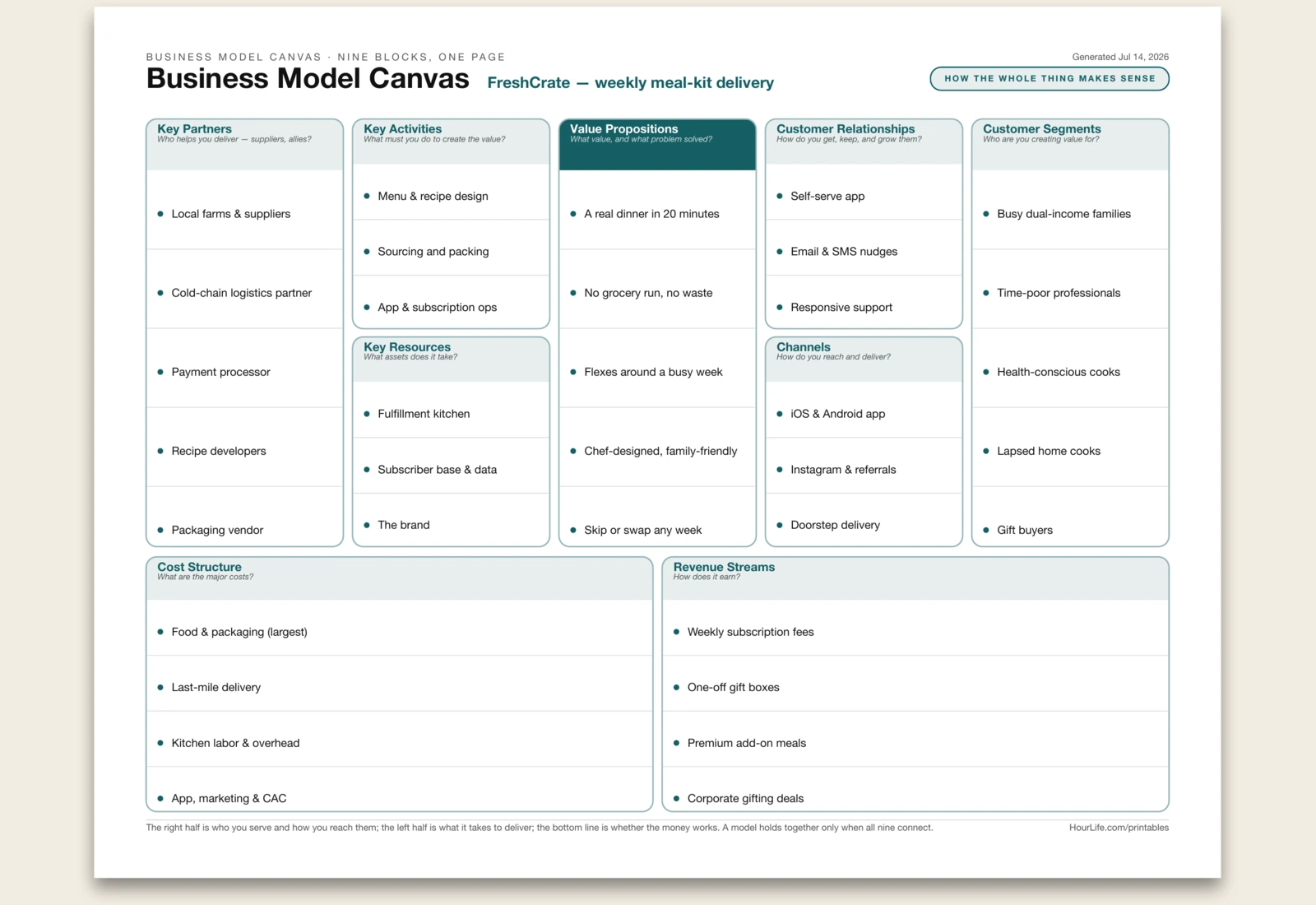
Business Model Canvas
Alexander Osterwalder's Business Model Canvas puts an entire business on one page — nine building blocks that, read together, answer whether a venture actually holds together. The right half is the market: Customer Segments (who you create value for), Value Propositions (the value you offer and the problem it solves), Channels (how you reach and deliver), and Customer Relationships (how you get, keep, and grow them). The left half is the machine that delivers it: Key Partners, Key Activities, and Key Resources. And along the bottom, the two blocks that decide if it works at all — Cost Structure (what it takes to run) against Revenue Streams (how it earns). The value isn't in any one box; it's in seeing all nine at once, so a gap or a contradiction — a segment no channel reaches, an activity with no revenue behind it — jumps out. Start from who you serve and what you offer, then work outward. Fill it in to pressure-test or pitch a model, or print it blank and map it on a wall with sticky notes.
Best for
Sketching or stress-testing how a business works end to end — turning a vague idea into nine concrete blocks you can see, question, and connect on one page.
Landscape · 1 page
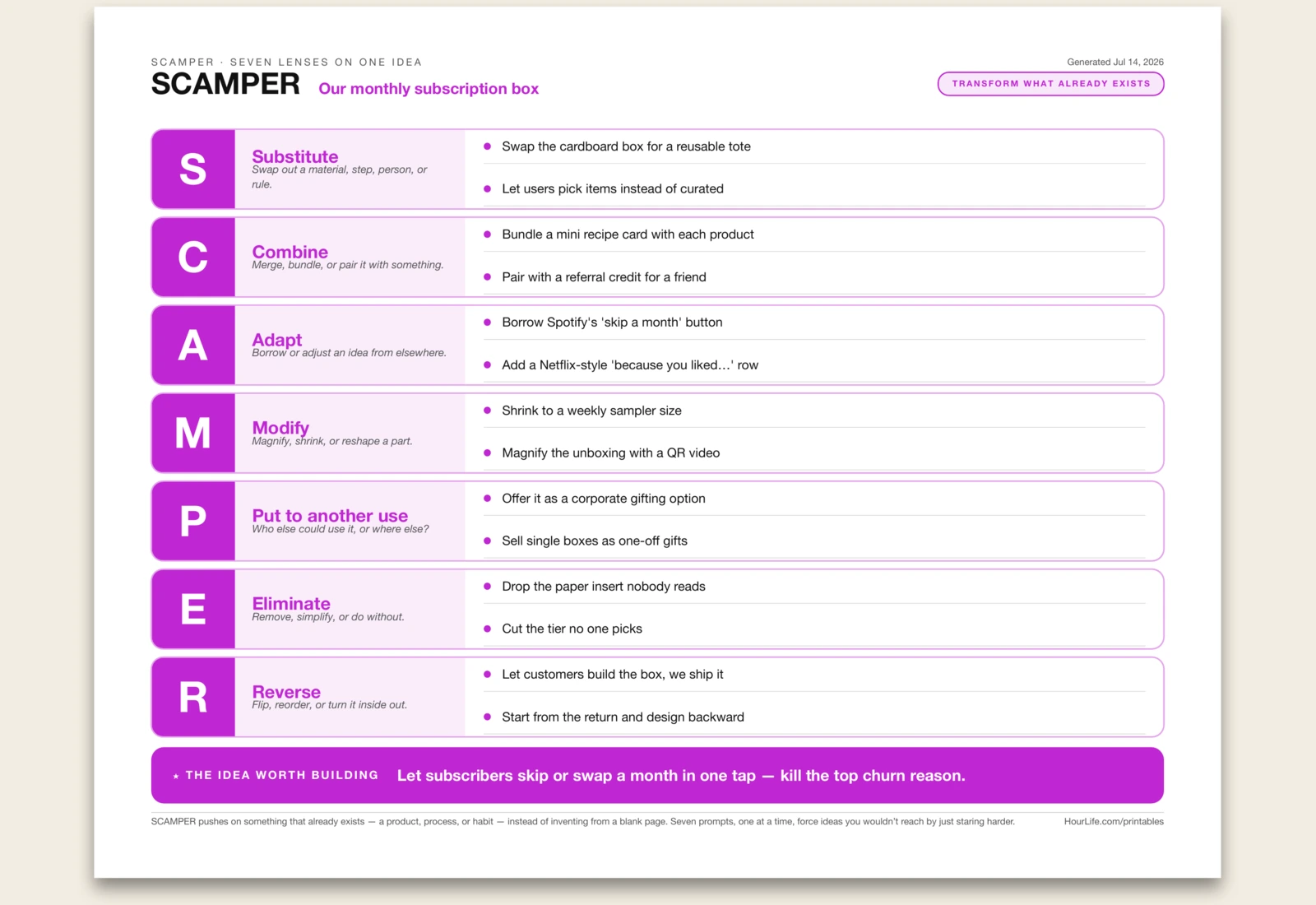
SCAMPER
SCAMPER is a checklist for reinventing something that already exists — a product, a process, a habit — instead of inventing from a blank page. You name one subject, then run it through seven prompts one at a time, each a specific move on what's already there: Substitute (swap out a material, step, person, or rule), Combine (merge or bundle it with something), Adapt (borrow an idea from elsewhere), Modify (magnify, shrink, or reshape a part), Put to another use (who else could use it, or where else), Eliminate (remove or simplify), and Reverse (flip, reorder, or turn it inside out). Because each letter forces a particular kind of change, you reach ideas you'd never get to by staring harder at the problem — and quantity is the point, since a weak idea under one lens often sparks a strong one under the next. Seven stacked prompt bands spell the mnemonic down the page, two ideas each, closing with the single idea worth building. Fill it in as a record, or print it blank and brainstorm by hand.
Best for
Generating a burst of concrete ideas for improving something you already have — when a blank page leaves you stuck but a prompt gets you moving.
Landscape · 1 page
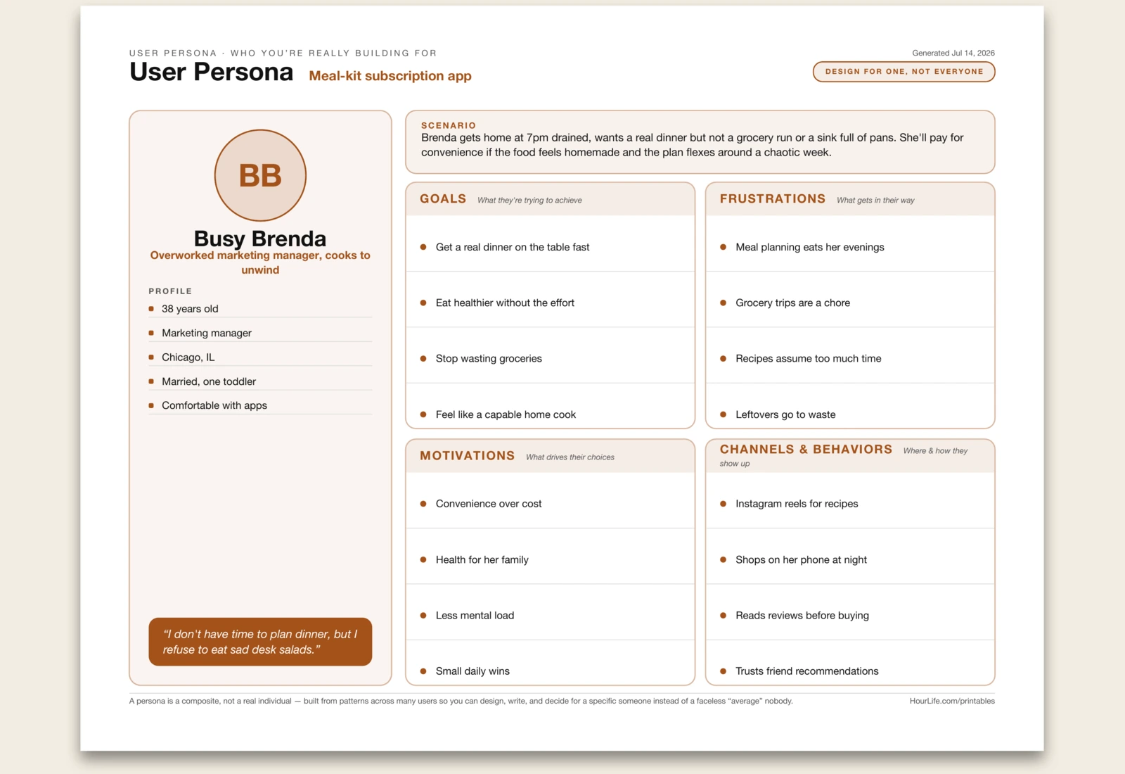
User Persona
The whole point of a persona is to turn "the user" — that faceless average nobody actually designs well for — into one specific person you can picture. This one-page dossier gives them a name, an avatar with their initials, a role in a phrase, and a line they'd actually say, then a scenario band that sets the day-in-the-life where your product fits. Down the left runs a profile column — age, job, location, whatever details make them real; across the right, four zones map what they're after: Goals (what they're trying to achieve), Frustrations (what gets in their way), Motivations (what drives their choices), and Channels & Behaviors (where and how they show up). Build it from patterns you've genuinely seen across users, not a wish list — a persona is a composite, not a real individual. Once the archetype has a face, arguments get shorter: you stop asking "would people like this?" and start asking "would she?" Fill it in to circulate, or print it blank and sketch the persona as a team.
Best for
Making "the user" concrete — one named, believable person the whole team can design, write, and decide for instead of a faceless average.
Landscape · 1 page
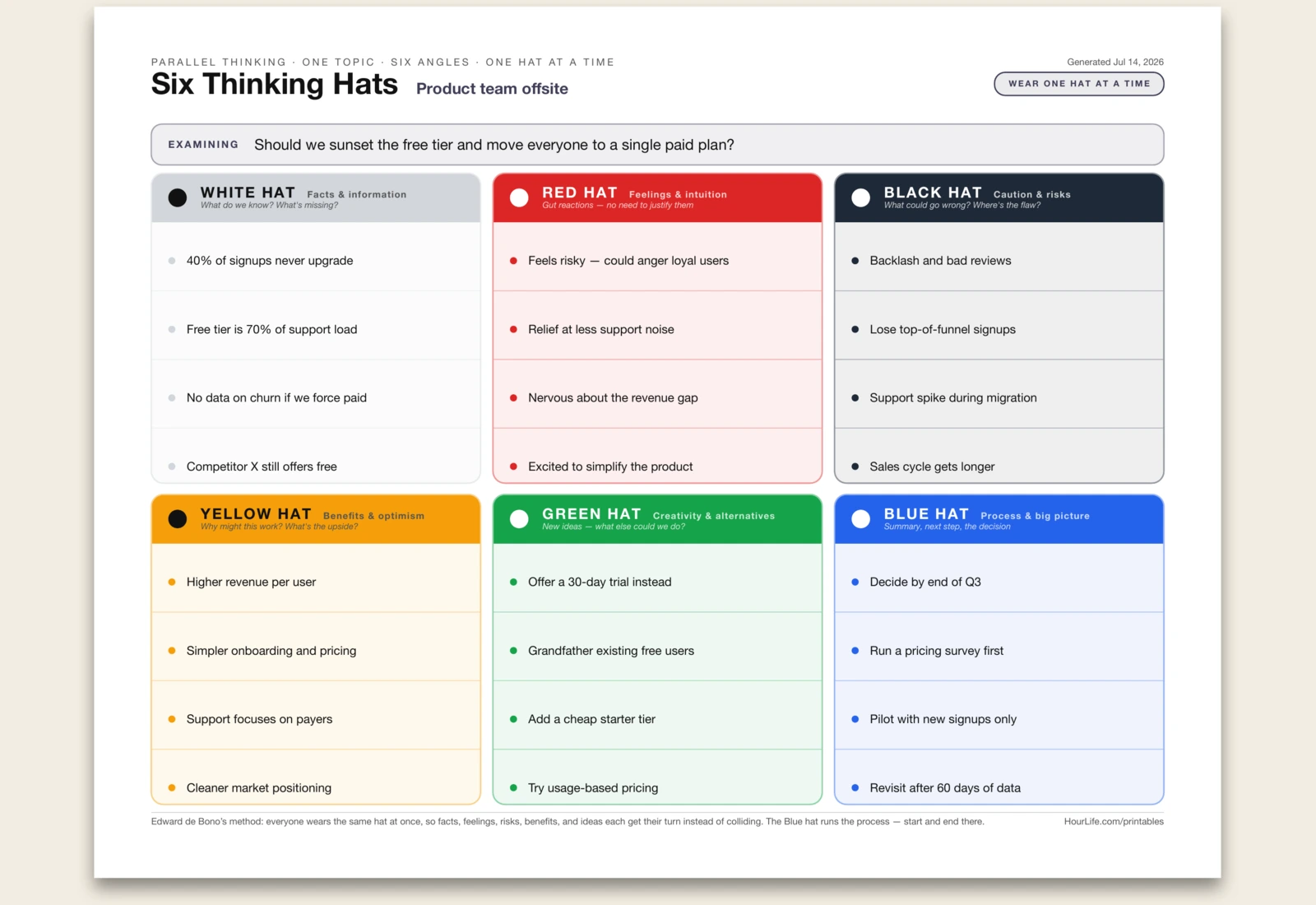
Six Thinking Hats
Edward de Bono's parallel-thinking method on one page — the antidote to meetings where the loudest voice wins and the same argument goes in circles. Instead of everyone pushing their own angle at once, the whole room wears one coloured hat at a time: White for facts and data, Red for gut feelings (no justification allowed — that's the point), Black for caution and risks, Yellow for benefits and optimism, Green for fresh ideas and alternatives, and Blue to run the process and land the decision. Because everyone thinks in the same mode together, the facts don't get buried under opinions, the risks get their turn before the enthusiasm takes over, and the quiet creative idea actually gets heard. Six colour-coded panels, four lines each, with a topic band up top and a Blue-hat close. Fill it in as a record, or print it blank and run the session live — start and end on Blue.
Best for
Breaking a circular debate open by forcing one mode of thinking at a time — so feelings, facts, risks, and fresh ideas each get a fair hearing.
Landscape · 1 page
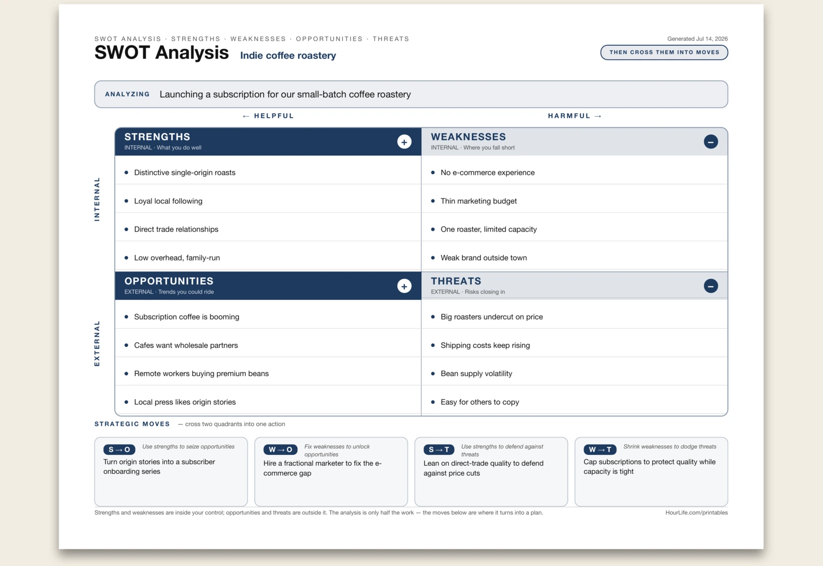
SWOT Analysis
The oldest strategy square there is, on one page — but built to end in a plan, not a list. Name what you're sizing up, then fill four quadrants laid out on two axes: Strengths and Weaknesses are internal, things you control; Opportunities and Threats are external, things you don't. The left column is helpful, the right is harmful, so the positive and negative halves read at a glance. Most SWOTs stop there and gather dust. This one adds a TOWS synthesis strip across the bottom that crosses the quadrants into four concrete moves — use strengths to seize opportunities (S→O), fix weaknesses to unlock them (W→O), use strengths to defend against threats (S→T), and shrink weaknesses to dodge threats (W→T). Fill it in to circulate a decision, or print it blank to run the analysis live on a whiteboard and cross the quadrants into action together.
Best for
Turning a scattered gut-check about a decision into a clear-eyed square — and then into four moves you can actually run.
Landscape · 1 page
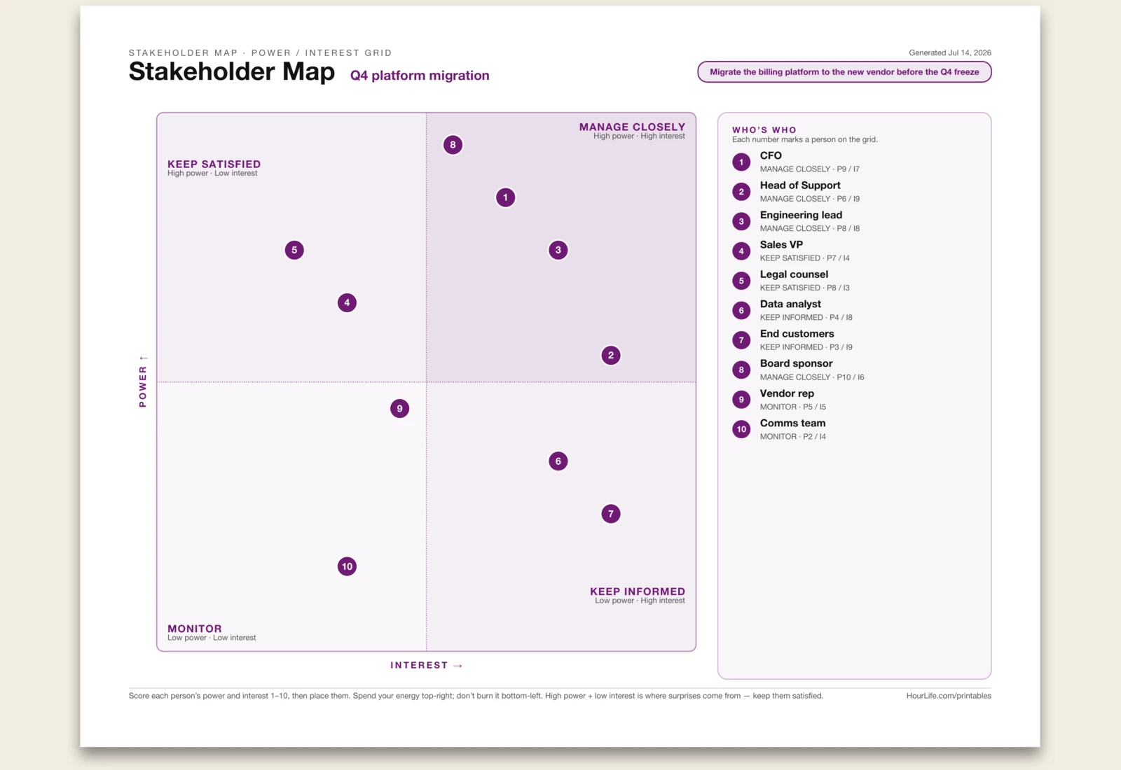
Stakeholder Map
A one-page power/interest grid — the classic Mendelow matrix used to decide who to manage, and how hard. Name the initiative, list everyone with a stake, and score each person on two axes: how much power they hold over the outcome and how much interest they take in it, 1–10. Each name plots as a numbered dot on a square grid, landing in one of four quadrants that come with a ready-made strategy — Manage Closely (high power, high interest), Keep Satisfied (high power, low interest), Keep Informed (low power, high interest), or Monitor (low power, low interest). A numbered legend down the side maps every dot back to a name and its strategy. The point is to spend your attention where it moves the needle — and to spot the quiet, powerful people who can blindside a project if you leave them uninformed. Print it blank to place everyone on a wall by hand.
Best for
Deciding who on a project actually needs your attention — and catching the powerful-but-quiet people before they derail it.
Landscape · 1 page
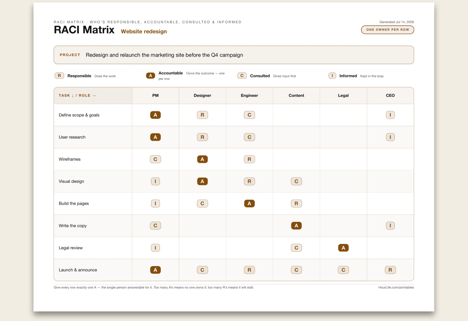
RACI Matrix
A one-page responsibility chart that settles the question every project stalls on: who actually owns what? Name the project, list your tasks down the left and your people or roles across the top, then mark each cell with one letter — R (Responsible, does the work), A (Accountable, owns the outcome), C (Consulted, gives input first), or I (Informed, kept in the loop). A four-part legend prints across the top so nobody has to remember what the letters mean. The discipline that makes it work is one A per row: every task needs a single owner who is answerable for it. Too many A's and no one owns it; too many R's and it stalls in committee. Print it filled to circulate a decision, or blank to divide the work up live in the room.
Best for
Ending the 'I thought you were doing that' problem by pinning a single owner to every task before the work starts.
Landscape · 1 page
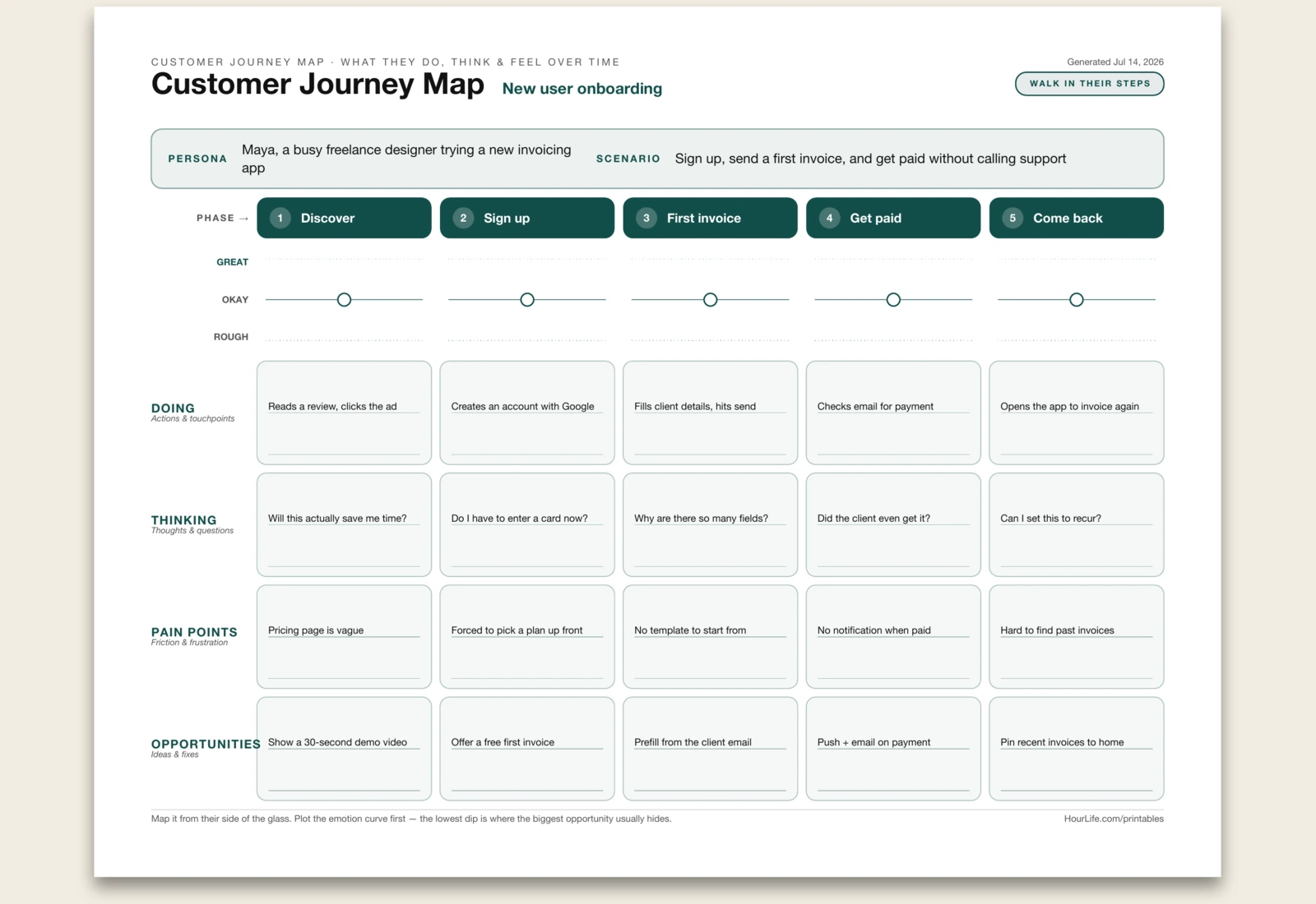
Customer Journey Map
A one-page journey map that lays a customer's experience out left to right, phase by phase. Name the persona and the scenario, set up to five phases across the top, and for each one capture what they're doing, what they're thinking, where it hurts, and the opportunities you see. Above the grid runs an emotion band — three guide lines and a dot per phase — that you plot by hand into a curve of highs and lows. Mapping the experience from their side of the glass, in order, is what turns a vague sense that 'onboarding is rough' into a specific dip you can fix. The lowest point on the curve is almost always where the biggest opportunity hides. Leave any line blank to fill in by hand.
Best for
Seeing a product or service the way the person using it does — and finding the exact moment that most needs fixing.
Portrait · 1 page
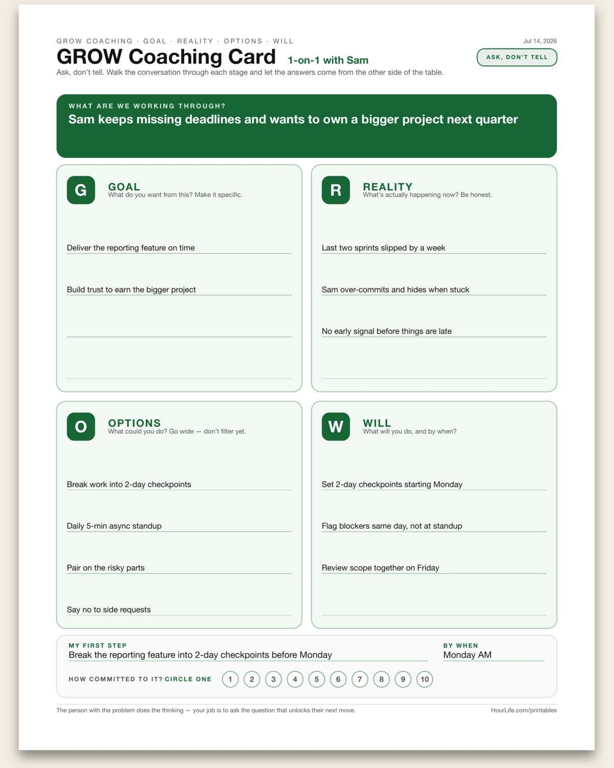
GROW Coaching Card
A one-page coaching canvas built on John Whitmore's GROW model — the questioning framework behind modern performance coaching. Name the topic you're working through, then walk the conversation across four quadrants: Goal (what do you want?), Reality (what's actually happening now?), Options (what could you do?), and Will (what will you do, and by when?). It closes with a first step, a date, and a 1–10 scale to circle how committed you really are. The point is to ask, not tell — the person with the problem does the thinking. Works as a 1-on-1 aid for a manager or mentor, or as a self-coaching sheet to talk yourself through something stuck. Print it blank to run the conversation live.
Best for
Coaching someone — or yourself — through a stuck problem by asking the right questions instead of handing over the answer.
Landscape · 1 page
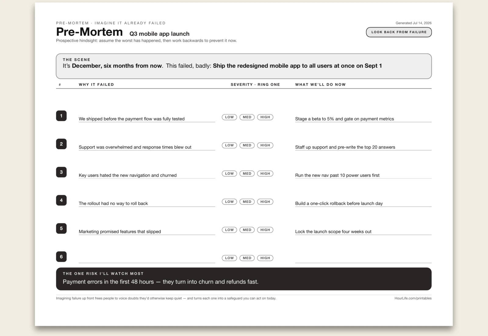
Pre-Mortem
A one-page pre-mortem drawn as a work-backwards ledger — the technique from Gary Klein and Daniel Kahneman. Instead of asking what might go wrong, you assume the decision has already failed at some future point and ask why. Name the project and the horizon, brainstorm the reasons it failed down the left, ring how severe each one is, and write the safeguard you'd put in place now on the right. It closes with the single biggest risk to watch. Imagining failure up front frees people to voice the doubts they'd otherwise keep quiet — and turns each one into a safeguard you can act on today. Print it blank to run the session by hand.
Best for
Stress-testing a plan or decision before you commit — surfacing risks while there's still time to prevent them.
Portrait · 1 page
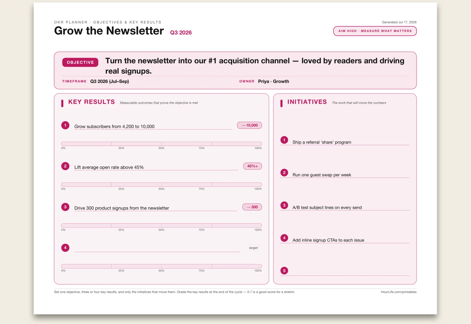
OKR Planner
The Objectives & Key Results sheet on one page — the goal-setting method that ran Intel and Google, from Andy Grove to John Doerr. It splits an ambition into two honest halves: one qualitative Objective at the top — the direction you're heading, stated to inspire, not to measure — and beneath it up to four Key Results, each a number you can't argue with, written as result and a start → target so progress is visible. The distinction is the whole point: the objective is where you want to go, the key results are how you'll know you got there. Each key result carries a grade scale you ring at the period's end, and OKR grading runs 0.0–1.0 with 0.7 — not a perfect 1.0 — as the target, because if you're always maxing out you set the bar too low. An initiatives checklist at the bottom holds the actual work that moves the numbers, kept deliberately separate so you never mistake being busy for making progress. Set it for a quarter, or print it blank and draft your OKRs by hand.
Best for
Turning a fuzzy ambition into one clear objective and a handful of measurable results — so a quarter ends with evidence, not opinions.
Landscape · 1 page
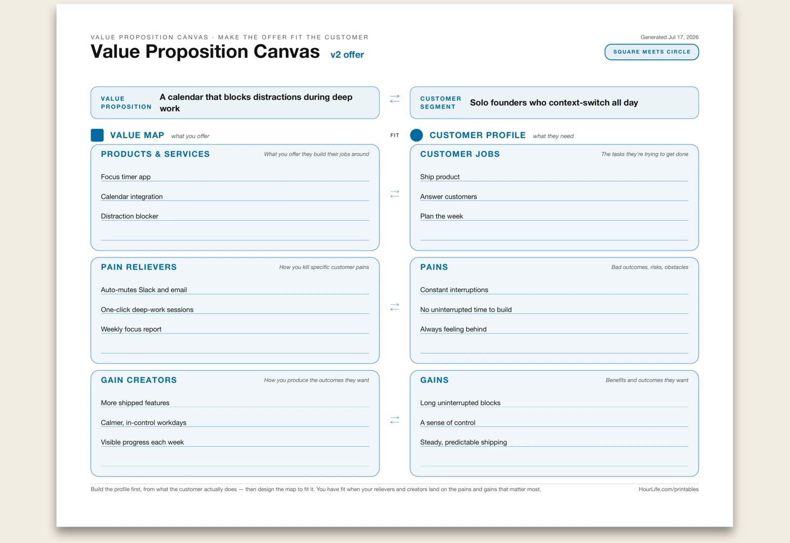
Value Proposition Canvas
A one-page Value Proposition Canvas laid out the way Alexander Osterwalder drew it — two halves that have to fit. On the right, the Customer Profile (the circle): the Jobs they're trying to get done, their Pains, and the Gains they want. On the left, the Value Map (the square): your Products & Services, the Pain Relievers that kill specific pains, and the Gain Creators that produce the outcomes they're after. The two sides are stacked so each row reads as a fit pair — products against jobs, relievers against pains, creators against gains. Name the value proposition and the customer segment at the top, then build the profile first from what the customer actually does before you design the map to fit it. You have fit when your relievers and creators land on the pains and gains that matter most. Print it blank to run a workshop by hand, or leave any zone empty to fill in later.
Best for
Pressure-testing whether an offer actually matches what a specific customer segment needs — before you build it.
Landscape · 1 page
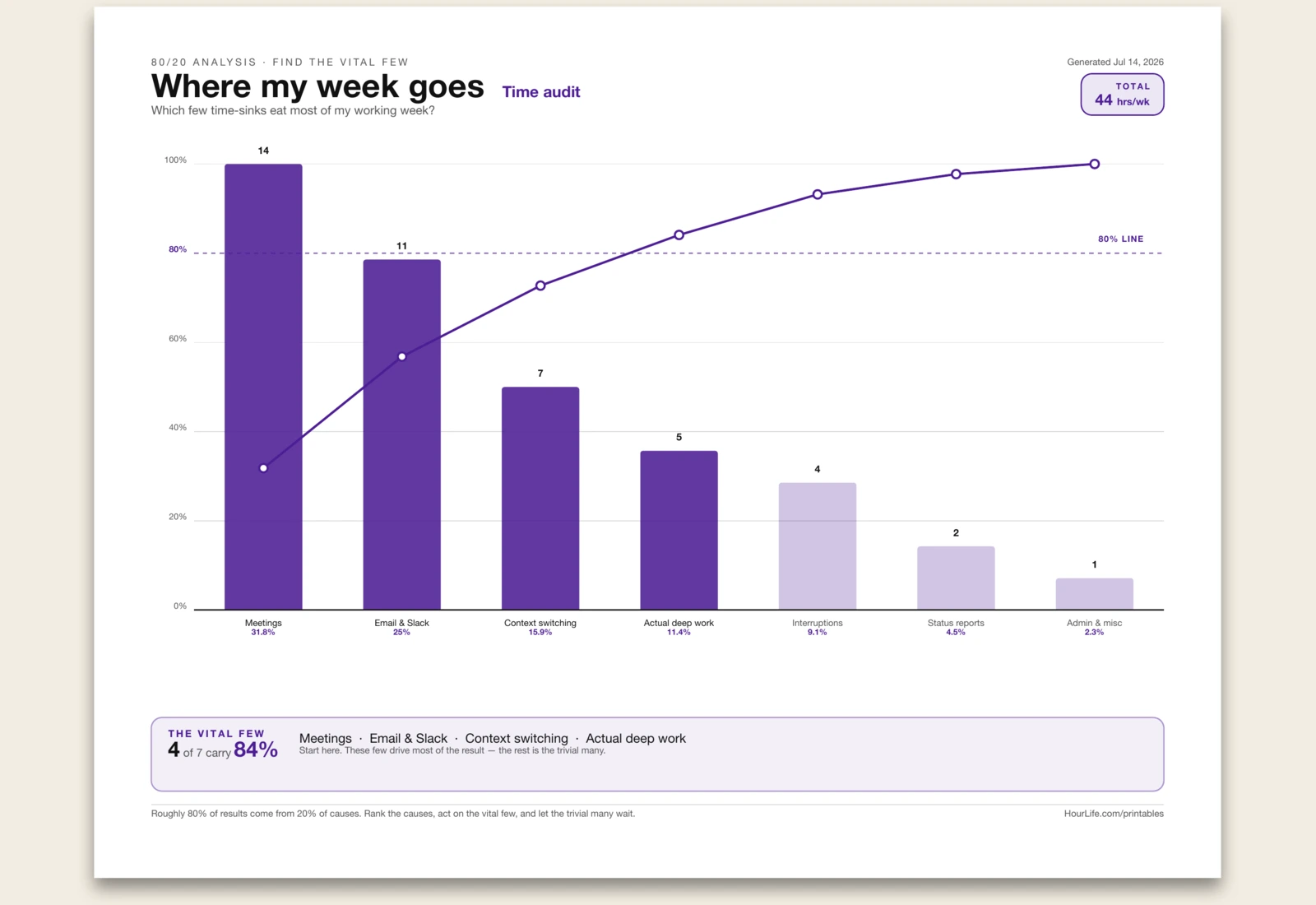
80/20 Analysis
A one-page 80/20 worksheet drawn as a proper Pareto chart — ranked bars with a cumulative line and the 80% reference line marked. List the causes you're analysing with a value each (where your hours go, which issues recur, what drains the budget), and the sheet sorts them biggest first, works out each one's share and the running cumulative total, and flags the vital few that carry roughly 80% of the result. Those few are where your effort pays off; the rest is the trivial many that can wait. Print it blank to sketch a chart by hand. All the ranking and the percentages are done for you.
Best for
Cutting a long list of causes down to the vital few that drive most of the result.
Landscape · 1 page
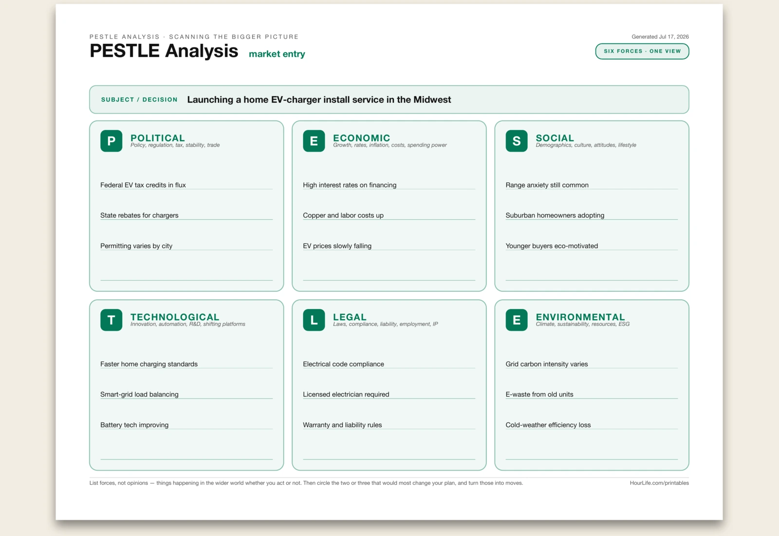
PESTLE Analysis
A one-page PESTLE analysis for scanning the macro forces around a decision or plan: Political, Economic, Social, Technological, Legal, and Environmental. Name the subject, jot a few concrete forces under each factor, and mark the two or three that would most change your strategy. Where Porter's Five Forces reads the industry you're in, PESTLE reads the wider world it sits inside. Print it blank to run the scan with a team.
Best for
Spotting the outside-world forces that could change a market, launch, or strategic plan.
Landscape · 1 page
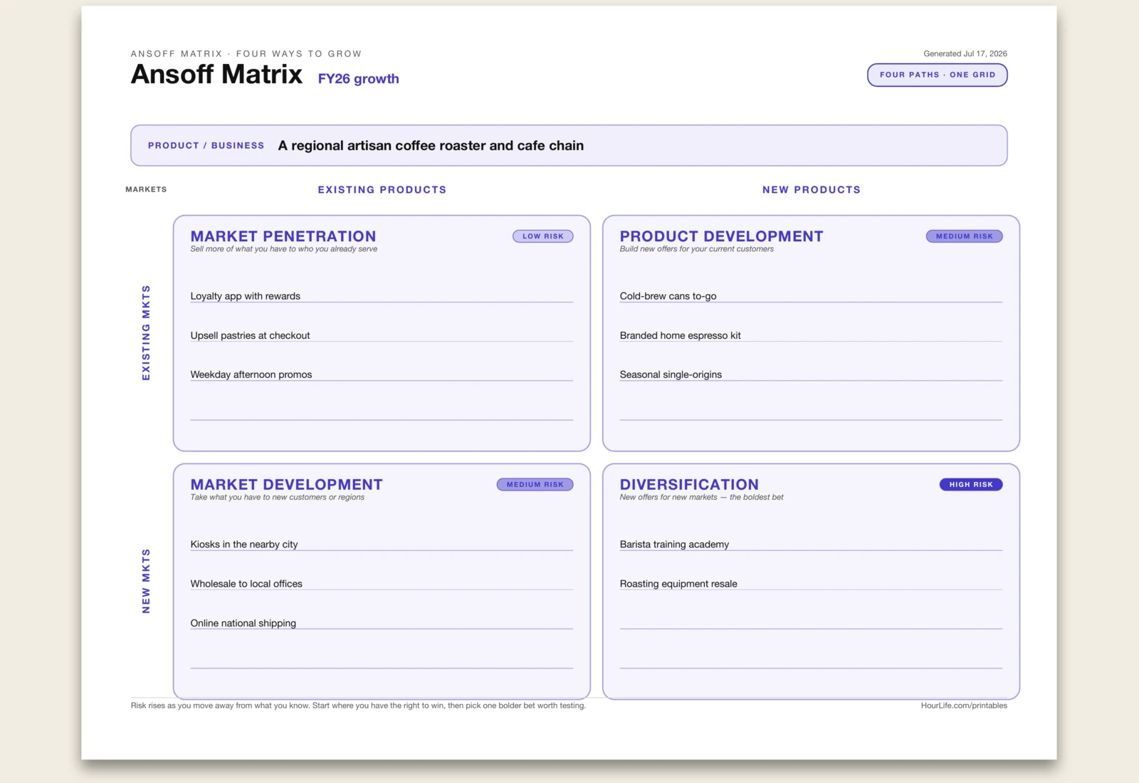
Ansoff Matrix
A one-page Ansoff Matrix — the classic 2x2 that maps growth along two axes: the products you sell and the markets you sell them to. Cross them and you get four paths, drawn as quadrants with the risk rising from top-left to bottom-right. Market Penetration sells more of what you have to who you already serve (lowest risk). Product Development builds new offers for current customers. Market Development takes today's offers to new customers or regions. Diversification means new offers for new markets — the boldest bet. Name the business, jot a few concrete moves in each quadrant, and the sheet lays out the grid with axis labels and risk chips so you can see where you have the right to win. Print it blank to plan by hand.
Best for
Weighing where to grow next — and how much risk each path really carries.
Portrait · 1 page
Cost–Benefit Analysis
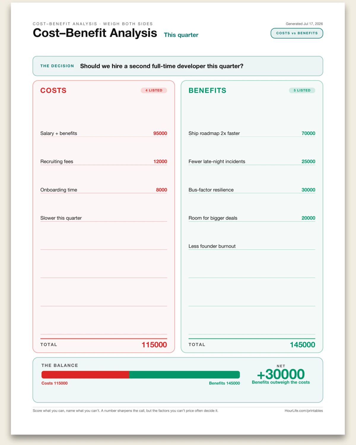
A one-page cost–benefit ledger that lays the price of a decision next to its payoff. List the costs on one side and the benefits on the other, one factor per line, with a number after any line you can put a figure on — money, hours, or points. The sheet tallies each side, works out the net, draws a balance bar showing which way it tips, and states the verdict. Lines without a number still list as qualitative factors to weigh by hand. Name the decision, fill both columns, and read the balance. Print it blank to work it out by hand — the maths is done for you when you add the numbers.
Best for
Weighing a purchase, hire, or change by putting its costs and benefits side by side.
Landscape · 1 page
Porter's Five Forces
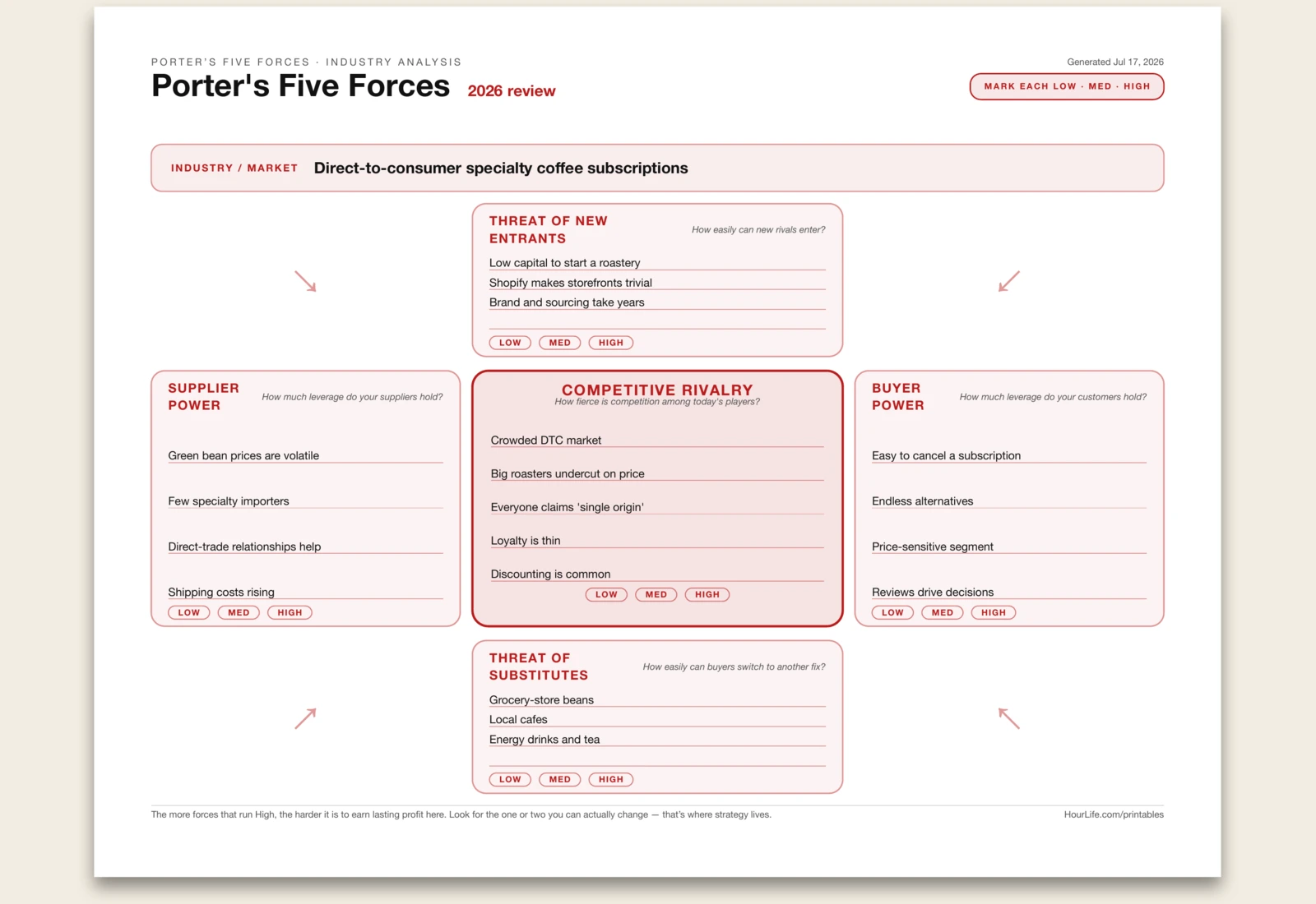
A one-page Porter's Five Forces worksheet for reading the pressure inside an industry. Competitive Rivalry sits at the centre, pressed on by four outside forces: Threat of New Entrants, Threat of Substitutes, Supplier Power, and Buyer Power. Name the industry, write a few notes under each force, and the sheet gives you the classic strategy map with low/medium/high pressure chips to mark by hand. The point is not to admire the diagram; it is to see which forces compress profit and which ones your strategy can actually change. Print it blank to run the analysis in a workshop.
Best for
Understanding the competitive pressure in an industry before choosing a strategy.
Landscape · 1 page
Gap Analysis
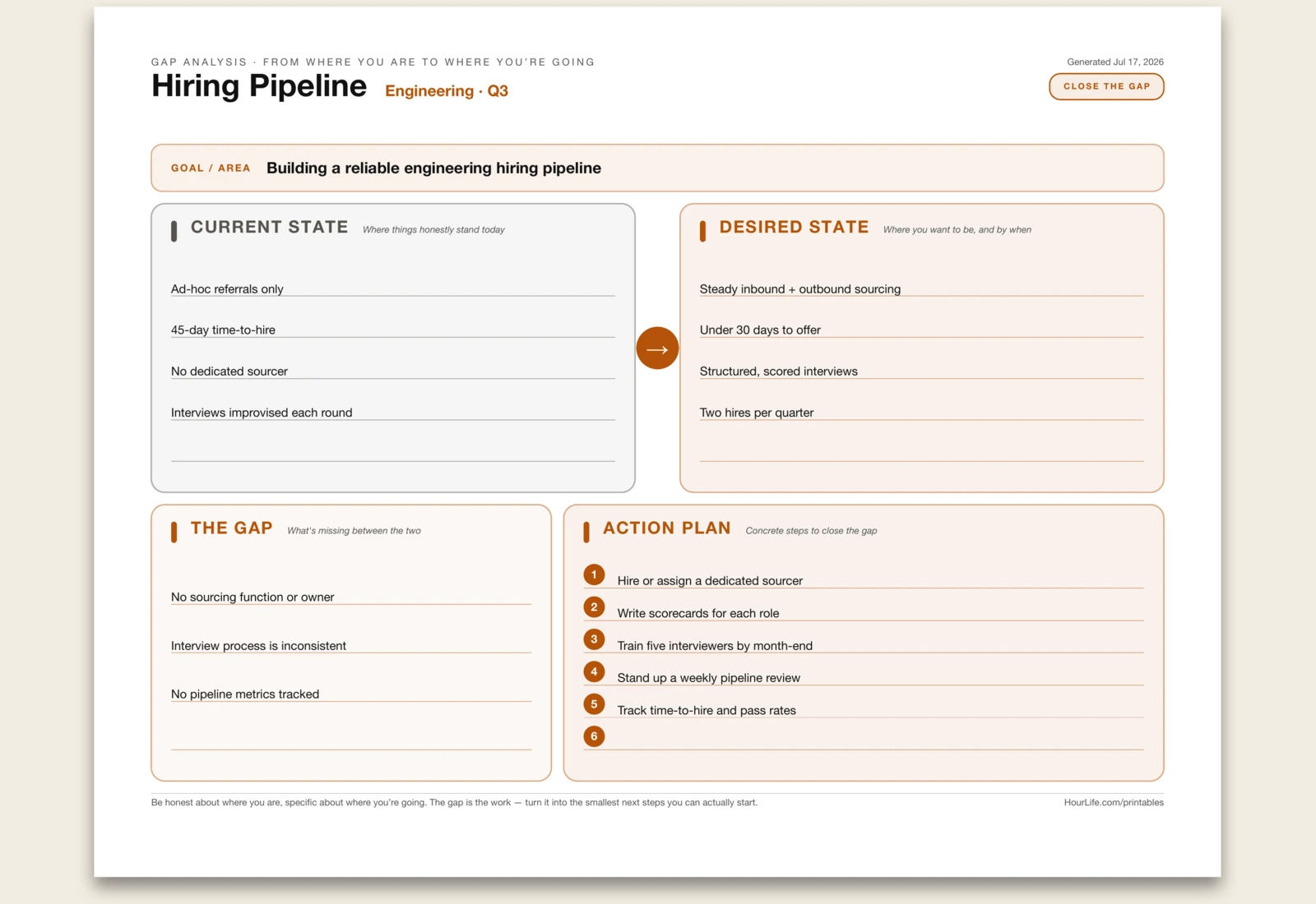
A one-page gap analysis that lines up where you are against where you want to be, names the difference, and turns it into a plan. Lay out the current state honestly and the desired state specifically, side by side with an arrow between them. Then name the gap — what's actually missing — and break it into a numbered action plan of the smallest next steps you can start on. Name the goal or area, fill the four parts, and the sheet lays out the flow from today to your target. Print it blank to work through by hand.
Best for
Turning the distance between today and a goal into concrete next steps.
Landscape · 1 page
OKR Planner
A one-page OKR sheet that pairs one ambitious Objective with the measurable Key Results that prove you reached it — the framework Google and Intel run on. State the qualitative objective up top, with a timeframe and an owner, then list up to four key results, each an outcome you can grade, with an optional target chip and a 0–100% rail to track by hand. Alongside them, list the initiatives — the work that actually moves the numbers. Keep the objective inspiring, the key results few and honest, and grade them at the end of the cycle. Print it blank to plan a cycle by hand.
Best for
Turning one ambitious goal into a handful of measurable results and the work that drives them.
Portrait · 1 page
SMART Goal
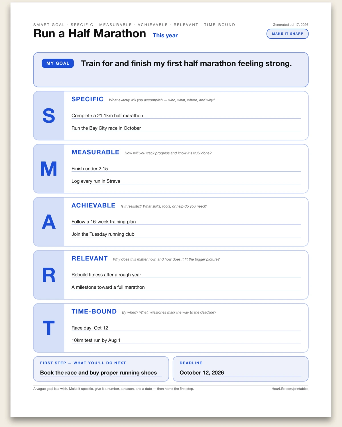
A one-page SMART goal worksheet that turns a vague wish into something you can actually chase. Write the goal in a sentence, then sharpen it against the five criteria — Specific, Measurable, Achievable, Relevant, and Time-bound — a line or two under each big letter tile. Finish by naming a first step and a deadline so the goal has a starting point and an end date. A vague goal is a wish; a specific one with a number, a reason, and a date is a plan. Print it blank to work through by hand.
Best for
Turning a fuzzy goal into a specific, measurable one with a deadline and a first step.
Landscape · 1 page
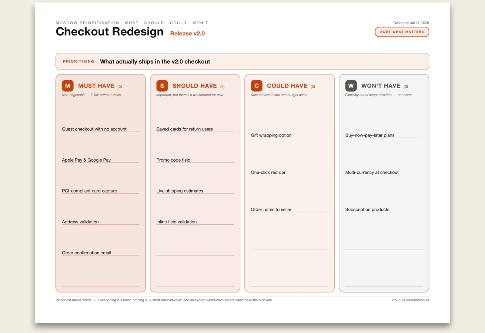
MoSCoW Prioritization
A one-page MoSCoW board that cuts a long wish-list down to a real plan. Name what you're prioritising, then sort every item into four lanes — Must have (it fails without these), Should have (important, but there's a workaround), Could have (nice if time and budget allow), and Won't have this time (explicitly out of scope, not never). The lanes shade from bold to muted so the priority order reads at a glance. Be honest about the must-have list — if everything is a must, nothing is — and an explicit won't-have list is what keeps the scope real. Print it blank to sort by hand.
Best for
Cutting a long backlog down to a short must-have list and an explicit won't-do list.
Landscape · 1 page
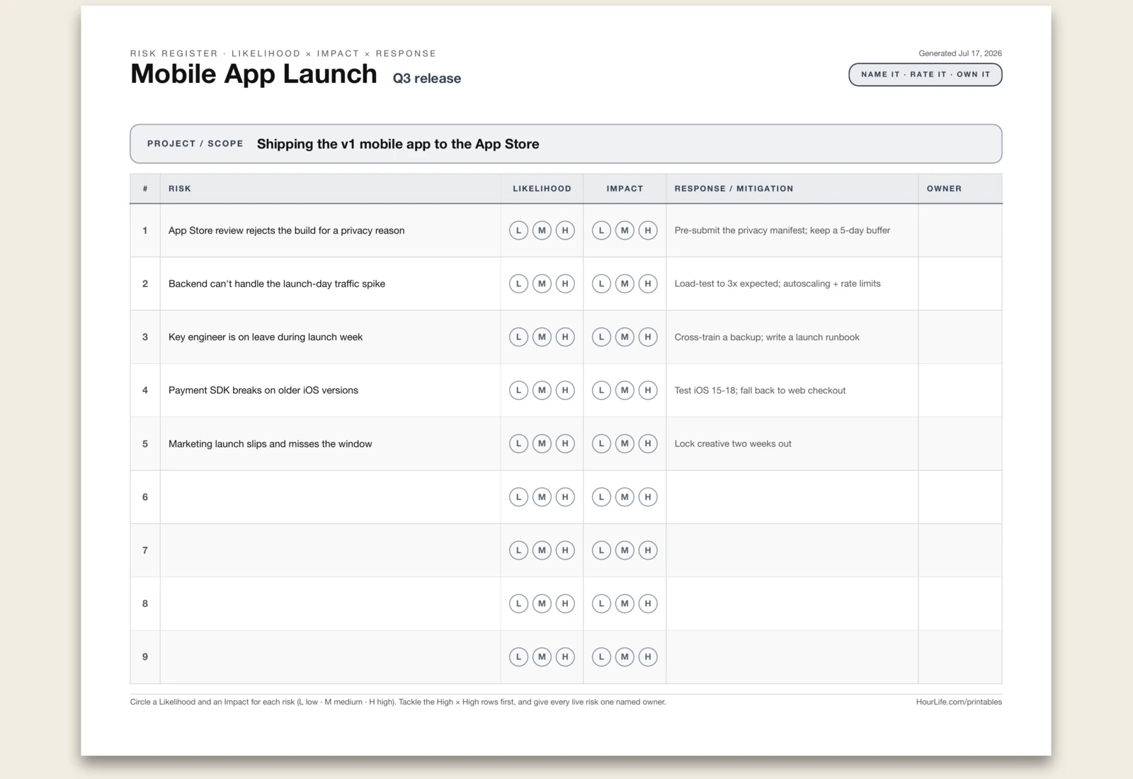
Risk Register
A one-page project risk register. Name the launch or plan it covers, then list what could go wrong — one risk per line, with an optional response after a pipe ("Risk | Mitigation"). Each line becomes a numbered row with the risk and planned response pre-filled, plus Likelihood and Impact chips (L · M · H) to circle and an Owner column to fill in by hand. Rate every risk on both axes, tackle the High × High rows first, and give each live risk one named owner so nothing sits unassigned. Print it blank to run the exercise with your team.
Best for
Surfacing what could go wrong on a project and assigning an owner and response to each risk.
Landscape · 1 page
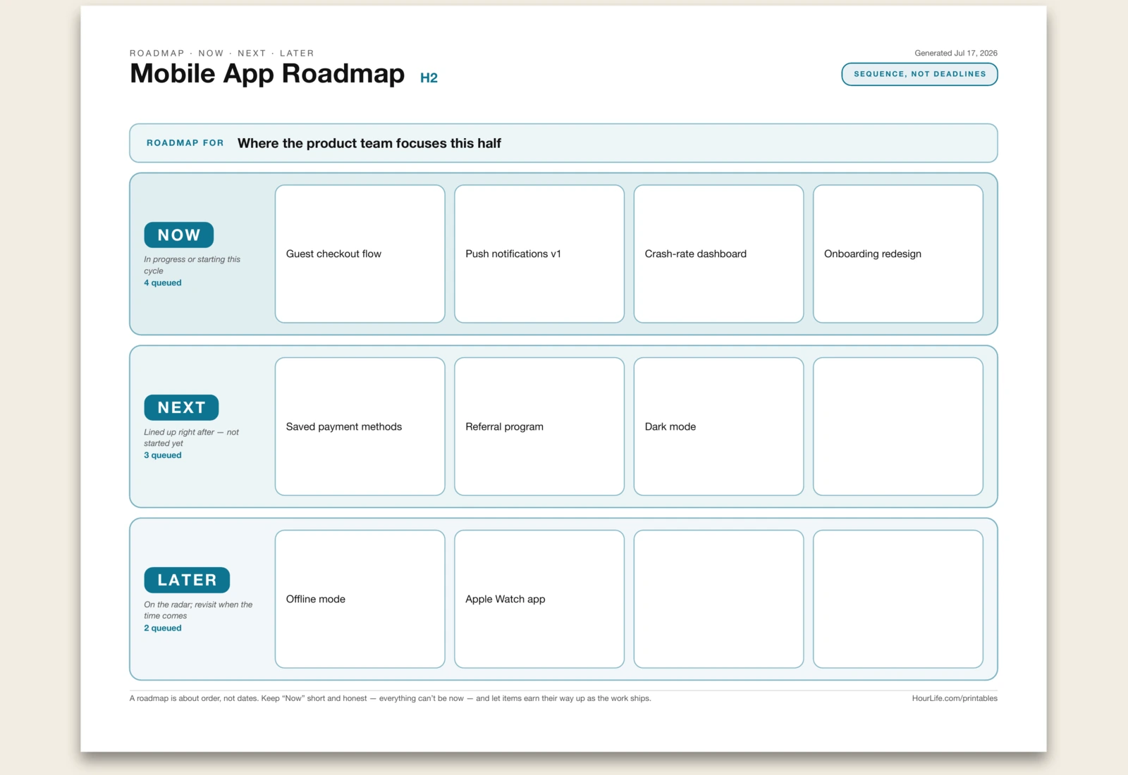
Now / Next / Later Roadmap
A one-page Now / Next / Later roadmap — the simplest way to show what's happening without pretending you know the exact dates. Name what the roadmap is for, then list items under three horizons: Now (in progress or starting this cycle), Next (lined up right after), and Later (on the radar; revisit when the time comes). Each line becomes a card in that band, and the bands fade from bold to faint so the sequence reads at a glance. A roadmap is about order, not deadlines — keep the Now band short and honest, and let items earn their way up as the work ships. Print it blank to plan on the wall.
Best for
Communicating what a team is working on now, next, and later — without committing to hard dates.
Landscape · 1 page
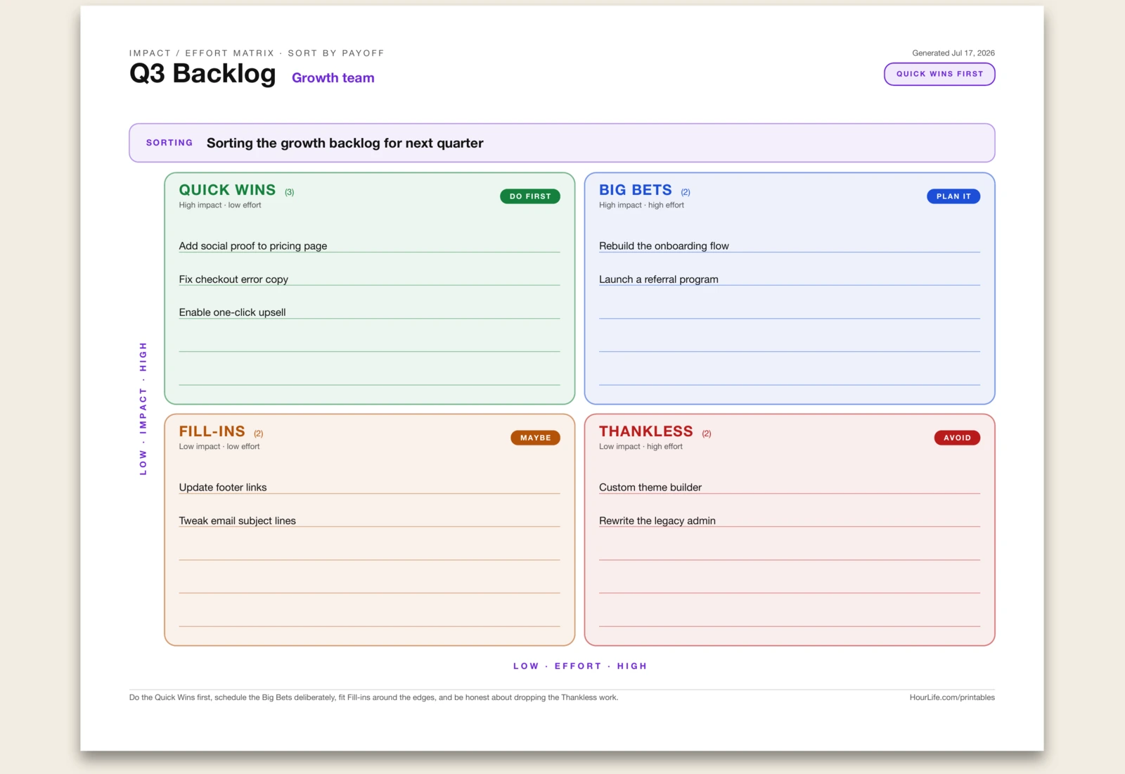
Impact / Effort Matrix
A one-page Impact / Effort matrix for cutting a long list down to what's worth doing. Name what you're sorting, then drop each item into one of four quadrants by how much it moves the needle versus how much work it takes: Quick Wins (high impact, low effort — do first), Big Bets (high impact, high effort — plan and resource), Fill-ins (low impact, low effort — do between the big work), and Thankless (low impact, high effort — avoid or drop). The colored quadrants and verdict badges make the call obvious at a glance. Start with the Quick Wins, schedule the Big Bets deliberately, and be honest about dropping the Thankless work. Print it blank to sort as a team.
Best for
Prioritising a backlog or idea list by payoff — surfacing the quick wins and killing the thankless work.
Landscape · 1 page
After-Action Review
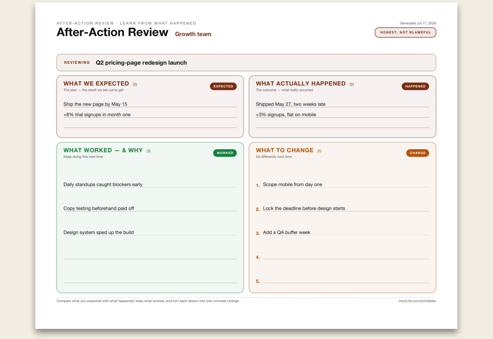
A one-page After-Action Review (AAR) for turning a finished project, launch, event, or incident into lessons you'll actually use. First name what you're reviewing, then work four sections: What We Expected (the plan and the result you set out to get), What Actually Happened (the real outcome, side by side with the plan), What Worked — and Why (the things to keep doing), and What to Change (each gap turned into a concrete, numbered action for next time). Borrowed from the military and used across engineering, ops, and agile teams, the AAR keeps a retrospective honest and blameful-free by comparing intent with reality rather than hunting for fault. Run it solo or with the team, and print it blank to fill in together.
Best for
Debriefing a project, launch, sprint, or incident — capturing what worked and turning each lesson into a concrete change.
Landscape · 1 page
SIPOC Diagram
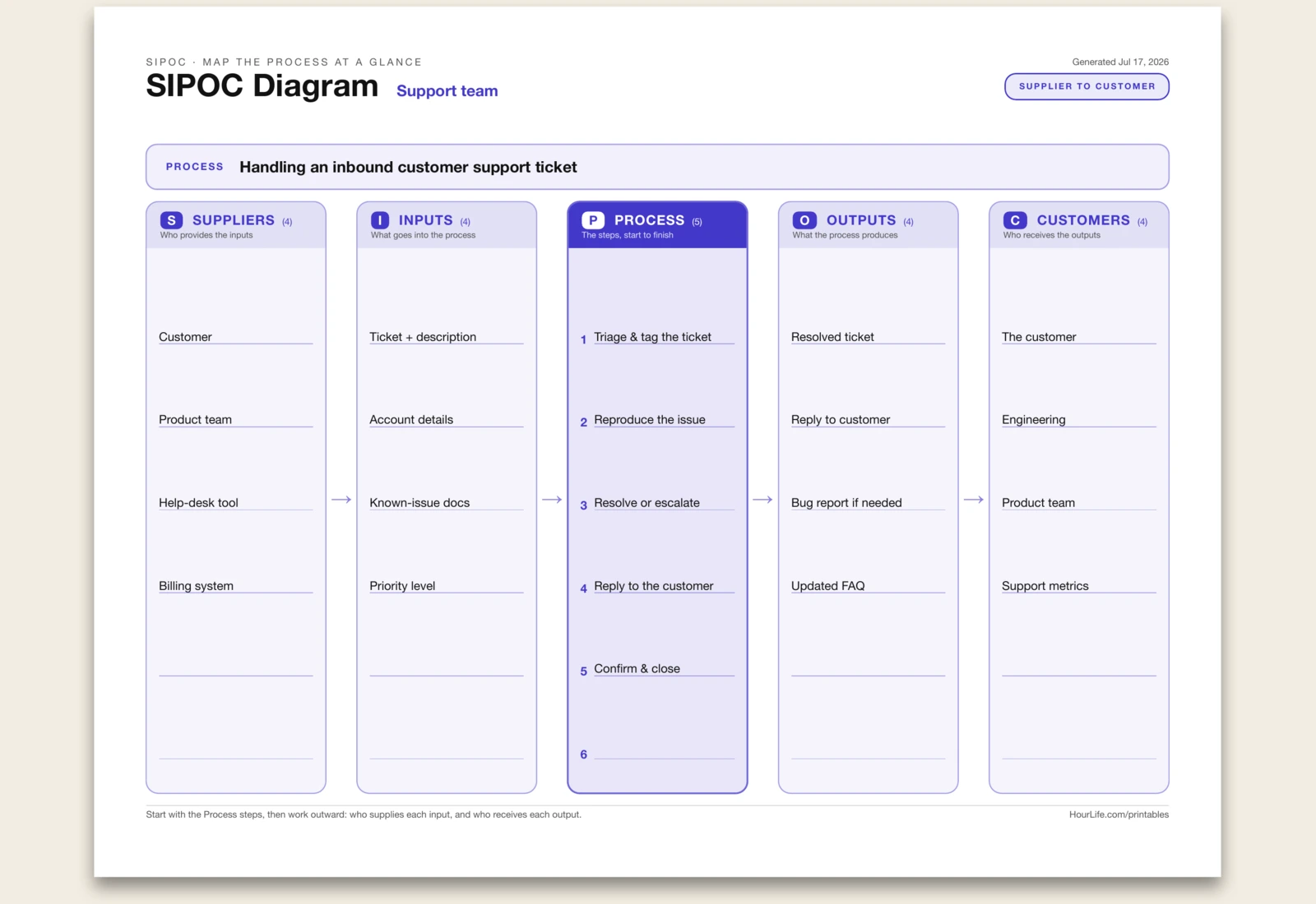
A one-page SIPOC diagram for mapping any process at a high level before you try to improve it. SIPOC stands for the five columns you fill left to right: Suppliers (who provides the inputs), Inputs (what goes into the process), Process (the four-to-six high-level steps, start to finish), Outputs (what the process produces), and Customers (who receives the outputs). A staple of Lean and Six Sigma, it's the first thing teams draw to get everyone on the same page about scope and hand-offs. Start with the Process steps in the middle, then work outward to who supplies each input and who receives each output. The numbered Process column anchors the flow, and chevrons show the direction from supplier to customer. Print it blank to map a process together on a wall.
Best for
Getting a team aligned on a process end to end — its steps, inputs, outputs, and who's on each side — before improving it.
Portrait · 1 page
Project Charter
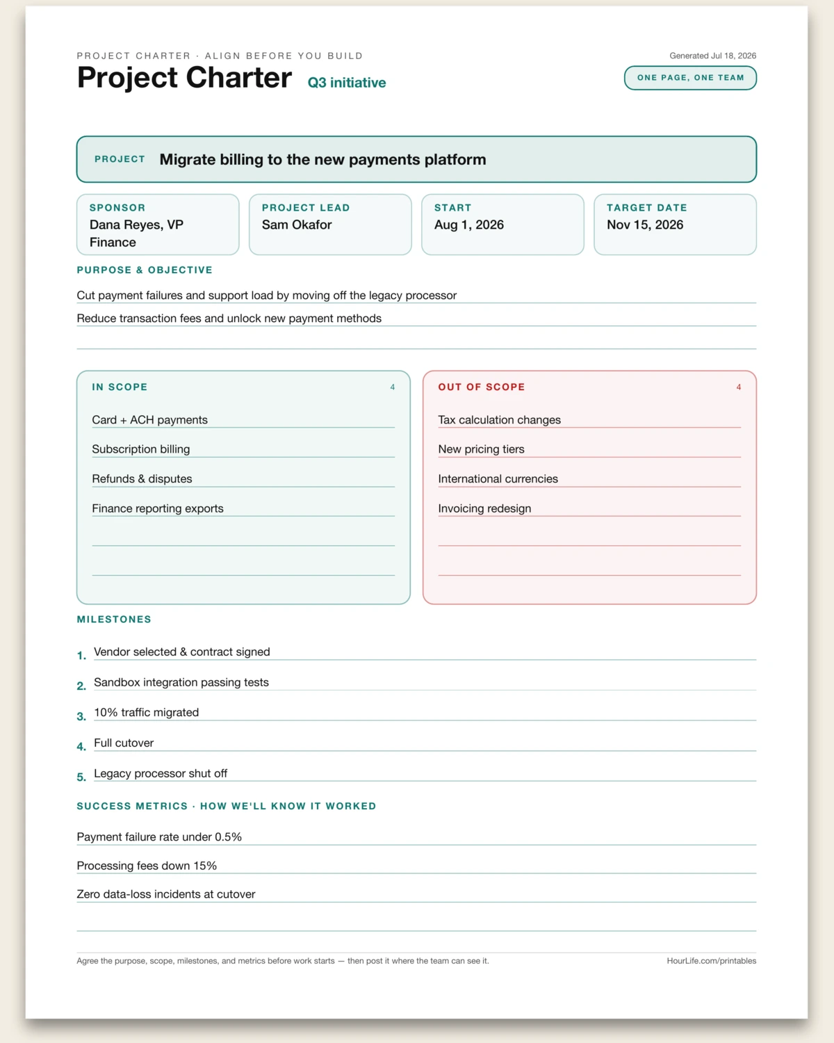
A one-page project charter — the single sheet a team agrees on before any work starts, so everyone shares the same picture of what this project is and isn't. It captures the project name, a metadata row (sponsor, project lead, start, and target date), the Purpose & Objective (why it's worth doing), what's In Scope and — just as important — explicitly Out of Scope, the Milestones that give the plan a spine, and the Success Metrics that say how you'll know it worked. Naming the out-of-scope items up front is what prevents scope creep later. Fill it collaboratively at kickoff, get sign-off, and post it where the team can see it. Print it blank to draft on a whiteboard.
Best for
Kicking off a project with shared agreement on purpose, scope, milestones, and success metrics before work begins.
Landscape · 1 page
RAID Log
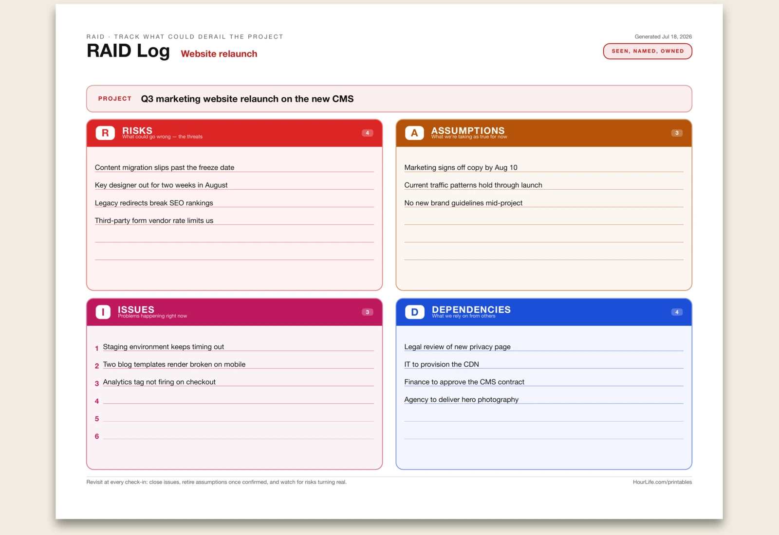
A one-page RAID log — the running list every project manager keeps of the four things that can quietly derail a project. RAID stands for the four colour-coded quadrants you fill in: Risks (what could go wrong and hasn't yet), Assumptions (what you're taking as true for now, and would have to rethink if it turned out false), Issues (problems happening right now that need action), and Dependencies (what you rely on from other people or teams to succeed). The point is to say each one out loud so it gets an owner instead of being forgotten — a risk that's named can be watched, and an assumption that's written down can be checked. The Issues quadrant is numbered so you can work it down like a to-do list. Bring it to every status check-in: close the issues you've resolved, retire assumptions once you've confirmed them, and keep an eye on which risks are turning real. Print it blank to run the exercise with your team on a wall.
Best for
Tracking the risks, assumptions, issues, and dependencies on a project in one view, and reviewing them at every check-in.
Landscape · 1 page
Plus, Minus, Interesting
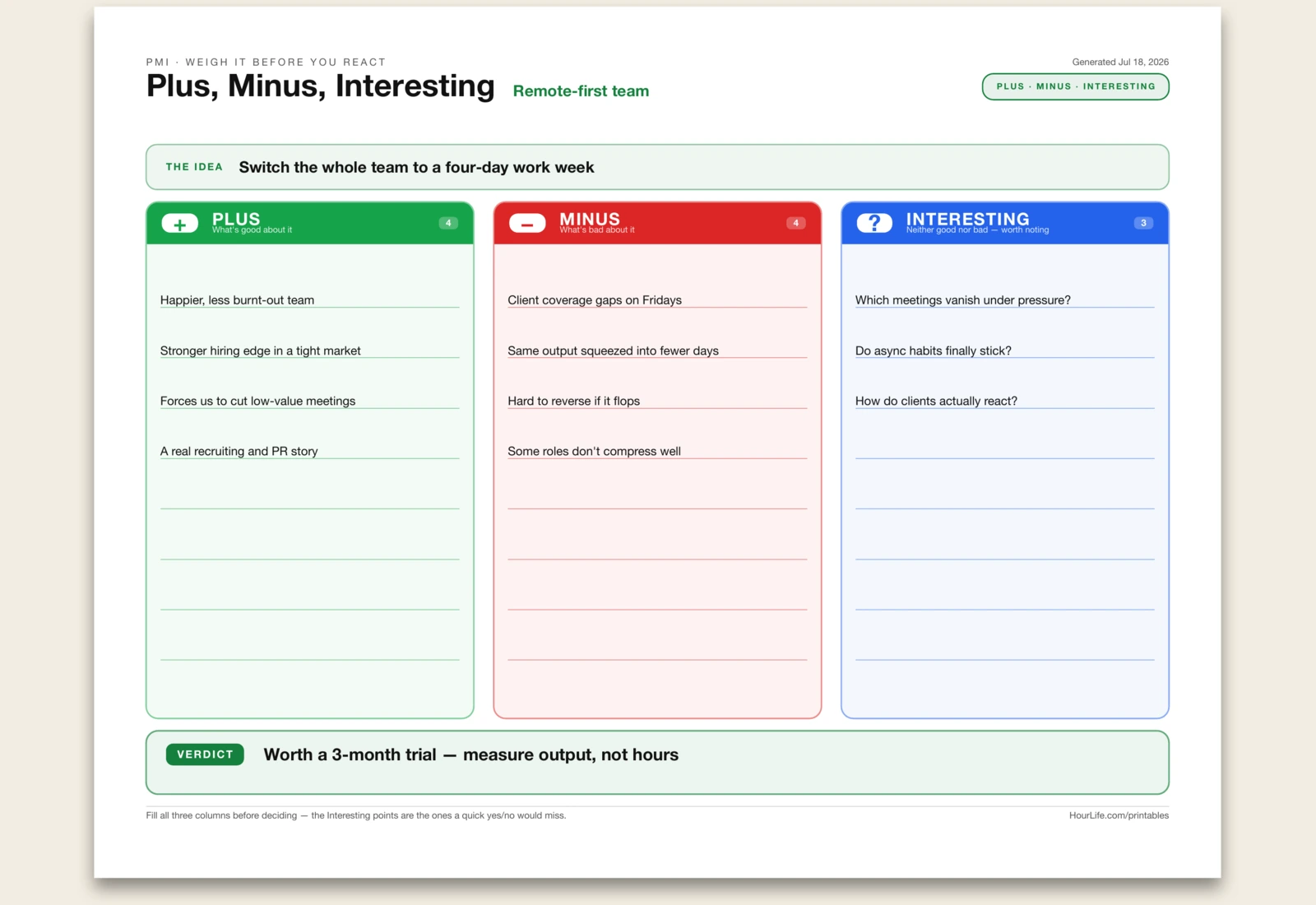
A one-page PMI sheet — Edward de Bono's simple tool for looking at an idea on purpose instead of reacting to it with a gut yes or no. You name the idea, then fill three colour-coded columns: Plus (what's good about it), Minus (what's bad about it), and Interesting (the points that are neither good nor bad but worth noting — the questions and side-effects a quick decision would miss). Forcing yourself to write the Interesting column is the whole trick: it pulls your attention past your first reaction and surfaces what you'd otherwise overlook. When all three are full, you write a one-line Verdict at the bottom — yes, no, or maybe, and why. Use it for any decision where you catch yourself deciding too fast, or run it with a group to get every angle on the table. Print it blank to think it through by hand.
Best for
Weighing a decision or idea deliberately — its upsides, downsides, and the notable points in between — before making the call.
Portrait · 1 page
1-3-5 Daily Plan
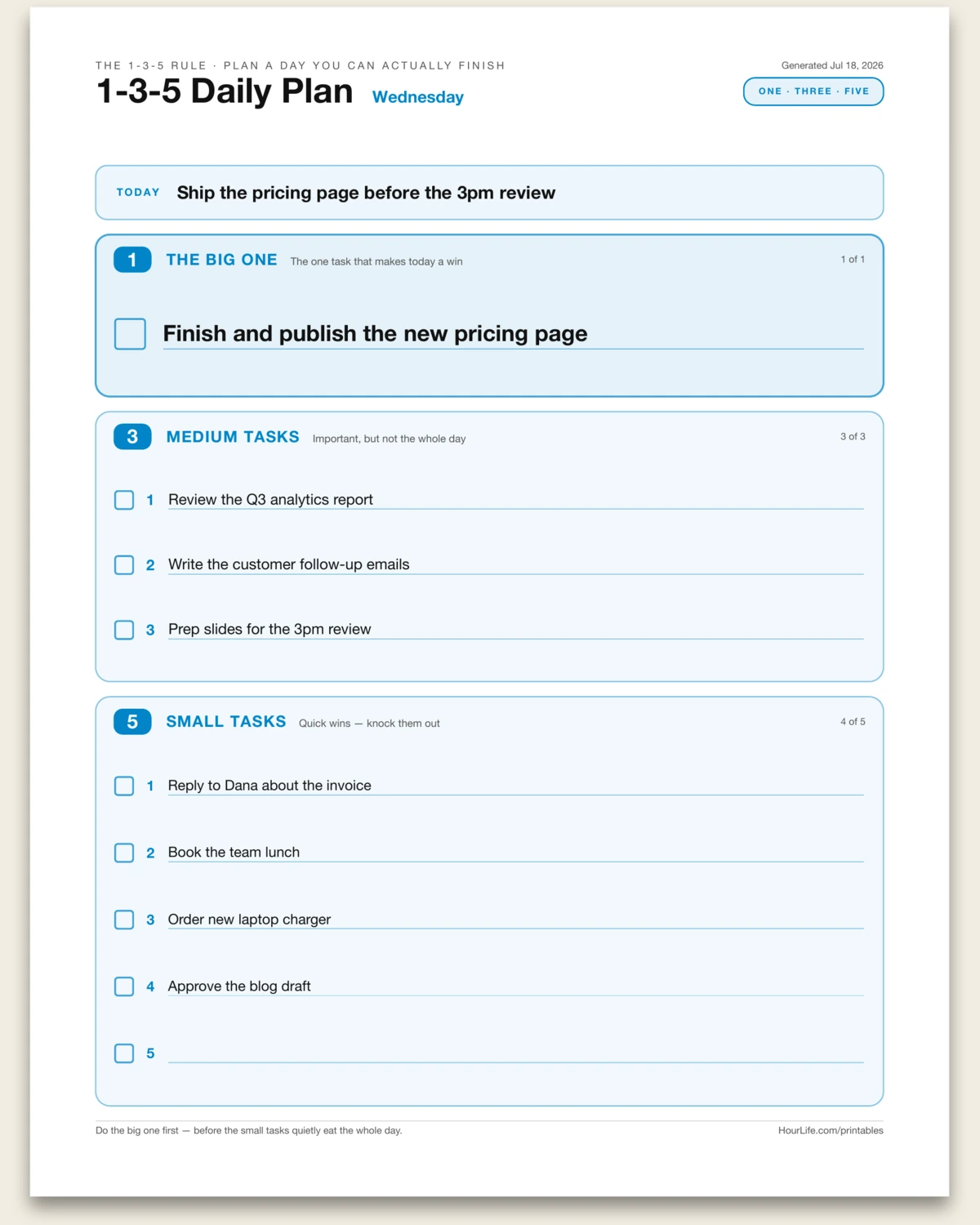
A one-page daily plan built on the 1-3-5 rule — a simple cure for the endless to-do list that never gets done. Instead of writing twenty things and finishing five, you commit to nine: one big task that would make the day a win, three medium tasks that genuinely matter, and five small ones to clear out. Naming a single big task up front is the whole point — it's the thing you protect your morning for and do before the small stuff quietly eats the day. Write a one-line focus for the day at the top, fill the three tiers with a checkbox beside each task, and work top to bottom. Nine items is about all a real day holds, which is exactly why the limit helps. Print it fresh each morning, or run it blank as a repeating daily template.
Best for
Planning a realistic day around one big priority instead of an overwhelming, never-finished to-do list.
Portrait · 1 page
Problem Tree
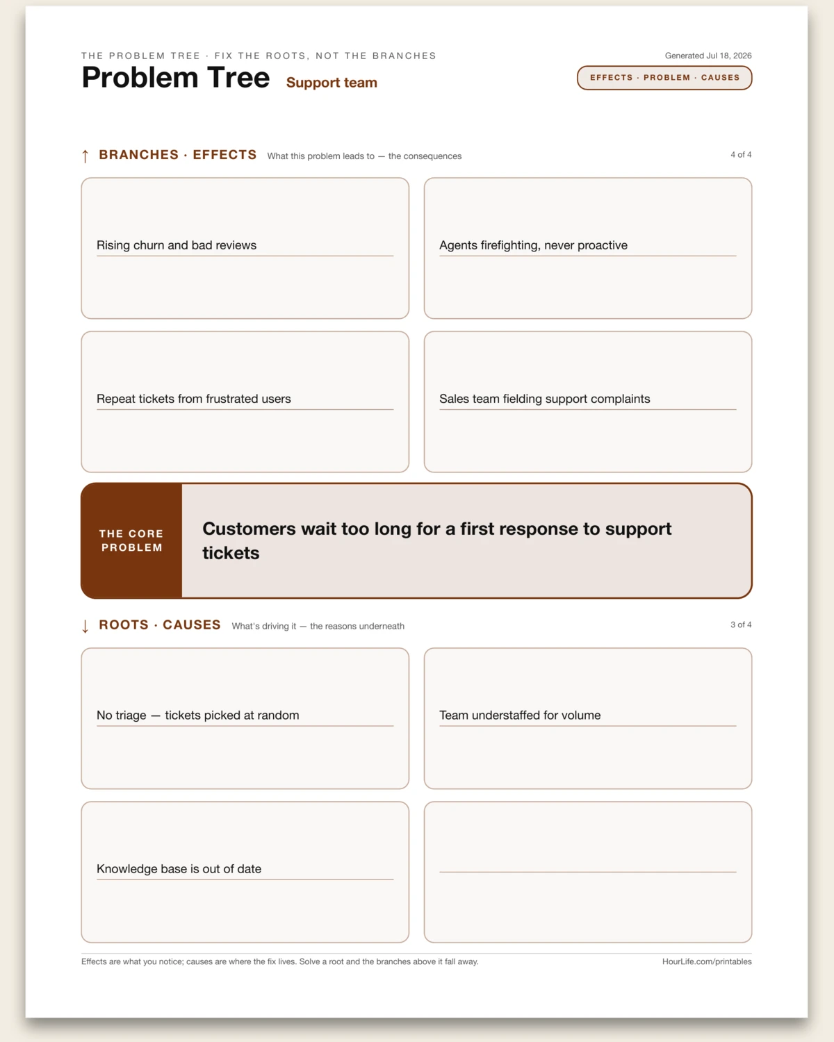
A one-page Problem Tree — the analysis tool that pulls a messy problem apart into its causes and its effects so you stop treating symptoms. You write the core problem as the trunk, then trace upward into the branches (the effects it leads to) and dig downward into the roots (the causes driving it). Laying it out this way makes an important distinction obvious: the effects are what everyone notices and complains about, but the leverage is almost always down in the roots. Fix a root cause and the branches above it wither on their own; patch a branch and the problem grows back. Use it before jumping to solutions on any recurring problem — a team bottleneck, a product complaint, a personal habit that won't stick — and pair it with a few rounds of 'why?' to get past the first, shallow causes. Print it blank to map a problem out by hand.
Best for
Separating a recurring problem from its root causes and its effects, so you fix what's driving it instead of the symptoms.
Portrait · 1 page
Trade-Off Triangle
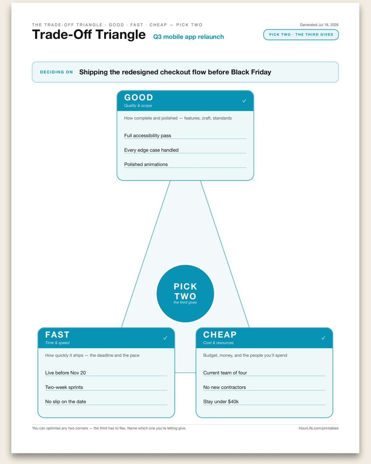
A one-page Trade-Off Triangle — the project-management law that no plan escapes: good, fast, cheap, pick two. The three constraints sit at the corners of a triangle and pull against each other. GOOD is quality and scope: how complete and polished the thing is. FAST is time: how quickly it ships. CHEAP is cost: the money and people you'll spend. You can optimise any two of them, but the third always has to give — want it good and fast, it won't be cheap; good and cheap, it won't be fast; fast and cheap, it won't be good. The trap is pretending you can have all three, then discovering which corner quietly gave way after it's too late. You name the project or decision you're weighing at the top, spell out what each corner means for it in concrete terms, then make the honest call: which two are you holding fixed, and which one are you consciously letting flex? Doing it on purpose beats finding out by accident. Use it when scoping a project, negotiating a deadline, pushing back on an impossible ask, or aligning a team on what actually matters most. Print it blank to work a trade-off out by hand.
Best for
Making the good-fast-cheap trade-off explicit — naming which two corners of a project you're holding fixed and which one you'll let give.
Portrait · 1 page
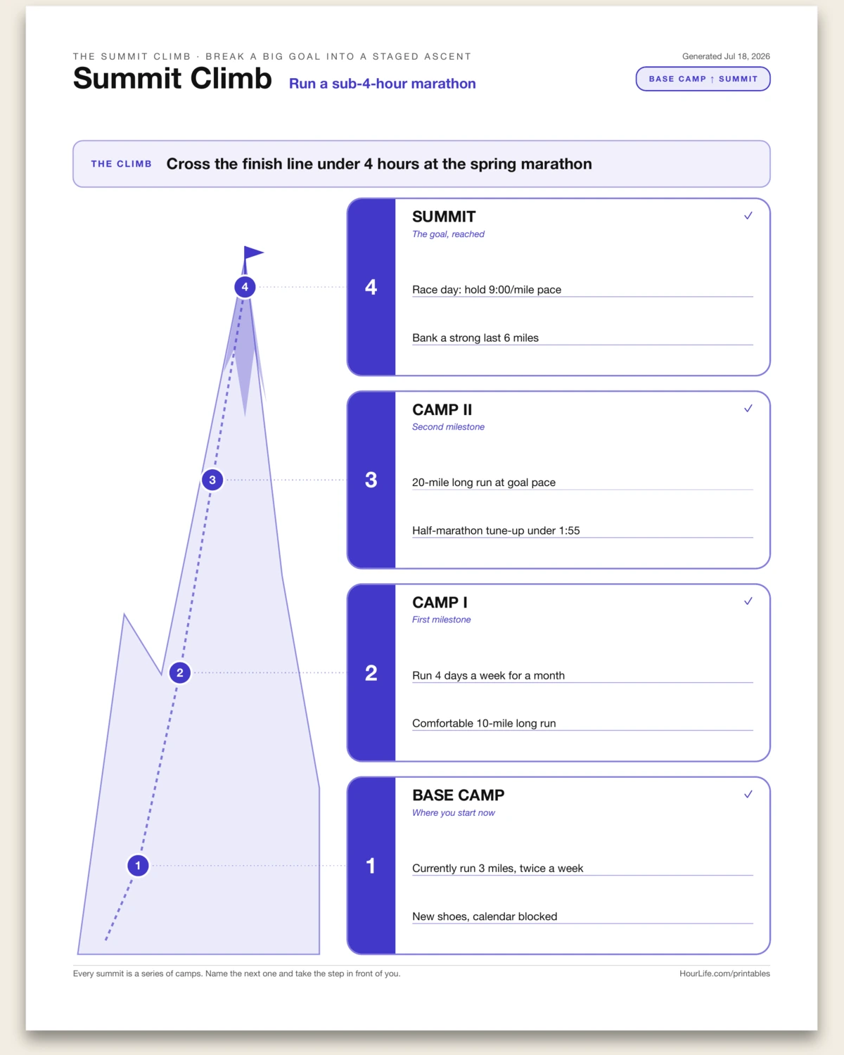
Summit Climb
A one-page Summit Climb — a way to turn a big, daunting goal into a staged ascent you can actually start. Stare at a huge goal all at once and it reads as one impossible leap; break the route into camps and it becomes a series of reachable next steps. You name the goal as the summit, then plot the climb up a mountain trail: Base Camp is where you're standing right now — your current fitness, savings, skill, or starting reality. Camp I and Camp II are the milestones along the way, the intermediate wins that prove you're gaining altitude. The Summit is the goal reached, described concretely enough that you'll know when you've arrived. Laying it out as a climb does two useful things: it makes the size of the gap honest, and it points you at the one thing that matters today — the next camp, not the peak. Climbers don't summit by staring at the top; they move from camp to camp. Use it when a goal feels too big to begin, when you need to sequence a project, or when motivation dips and you need to see how far you've already come. Print it blank to sketch a climb by hand.
Best for
Breaking a big goal into a staged climb — base camp, two milestones, and the summit — so the next step is always clear.
Landscape · 1 page
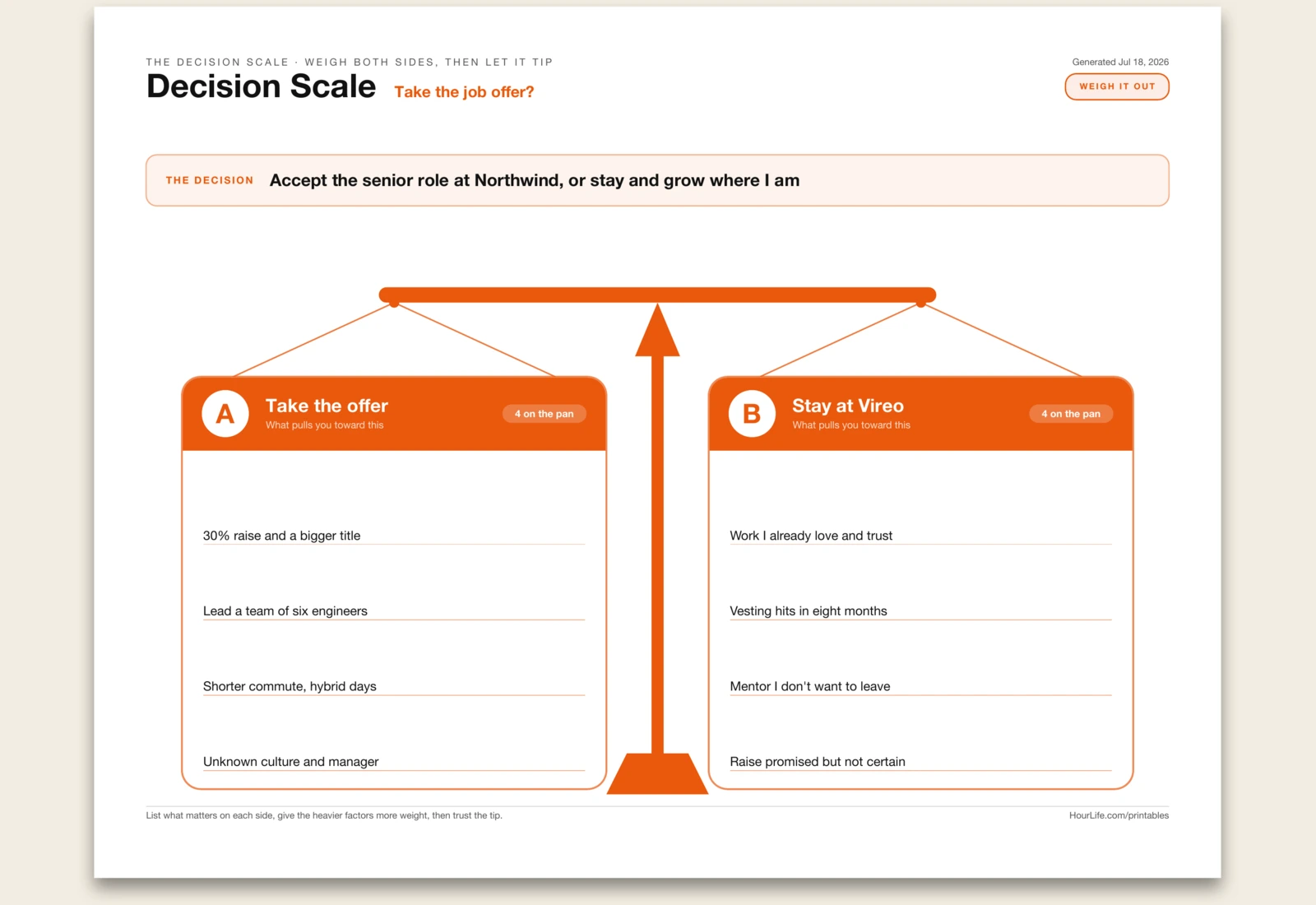
Decision Scale
A one-page Decision Scale — a way to weigh a two-sided decision on a balance beam instead of turning it over and over in your head. When you're stuck between two options, the arguments pile up unevenly: the loud, recent, or emotional ones crowd out the quieter ones that matter more, and you keep re-litigating the same case with no way to see the whole thing at once. This sheet lays the choice out as a physical scale. You name the decision in a single line, label the two options as Pan A and Pan B, and list up to four factors on each pan — the things that genuinely pull you toward that side. Seeing both pans side by side does two things at once: it forces you to actually generate reasons for the option you're leaning against (so you're comparing, not just justifying), and it lets you weigh factors by importance rather than by count — three heavy reasons can outweigh five light ones. The beam is drawn level on purpose. The sheet doesn't decide for you; it makes the trade honest and lets you feel which way it tips. Use it for a job offer, a move, a big purchase, a relationship call, or any fork where a simple pro-and-con list feels too flat. Print it blank to weigh a decision by hand.
Best for
Weighing a two-sided decision — the factors pulling toward each option laid on a balance scale so you can see which way it tips.
Portrait · 1 page
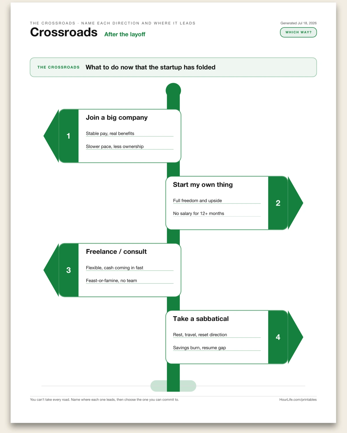
Crossroads
A one-page Crossroads signpost — a way to lay out a fork with several possible directions instead of circling the same two-or-three options in your head. When you're facing a real decision with more than a simple yes-or-no — a career move, where to live, what to do after a big change — the options tend to blur together, and the loud one crowds out the rest. This sheet draws the decision as a signpost. You name the crossroads you're standing at in a single line, then post up to four directions, each an arrow-plank on the pole with a path name and a line or two on where it leads or what it costs. Laying the roads out side by side does two useful things: it forces you to actually name the options you're leaning against, so you're choosing rather than defaulting, and it turns a vague 'what should I do' into a concrete set of destinations you can weigh against each other. The signpost doesn't choose for you — but you can't commit to a road until you've seen where each one goes. Use it for a career fork, a relocation, a what-next moment after a job ends or a chapter closes, or any decision with three or four live options. Print it blank to map the directions by hand.
Best for
Mapping a fork with several directions — each possible path posted on a signpost with where it leads — so you can choose the one road to commit to.
Landscape · 1 page
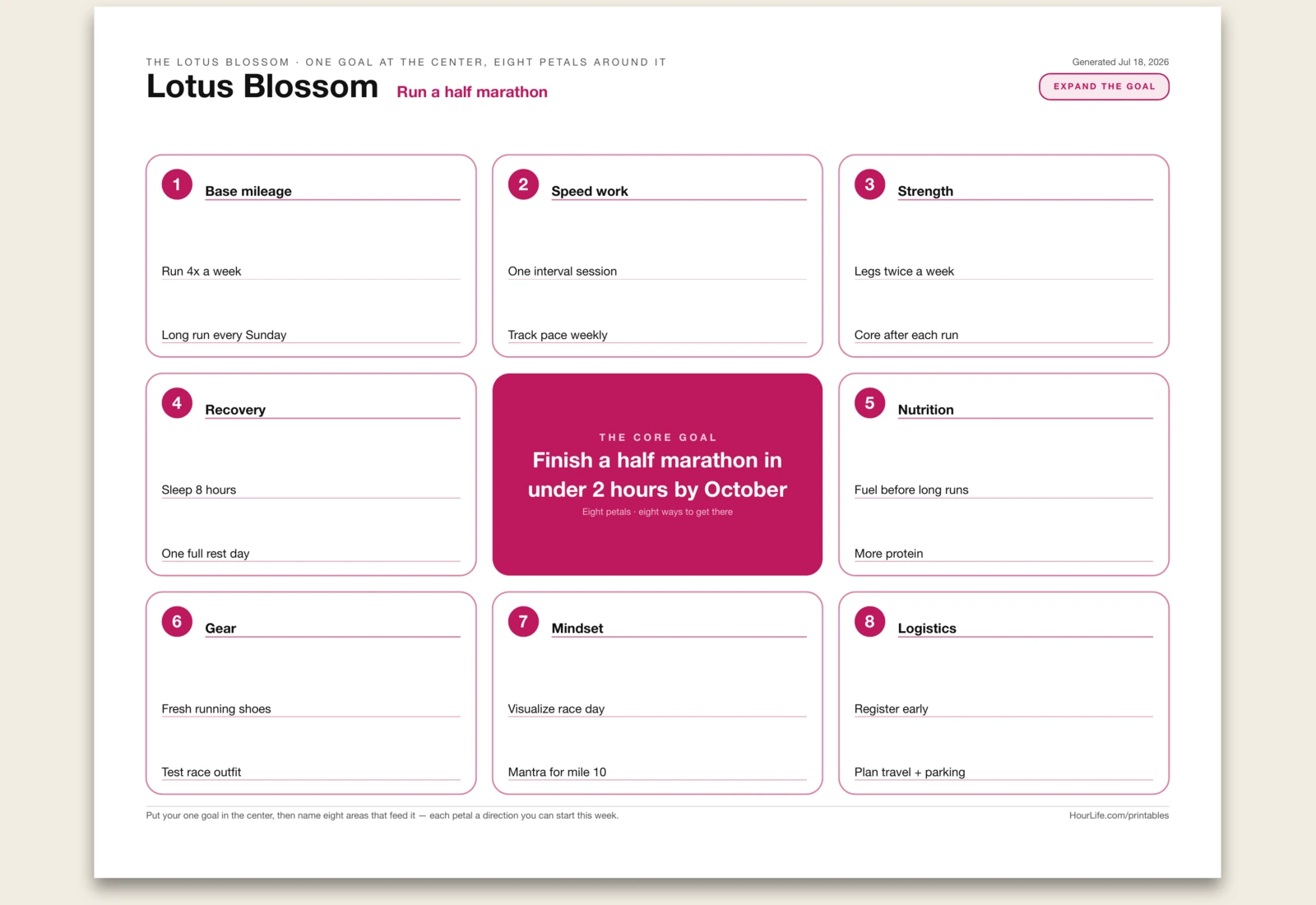
Lotus Blossom
A one-page Lotus Blossom — the mandala chart made famous by Shohei Ohtani's high-school goal sheet — for cracking one big goal open into eight concrete directions. A goal like 'get in shape' or 'grow the business' stalls because it stays a single vague sentence with nowhere obvious to push. This sheet draws it as a 3x3 grid: your one core goal sits in the center cell, and the eight petals around it are the areas that feed it — training, recovery, money, mindset, whatever your particular goal actually needs. Each petal takes a short theme line and a couple of supporting moves, so the aim fans out from one intimidating target into eight smaller directions you can start on. Two things make it work. First, being forced to name eight supporting areas stops you from over-focusing on the one obvious lever and ignoring the rest — the goal gets support from every side. Second, once each petal holds a real move or two, 'get in shape' becomes a page of things you could do this week, and you just pick the petal to begin with. Use it for a fitness goal, a business or career target, a skill you're building, a habit overhaul, or any single aim big enough that it needs breaking down. Print it blank to fill the center and petals in by hand.
Best for
Breaking one big goal into eight supporting areas — a core aim in the center, eight petals of concrete moves around it — so a vague target becomes a page of things you can start.
Landscape · 1 page
Venn Diagram
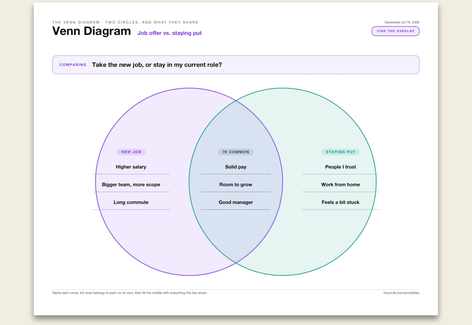
A one-page Venn Diagram — two overlapping circles for comparing any two things and, more usefully, finding what they share. Set two things side by side — two job offers, two cities, two people's needs, two ideas, this year against last — and it's easy to list how each stands on its own. The overlap is the part that's hard to hold in your head and usually the most valuable: the common ground, the points of agreement, the shared requirements you can build on. This sheet gives you a clean two-circle Venn with three regions to fill. You name each circle (the left thing and the right thing), list up to three lines of what belongs to each one alone, then fill the lens in the middle with everything the two have in common. Two things make it worth drawing rather than just listing. Forcing yourself to place each point in a region — left only, right only, or shared — makes you decide what's actually distinctive versus what only feels that way. And seeing the overlap fill in reframes the comparison: instead of two rival columns, you get a shared core plus two sets of trade-offs, which is usually a calmer, clearer basis for a decision or a conversation. Use it for weighing two options, comparing two roles or tools, finding common ground in a disagreement, teaching compare-and-contrast, or mapping where two goals reinforce each other. Print it blank to fill the circles by hand.
Best for
Comparing two things and finding their common ground — what belongs to each on its own, and what they share in the overlap — for a decision, a conversation, or a compare-and-contrast.
Landscape · 1 page
The Tier List
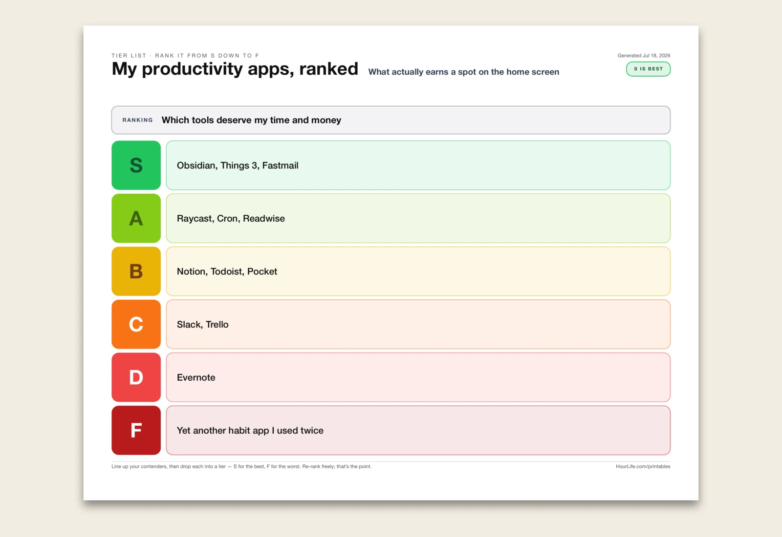
A one-page tier list — the S/A/B/C/D/F ranking gamers use, turned into a decision tool. Faced with a pile of things that all feel important, a flat list is useless: everything looks equal and nothing gets cut. A tier list forces the opposite. Six coloured bands run down the page, from a green S tier for the genuinely elite down through A, B, C and D to a red F tier for what should be dropped, and every contender has to land in exactly one. That constraint is the whole point — 'pretty good' isn't a tier, so you're made to decide whether something is truly best-in-class or merely fine, and the act of sorting surfaces judgements you'd otherwise leave vague. Rank the tools competing for your home screen, the subscriptions draining your card, the habits worth keeping, the goals for the quarter, the features on a roadmap, the books on your shelf — anything where you have too many options and too little honesty about which ones actually earn their place. The finished sheet reads at a glance: what's in S gets your time and money, what fell to D and F is a permission slip to quit. Print it blank to write your own contenders and rank them by hand, or fill it in and pin it up as a decision you've committed to.
Best for
Ranking a messy pile of options into S-down-to-F tiers so the best rise and the rest get cut.
Landscape · 1 page
The Flow Map
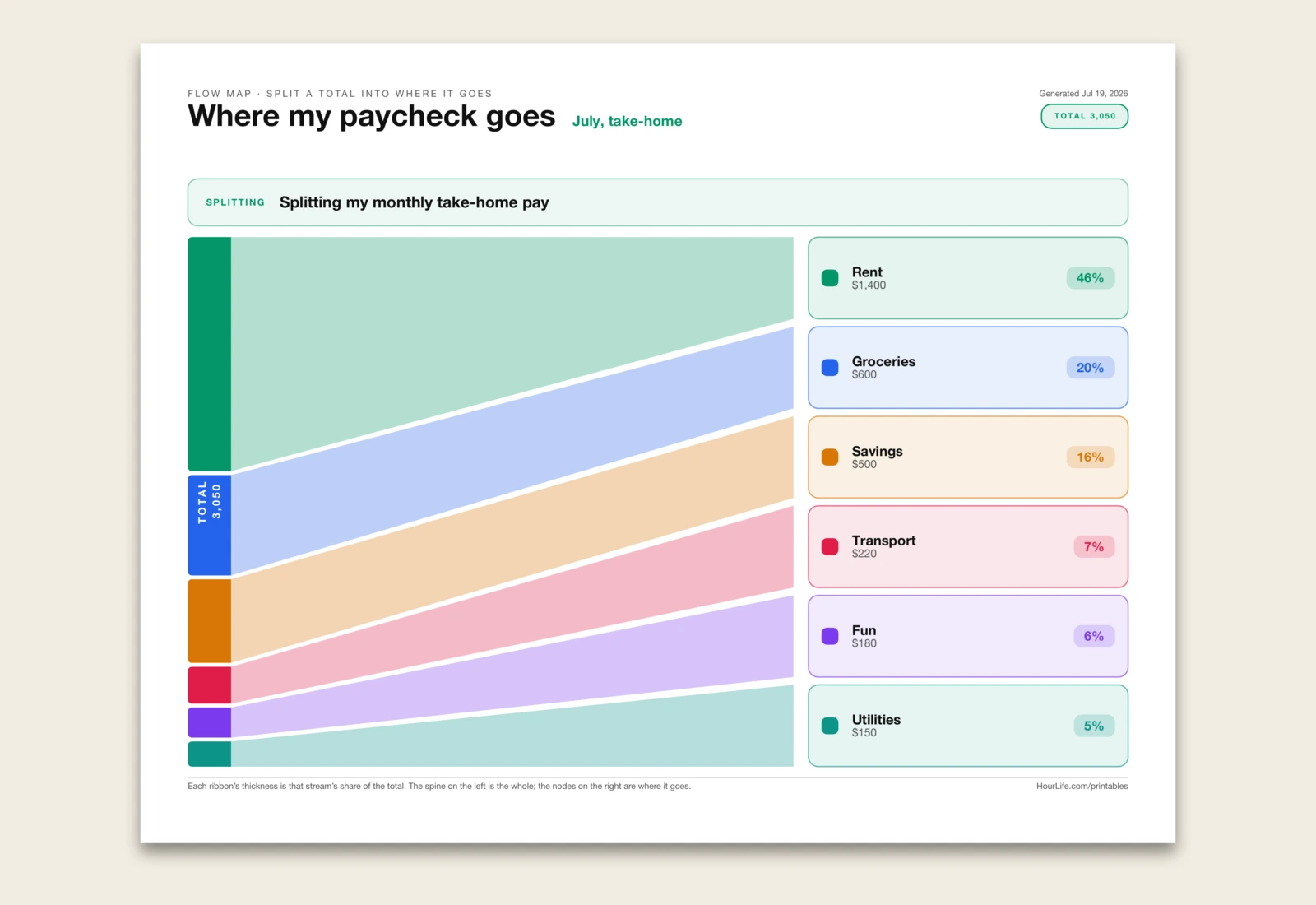
A one-page flow map — a simplified Sankey diagram — that takes one total and splits it into proportional streams so you can see, in a single picture, exactly where it all goes. A column of numbers is easy to skim past; a flow is not. Give it a whole — a paycheck, a 40-hour week, a project budget, your monthly spending, even your energy — then list where it goes, one line each with an amount. The total leaves a source spine on the left and fans out into ribbons, one per stream, each drawn as thick as its true share of the whole. The rent that swallows half your take-home looks like half the page; the small, forgettable leaks look small. Every ribbon lands on a labelled node showing its amount and its percentage, so the proportions are honest and impossible to argue with. Use it to map a budget and find the fat categories, to see how your working week really divides between deep work and everything else, to break a project's hours or dollars across workstreams, or to show a household where the money actually lands. Add the amounts and the flow is drawn for you, sized and labelled automatically.
Best for
Splitting one total — a budget, a week, a project — into proportional streams so you can see where it all goes at a glance.
Landscape · 1 page
The Risk Matrix
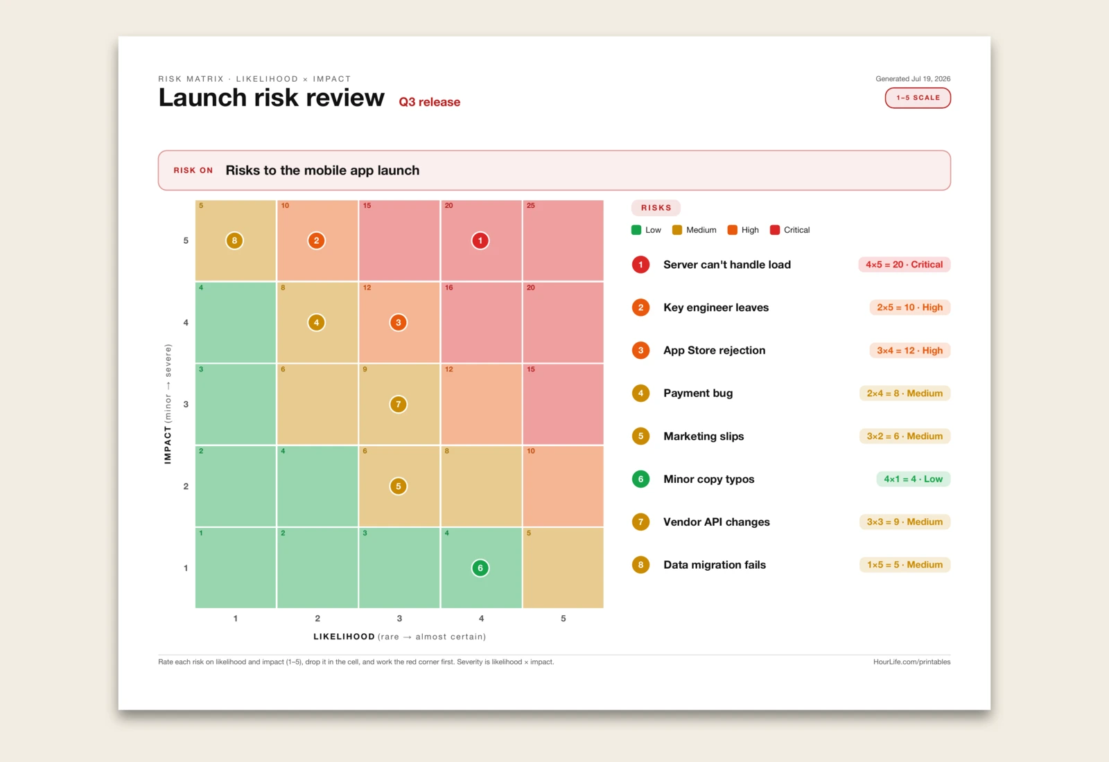
A one-page risk matrix — the probability-versus-impact heatmap every project manager reaches for — that turns a list of worries into a picture you can act on. Name what you're assessing, then list what could go wrong and rate each risk twice: how likely it is and how bad it would be, both on a 1–5 scale. Each risk drops onto a five-by-five grid as a numbered dot, and every cell is shaded by its severity — likelihood times impact — from calm green in the safe corner to alarm red in the critical one. The colour does the triage for you: the risks that land top-right can sink the whole thing and earn your attention first, while the green-corner worries can wait. A flat list treats every risk as equal and buries the real threats among the trivial ones; laid out on the grid, the dangerous few are impossible to miss, and a legend down the side maps every number back to its name, its score, and its band (Low, Medium, High, Critical). Use it for a launch or project risk review, a trip or event plan, a decision you're pressure-testing, a security or safety assessment, or any premortem where you want to see the threats before they arrive. Rate each risk and it's plotted and colour-coded for you; leave the ratings off to print the blank heatmap and place the dots by hand with your team.
Best for
Rating risks on likelihood and impact and seeing which few are severe enough to tackle first, colour-coded on a 5×5 heatmap.
Landscape · 1 page
The Waterfall Chart
A one-page waterfall chart — the bridge chart accountants and analysts reach for — that shows how a running figure climbs and falls from zero to where it lands. List the steps in order and sign each amount: a plus climbs, a minus drops. Each bar floats at the running total, starting exactly where the last one ended, so you see the story of the number rather than just its final value — the income that lifted it, the rent that took it back down, the small leaks that added up. Green bars climb and red bars drop, so the colour reads the trend for you, and dashed connectors carry your eye from each step to the next. A solid slate bar at the end, anchored to the baseline, marks where you landed, and it handles a total that dips below zero — the bridge simply crosses under the line. A single 'you have $4,380 left' hides how you got there; laid out as a bridge, every gain and every drain is visible in one glance, which makes it far easier to see where the money, the hours, or the headcount actually went. Use it for a monthly cash bridge, a revenue-to-profit walk, a budget variance, a day's 24 hours, a headcount change, or any before-and-after where the steps in between are the whole point. Type signed amounts and the bars stack and colour themselves with a closing total; leave them off to print the empty axis and sketch the bridge by hand.
Best for
Walking a running total from a starting figure through signed ups and downs to a final total — a cash bridge, profit walk, or budget variance — as floating green/red bars.
Landscape · 1 page
The Treemap
A one-page treemap that turns a list of parts into a single rectangle carved into tiles, each sized to its share of the total — so the thing that eats most of your budget, your day, or your disk is simply the biggest box on the page, impossible to argue with. A column of numbers makes you do the maths in your head to see what dominates; the treemap does it for you, laying the parts out largest-first and shading the big ones deeper so your eye lands on them first. Unlike a pie chart it stays readable with many parts and never collapses the small ones into an unlabelled sliver — every tile keeps its name, its value and its percentage right inside it. A squarified layout keeps the tiles close to square rather than thin strips, which is what makes them easy to compare at a glance, and a thin white gutter separates them so the boundaries stay crisp even when printed. Use it for a monthly budget by category, where your 24 hours actually go, a project's effort by workstream, storage by folder, an investment portfolio by holding, headcount by team, or website traffic by source — any whole you want to break into parts and rank by size in one picture. List the parts with a value each and the tiles size, pack, shade and label themselves; leave them blank to print an empty frame and block it out by hand.
Best for
Breaking a whole into parts and ranking them by size in one picture — a budget by category, a day's hours, effort by workstream, storage by folder — as tiles sized to each share.
Landscape · 1 page
The Parallel Coordinates Chart
A one-page parallel coordinates chart for comparing several options across several scored dimensions without collapsing everything into one average. Each dimension becomes a vertical axis from 0 to 10. Each option becomes one coloured line that crosses every axis at its score. The shape of the line is the point: flat, high lines show balanced strength; jagged lines show tradeoffs; crossings show where one option overtakes another depending on which dimension you care about. Unlike a radar chart, the axes are laid out as a horizontal sequence so crossings and reversals stay readable when several options are compared; unlike a slopegraph, it handles more than two dimensions. Use it for vendor shortlists, product ideas, hiring candidates, feature prioritisation, project health, team capabilities, habit plans, book choices, or any decision where a single score hides the actual profile. Name two to six axes, list each item with its scores, and the multi-axis profile draws itself. Leave it blank to print bare axes and score the options by hand.
Best for
Comparing options across multiple scored dimensions — vendors, product ideas, candidates, features, project health, team capabilities, habit plans, or book choices.
Landscape · 1 page
The Bubble Chart
A one-page bubble chart that plots each item on two measures at once — effort against impact, cost against value, price against quality, reach against risk — and scales each bubble by an optional third number, so three variables read from a single picture. Both axes fit themselves to your data, so any pair of measures works without you setting a scale; a faint cross splits the plane into four quadrants so the priority read pops out — low effort and high impact lands in one corner, and the winners are obvious at a glance. It beats a table because position does the ranking for you: you don't compare rows of numbers, you compare places on a map, and the eye sorts them instantly. Each bubble carries its own label, the size dimension carries a third value like reach or budget or head count so bigger bets literally look bigger, and the axes label their own extremes so you keep the scale. It works best when both measures are numeric and roughly continuous — a score, a count, a price, a week count. Use it for a feature or project prioritization, an effort-versus-impact backlog, a risk-versus-reward portfolio, a cost-versus-value shortlist, a market or competitor map, a customer segment plot, a price-versus-quality comparison, or any set you sized on two numbers and want to weigh at a glance. List a label, an x and a y — plus an optional size — per line and the bubbles, axes and quadrants draw themselves; leave it blank to print the empty plane and plot it by hand.
Best for
Plotting a set of items on two measures at once — effort vs impact, cost vs value, risk vs reward — with an optional third number sizing each bubble, so priorities read as places on a map.
Landscape · 1 page
Force Field Analysis
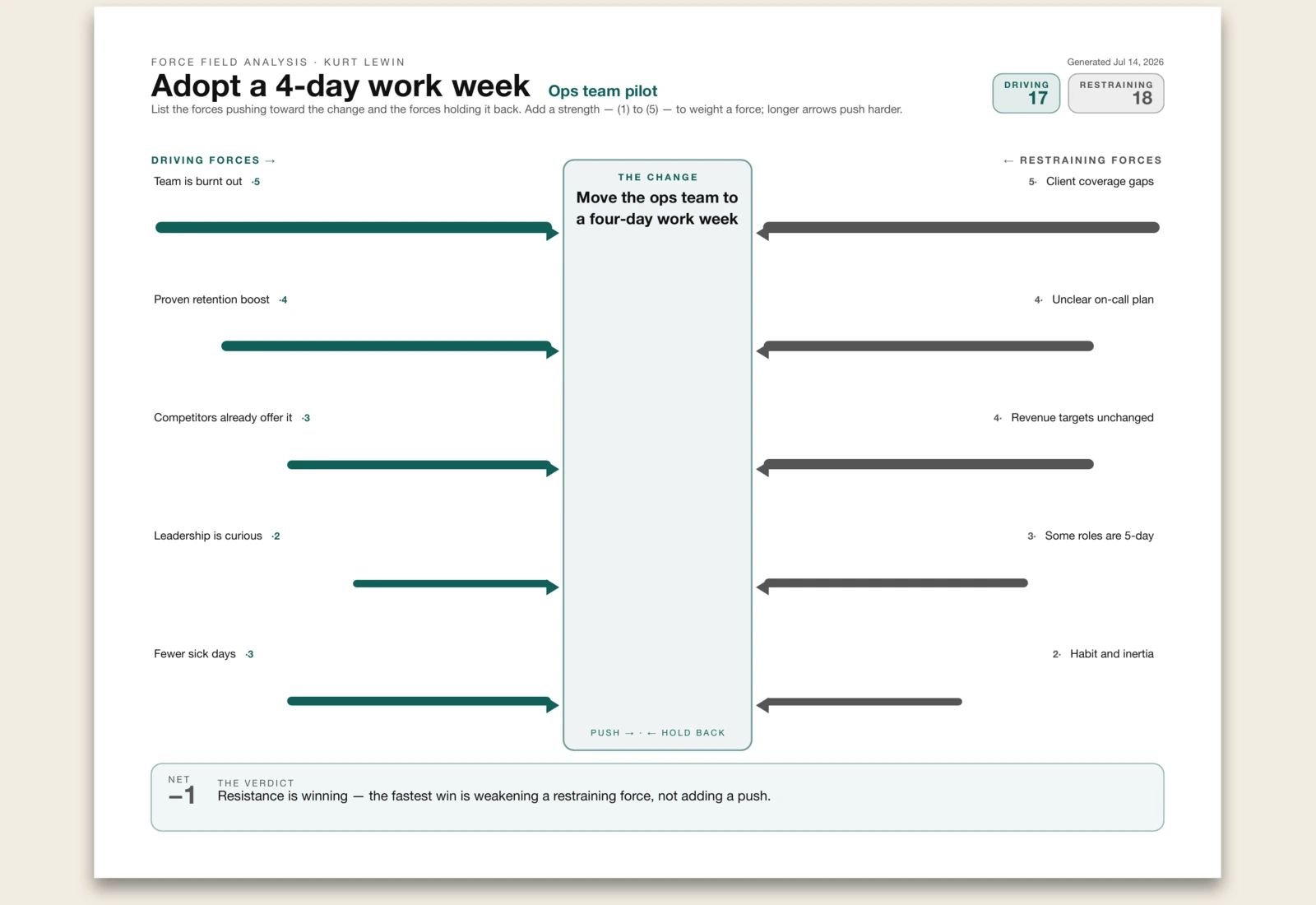
A one-page decision tool drawn as Kurt Lewin's force field — opposing arrows meeting at a central change. Name the change you're weighing, then list the driving forces pushing toward it and the restraining forces holding it back, one per line. Add a strength of (1) to (5) to any force and its arrow draws longer; the two totals settle into a verdict. Lewin's insight still holds: the fastest way to move a stuck change is to weaken what holds it back, not to push harder. Leave any line blank to map by hand.
Best for
Pressure-testing a change by weighing what's pushing for it against what's holding it back.
Portrait · 1 page
Mind Map
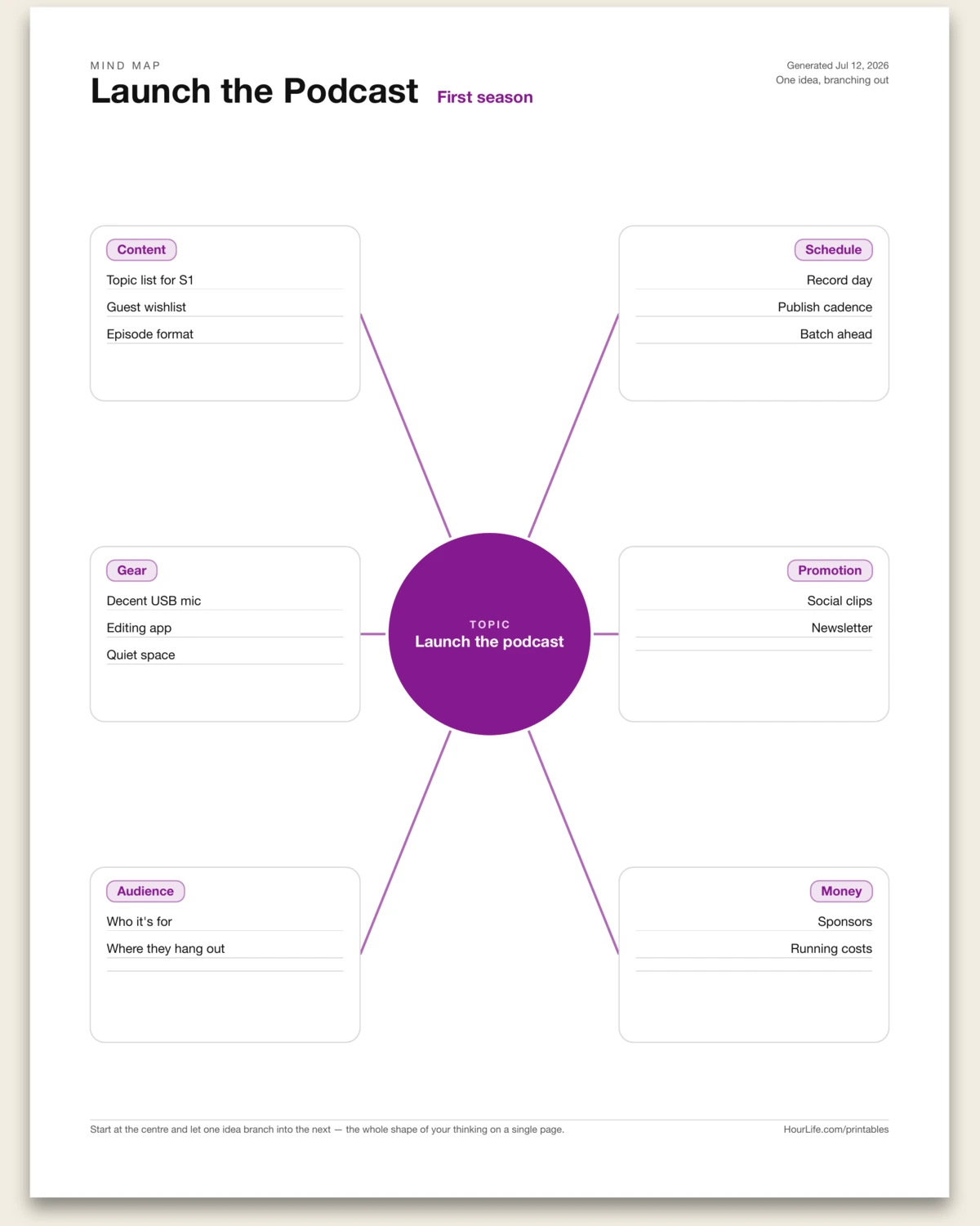
A one-page mind map: put your topic in the hub at the centre and let it branch. Name up to six branches — each with up to three sub-ideas — and they fan out around the hub on connecting lines, three down each side. Brainstorm a project, plan an essay, or break a goal into its parts. Start at the centre and let one idea branch into the next, and the whole shape of your thinking sits on a single page. Leave any node blank to fill in by hand.
Best for
Brainstorming or organising a topic when you think better in branches than in lists.
Portrait · 1 page
Decision Sheet
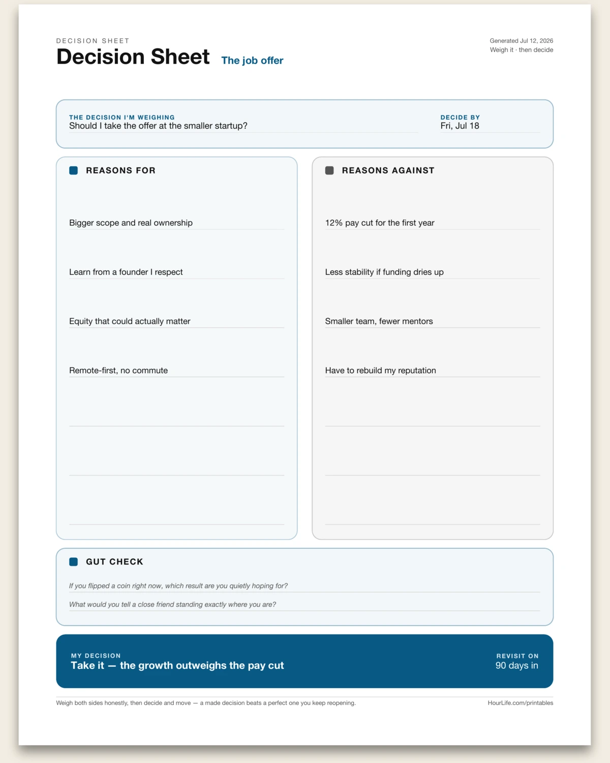
A one-page sheet for weighing a single yes-or-no decision. Frame the question and a deadline, lay the reasons for and against in two side-by-side columns, then answer two gut-check prompts before you commit. There's no scoring to tally — just honest reasoning and a decision you can point back to, with a date to revisit it. Leave lines blank to keep thinking on paper.
Best for
Talking yourself through a hard call instead of circling it in your head.
Landscape · 1 page
Recipe Card
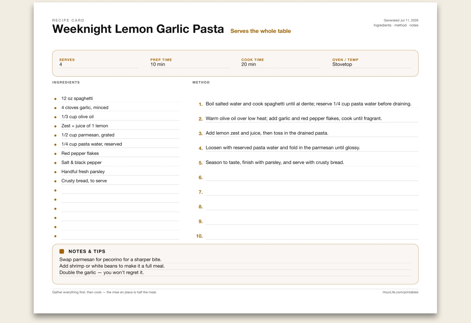
A one-page recipe card: log serves, prep, cook, and temp across the top, list ingredients as a bulleted column on the left, and write the method as auto-numbered steps on the right — with a notes band for swaps and reminders. Gather everything first, then cook. Leave anything blank to write it in by hand.
Best for
Writing up a recipe to cook from and keep in the binder.
Portrait · 1 page
Cornell Notes
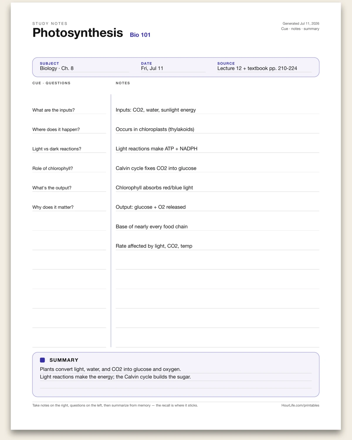
A one-page Cornell note-taking sheet: log the subject, date, and source, take notes down the wide right column, write cue questions in the narrow left column aligned to them, then synthesize the page in a three-line summary band. Take notes, ask questions, recall from memory — the recall is where it sticks. Leave anything blank to write by hand.
Best for
Taking lecture or reading notes you'll actually remember.
Landscape · 1 page
Travel Itinerary
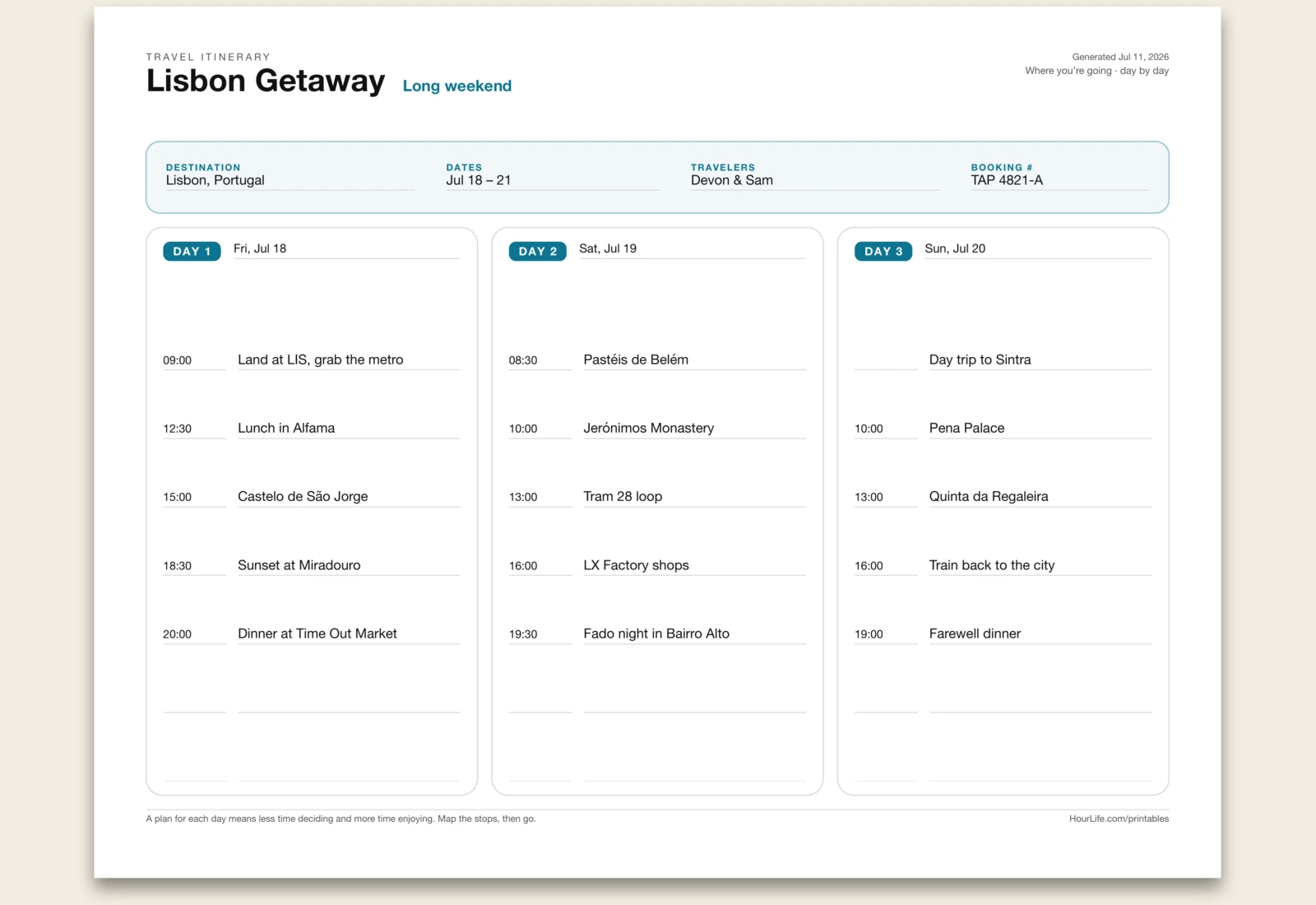
A one-page, day-by-day trip plan: log the destination, dates, travelers, and booking reference in a logistics band, then map three days of stops hour by hour — up to seven per day, entered as time and plan. A plan for each day means less time deciding on the road and more time enjoying it. Leave anything blank to fill in by hand.
Best for
Planning a trip so each day has a rhythm before you land.
Portrait · 1 page
Meeting Notes
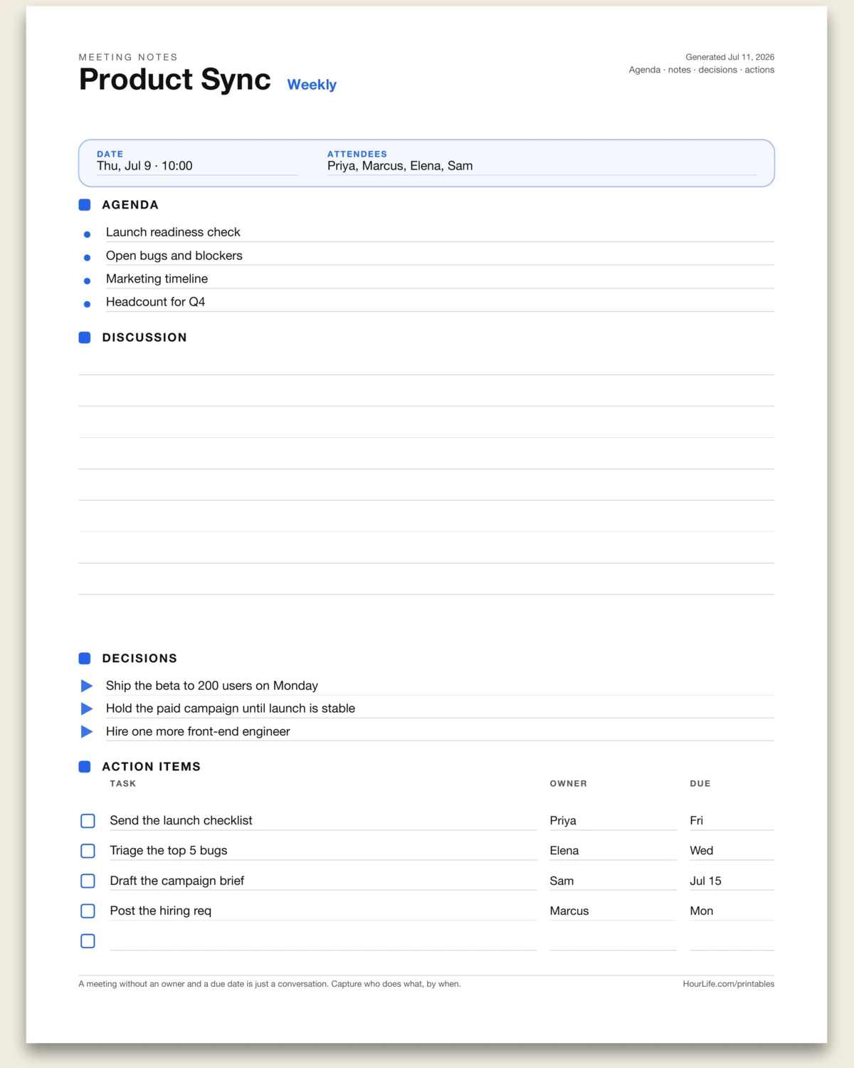
A one-page meeting or one-on-one sheet: log the date and attendees, set an agenda of up to four points, take notes in a wide ruled discussion area, record up to three decisions, then close with an action-items table — task, owner, and due date. A meeting without an owner and a due date is just a conversation. Leave anything blank to fill in by hand.
Best for
Running a meeting or one-on-one and leaving with clear owners and due dates.
Landscape · 1 page
Brain Dump
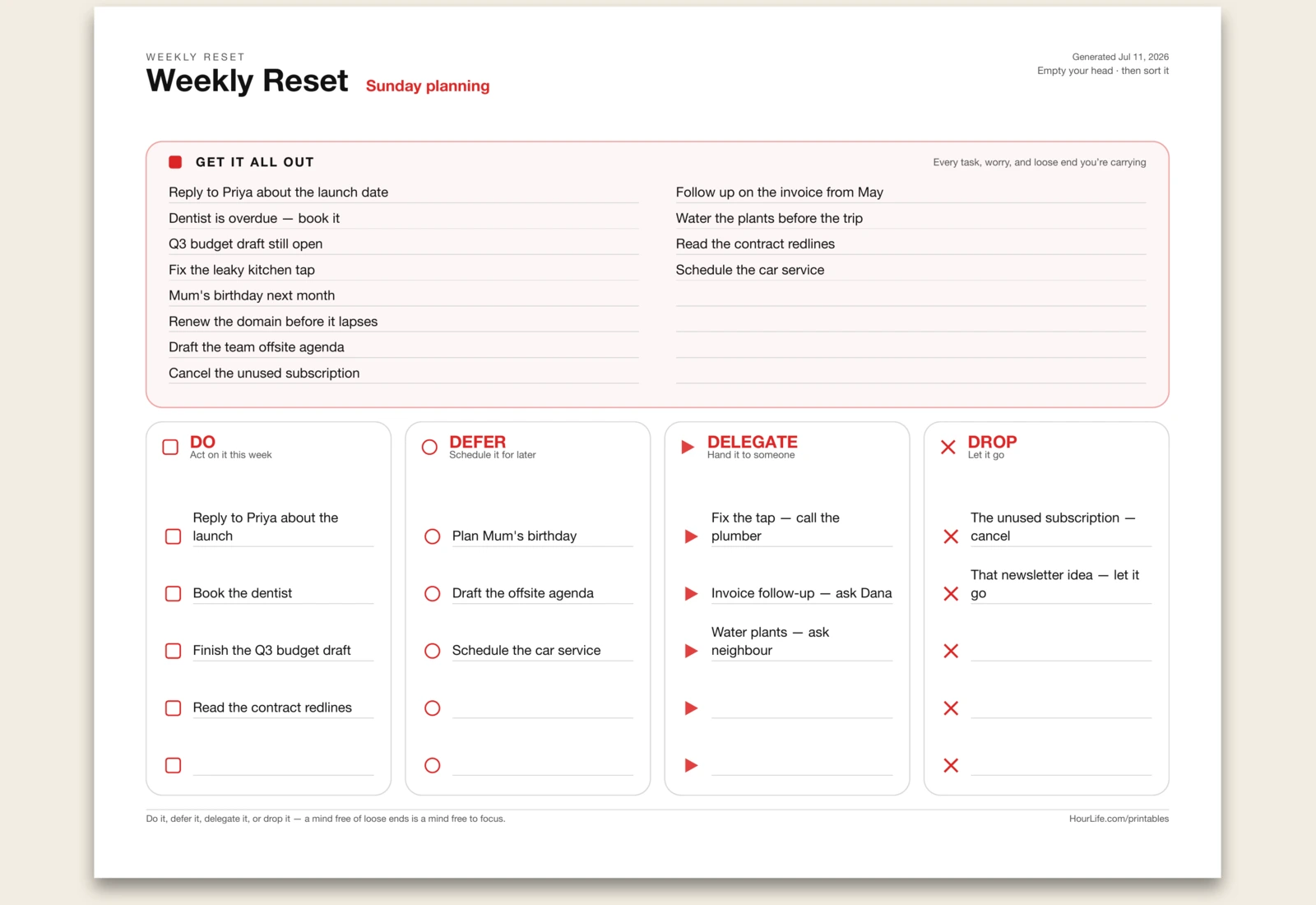
A one-page weekly reset: dump every task, worry, and loose end into one capture zone, then sort each one into the four D's — Do it this week, Defer it for later, Delegate it to someone, or Drop it. A mind free of loose ends is a mind free to focus. Leave anything blank to sort by hand.
Best for
Clearing a cluttered head and turning the pile into decisions.
Portrait · 1 page
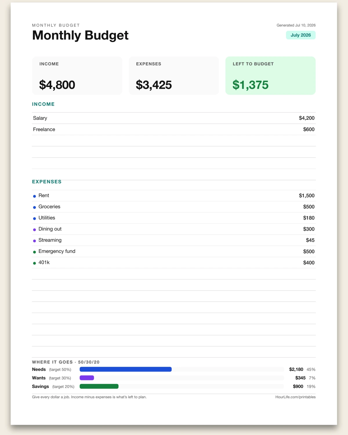
Monthly Budget
Type your income and expense lines with amounts and get a laid-out budget with computed totals, money left to plan, and a 50/30/20 breakdown when you tag lines @needs, @wants, or @savings.
Best for
Giving every dollar a job at the start of the month.
Landscape · 1 page
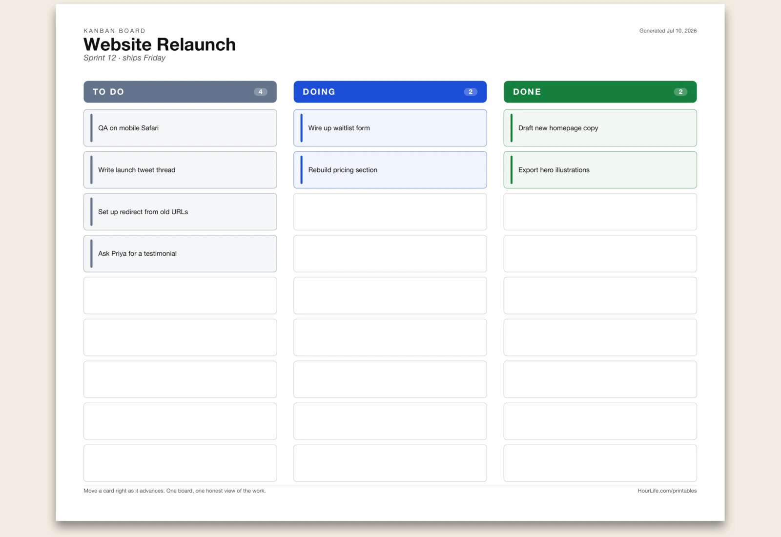
Kanban Board
Dump your task list and get a three-column board — To Do, Doing, Done. Tag a line @doing or @done to place it; the rest of each column stays blank to fill by hand.
Best for
Seeing everything in flight on one page and moving work forward.
Landscape · 1 page
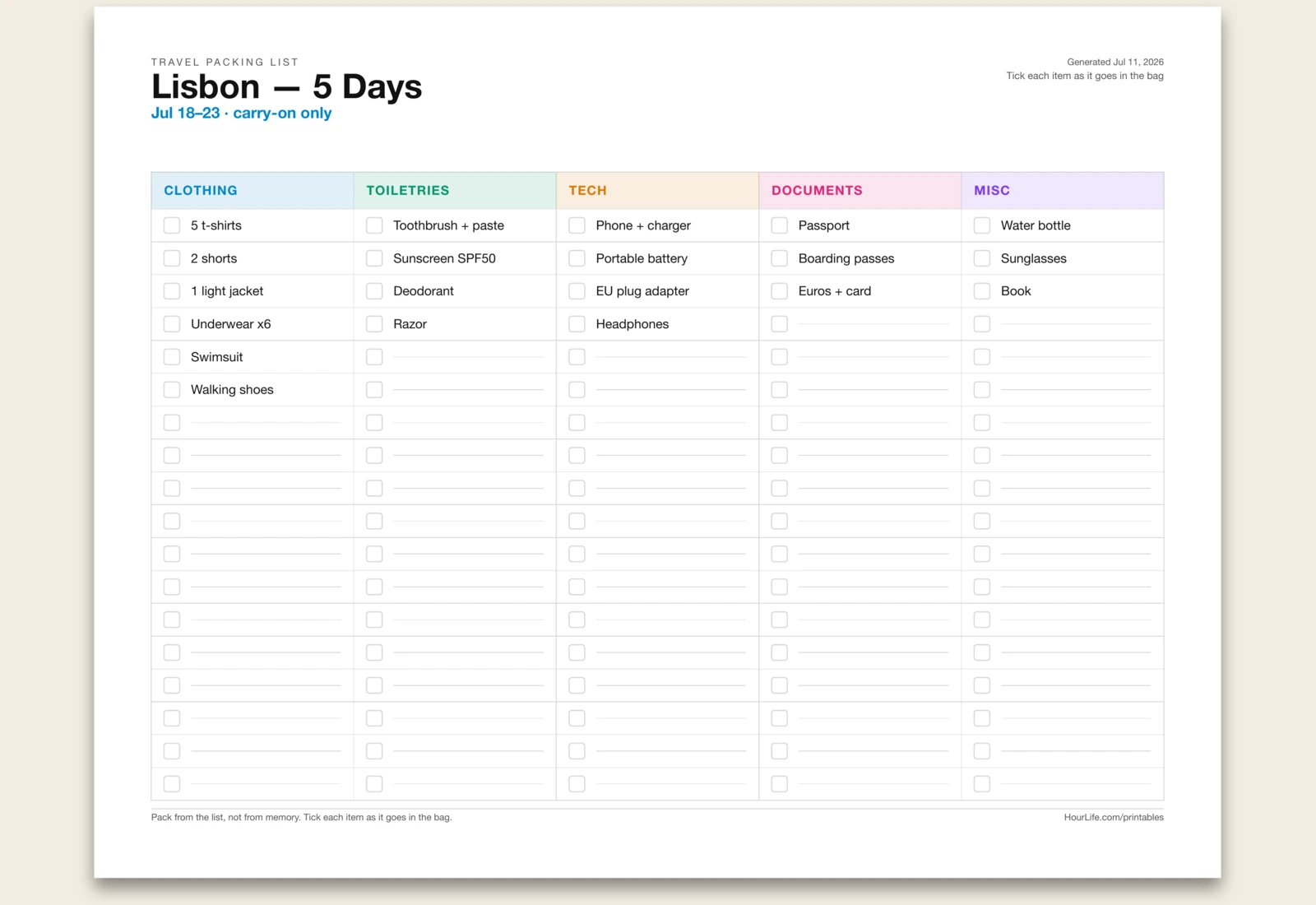
Travel Packing List
Group your items under simple category headers — a line ending in “:” starts a column — and get a color-coded, multi-column packing checklist with a tick-box for every item and blank lines to add more.
Best for
Packing from a list so nothing gets left behind.
Portrait · 1 page
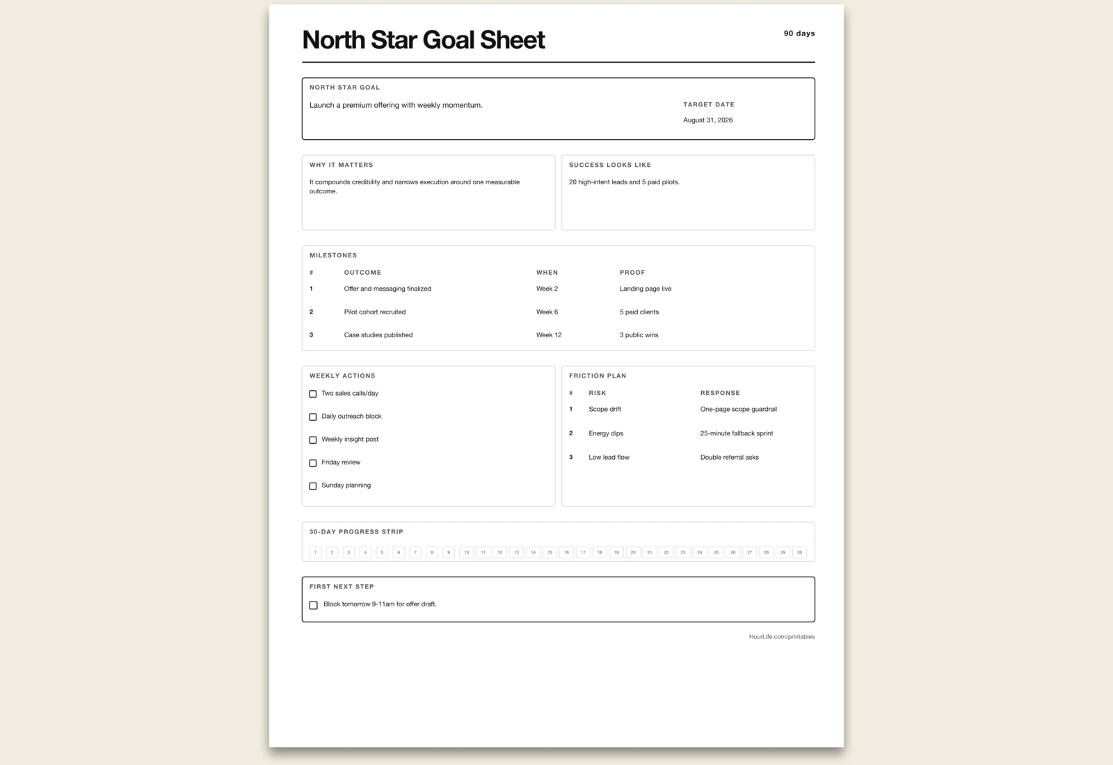
North Star Goal Sheet
One major goal broken into milestones, daily actions, and a 30-day progress strip.
Best for
Turning one meaningful objective into a practical rhythm.
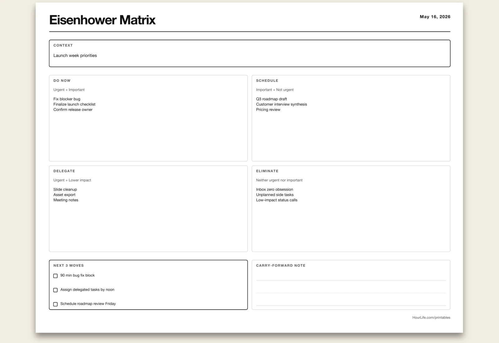
Landscape · 1 page
Eisenhower Matrix
A clean urgent-vs-important matrix to decide what to do now, schedule, delegate, or drop.
Best for
Cutting noise and choosing the few tasks that matter.
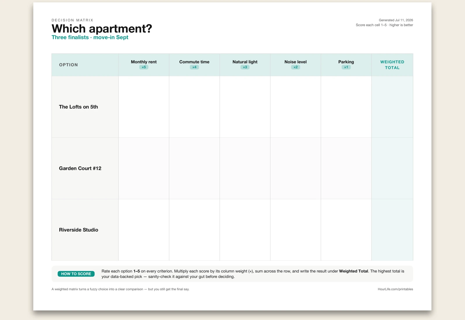
Landscape · 1 page
Decision Matrix
List the options you're choosing between and the criteria that matter — weight the important ones higher — and get a weighted scoring grid. Rate each cell 1–5, total each row, and let the numbers break the tie.
Best for
Making a hard choice with more than a gut feeling.
Reflection
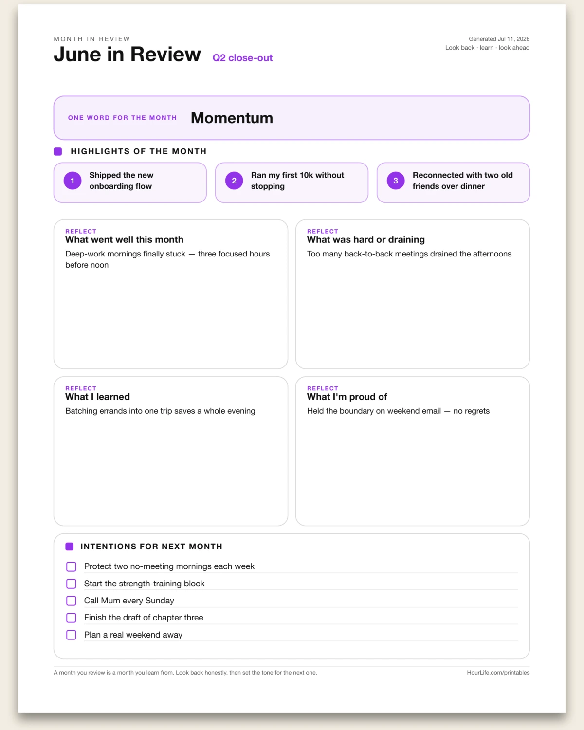
Portrait · 1 page
Monthly Reflection
A one-page month-in-review: name one word for the month, log up to three highlights, answer four honest prompts — what went well, what was hard, what you learned, what you're proud of — then set up to five intentions for next month. A month you review is a month you learn from. Leave anything blank to write by hand.
Best for
Closing out a month with a short, honest retrospective and a look ahead.
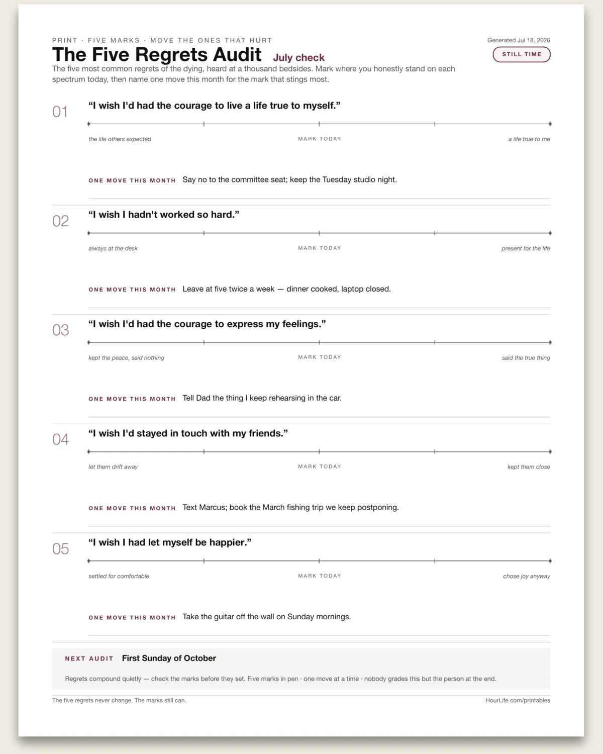
Portrait · 1 page
The Five Regrets Audit
The five most common regrets of the dying — heard at a thousand bedsides — turned into a checkup you run while there's still time. Each regret prints as a spectrum between two poles (always at the desk ←→ present for the life); you mark where you honestly stand today in pen, then name one move this month for the mark that stings most. Every regret gets a typed move line plus a blank second line for the move after the move, and a next-audit strip books the re-check before the marks set. The five regrets never change. The marks still can.
Best for
An honest quarterly check against the five deathbed regrets, while the answers can still change.
Portrait · 1 page
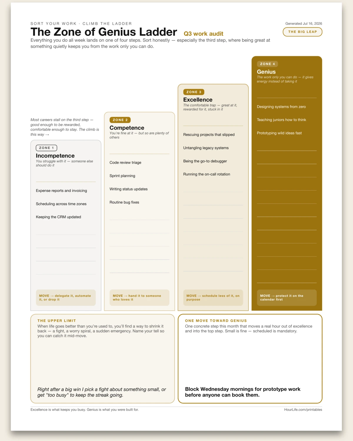
The Zone of Genius Ladder
The four-zones exercise from Gay Hendricks' The Big Leap, drawn as an ascending staircase. Sort everything you do in a normal week onto the steps: incompetence (you struggle with it — delegate it), competence (you're fine at it, but so are plenty of others), excellence (the comfortable trap — great at it, rewarded for it, stuck in it), and genius — the solid-gold top step for the work only you can do, that gives energy instead of taking it. Each step carries a fixed move: delegate it, hand it off, schedule less of it on purpose, protect it on the calendar first. Below the stairs, two boxes finish the exercise: your upper-limit tell — the way you self-sabotage when things go better than you're used to — and one concrete, scheduled move that shifts a real hour from excellence into genius. Fill it in, or print it blank and sort by hand.
Best for
Anyone whose calendar is full of work they're merely great at — finding the hours to move up a step.
Portrait · 1 page
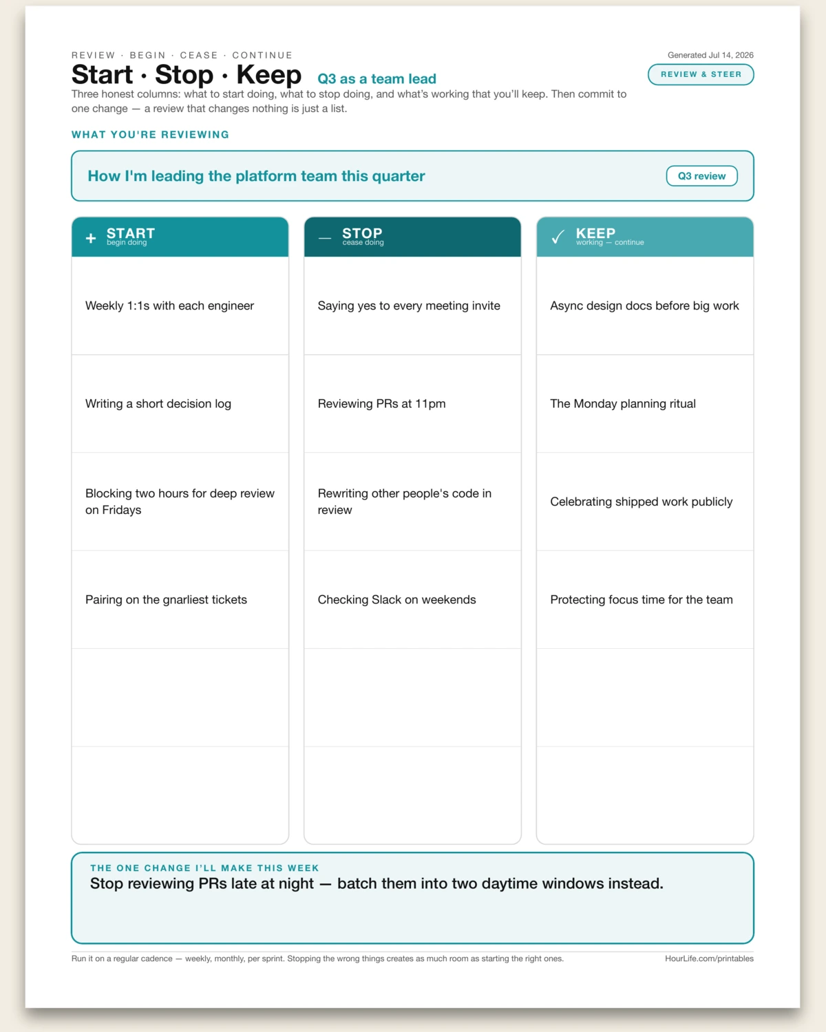
Start · Stop · Keep
The simplest honest review there is, on one page. Three columns steer whatever you're running — a role, a quarter, a team, a project, or your own habits: what to START doing that you're not, what to STOP doing that's costing you, and what's working that you'll KEEP. Naming the stops matters as much as the starts — clearing the wrong things creates as much room as adding the right ones, and most reviews only ever add. Up to six items each, listed one per line. It all funnels to the part most reviews skip: the single change you'll actually make this week. Because a review that names everything and changes nothing is just a list. Run it on a regular cadence — weekly, monthly, per sprint — and the compounding is in the repetition. Fill it in to leave with one concrete move, or print it blank and work the three columns by hand.
Best for
A fast, honest periodic review that ends in one concrete change — not just a list of observations.
Portrait · 1 page
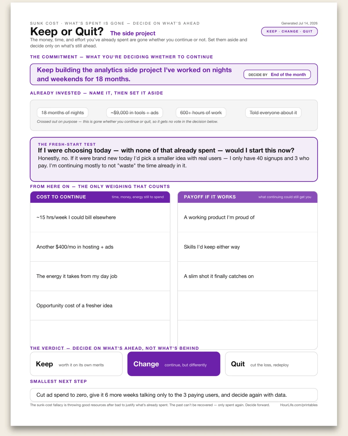
Keep or Quit?
A one-page sheet for the commitment you can't tell whether to stick with — the project, the degree, the relationship, the losing stock — built to break the sunk-cost trap. The money, time, and effort you've already poured in are gone whether you continue or not, so the sheet has you name them and then literally cross them out: they get no vote. What's left is the only question that counts, the fresh-start test — if none of that were already invested, would you start this today? From there you weigh only what's still ahead, cost to continue against payoff if it works, and circle a verdict: keep it on its own merits, change how you're doing it, or quit and redeploy what's left. It closes with the smallest next step that follows. The sunk-cost fallacy is throwing good resources after bad to justify what's already spent — the past can't be recovered, only spent again. Fill it in to make an honest call, or print it blank and work it through by hand.
Best for
Deciding whether to stick with something you're heavily invested in — without letting what's already spent make the call for you.
Portrait · 1 page
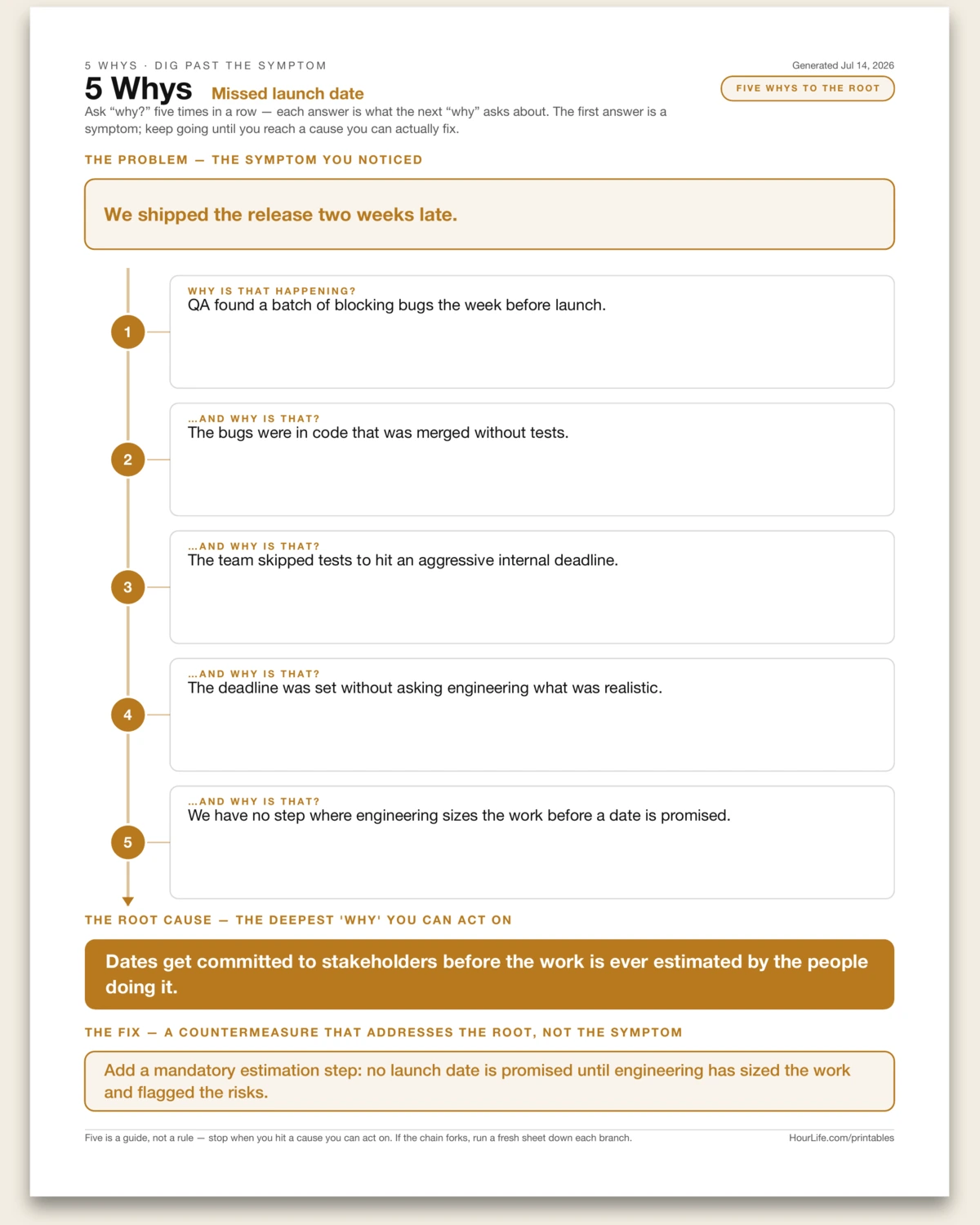
5 Whys
Toyota's root-cause drill on one page, drawn as a descending ladder. State the problem, then ask "why?" five times in a row — each answer becomes the thing the next "why" asks about — until the chain lands on a cause you can actually fix. The first answer is nearly always a symptom: the release slipped because QA found bugs, the bugs shipped because tests were skipped, tests were skipped to hit a deadline, and so on down to something structural you can change. Five rungs hang on a single spine so the whole causal chain reads as one descent, ending in a root-cause bar and the countermeasure that addresses it — not the symptom up top. Five is a guide, not a rule: stop when you hit an actionable cause, and if the chain forks, run a fresh sheet down each branch. Fill it in to work a problem through, or print it blank and drill down by hand.
Best for
Getting past the obvious symptom to the structural cause of a recurring problem — so the fix actually sticks.
Portrait · 1 page
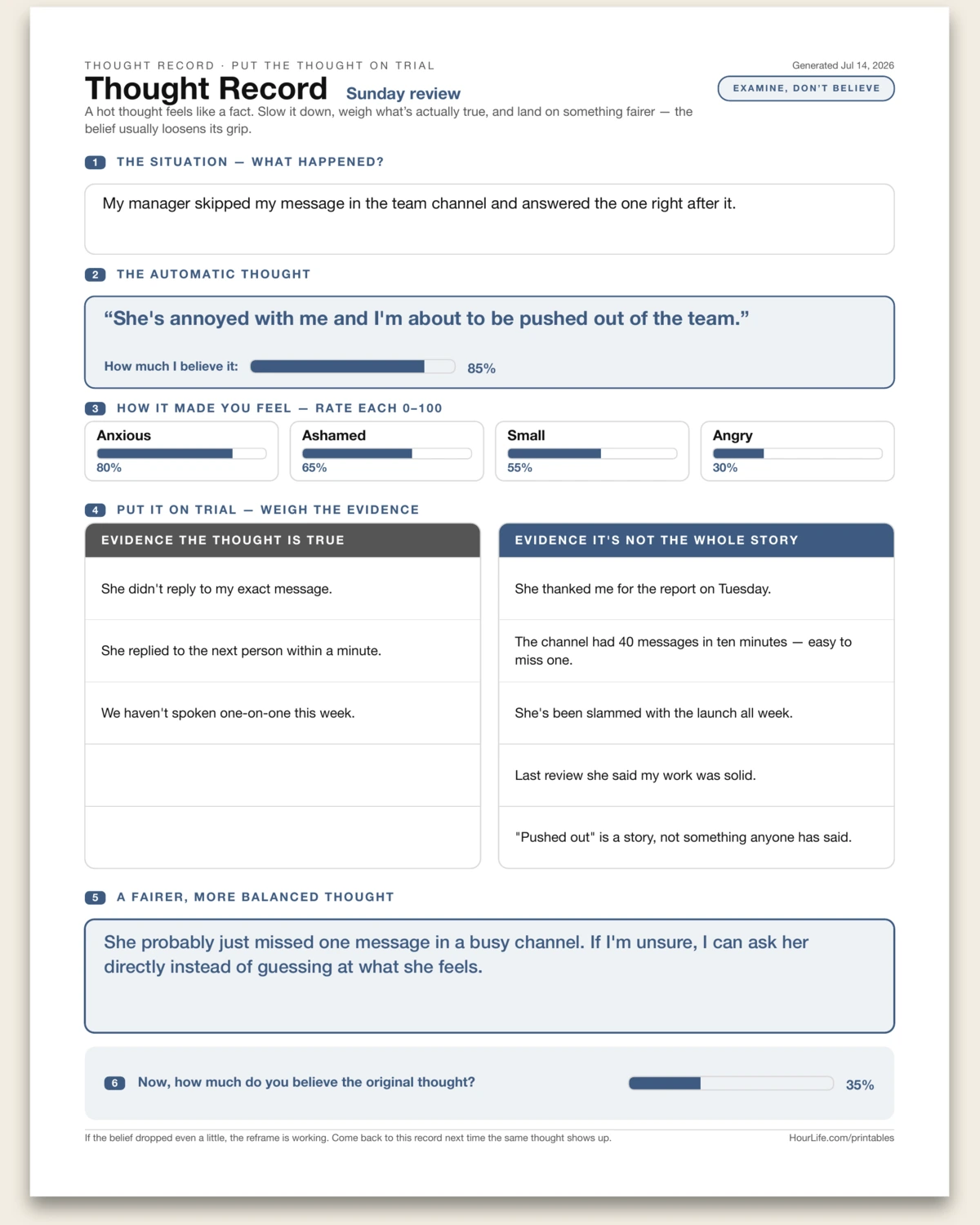
Thought Record
The core CBT worksheet for a thought that's running you — drawn as a courtroom for the mind. Name the situation, write the exact automatic thought that flashed through, and rate how strongly you believe it, 0 to 100. List the feelings it stirred up and how intense each one was, then do the real work: weigh the evidence the thought is true in one column and the evidence it's not the whole story in the other. With both sides in front of you, write a fairer, more balanced thought — not forced positivity, just the fuller truth — and re-rate how much you believe the original. A hot thought feels like a fact; slowing it down long enough to examine is what loosens its grip, and watching the belief drop even a little is proof the reframe is working. Fill it in to work through a specific spiral, or print it blank and do it by hand — paper is where the thought finally holds still.
Best for
Catching an anxious or self-critical thought and testing it against the evidence, instead of taking it at its word.
Portrait · 1 page
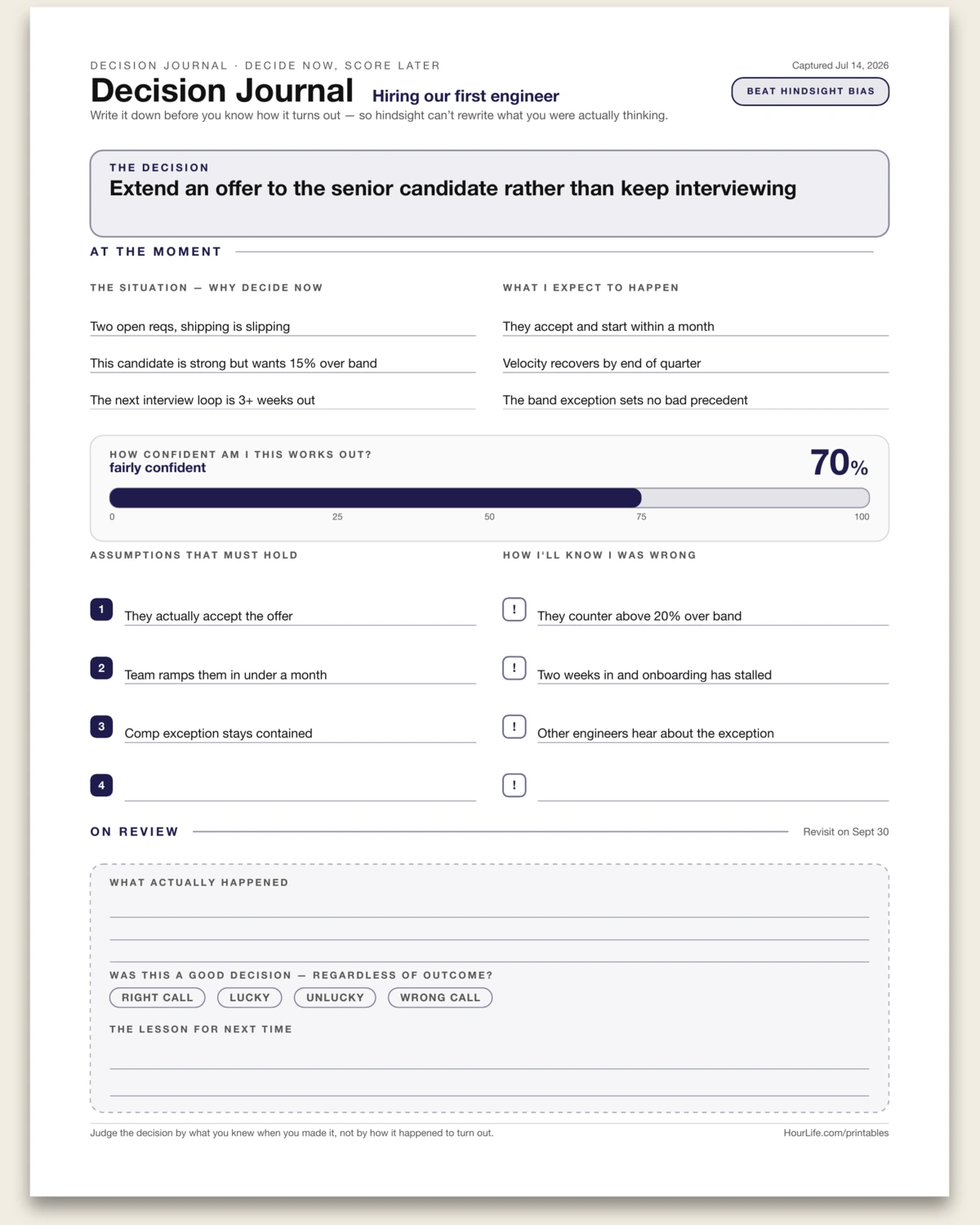
Decision Journal
A one-page decision record in the spirit of Annie Duke and Farnam Street. You fill the top half the moment you decide — the call itself, the situation, what you expect to happen, how confident you are on a 0–100 gauge, the assumptions that must hold, and the signals that would tell you you were wrong. The bottom half stays blank on purpose: a panel for a future you to record what actually happened and score whether it was a good decision, regardless of how it turned out. Capturing your reasoning before the result is in is the simplest cure for hindsight bias — your past self, on the record. Leave any line blank to fill in by hand.
Best for
Getting honest about your judgment over time — so you can tell a good decision from a lucky one.
Landscape · 1 page
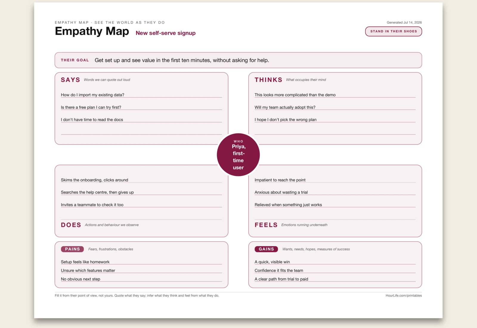
Empathy Map
A one-page empathy map drawn the classic way — one real person at the centre with the goal you're exploring on their behalf, four quadrants around them (Says, Thinks, Does, Feels), and two outcome cells beneath for their Pains and Gains. Name the person and the goal, then fill each zone from their point of view: quote what they say out loud, infer what they think and feel from what they actually do, then land on what blocks them and what a real win looks like. It's a fast way to step out of your own head and design for theirs. Print it blank to run a session by hand. Leave any zone empty to fill in later.
Best for
Getting a whole team to see a customer or stakeholder as a real person before designing for them.
Portrait · 1 page
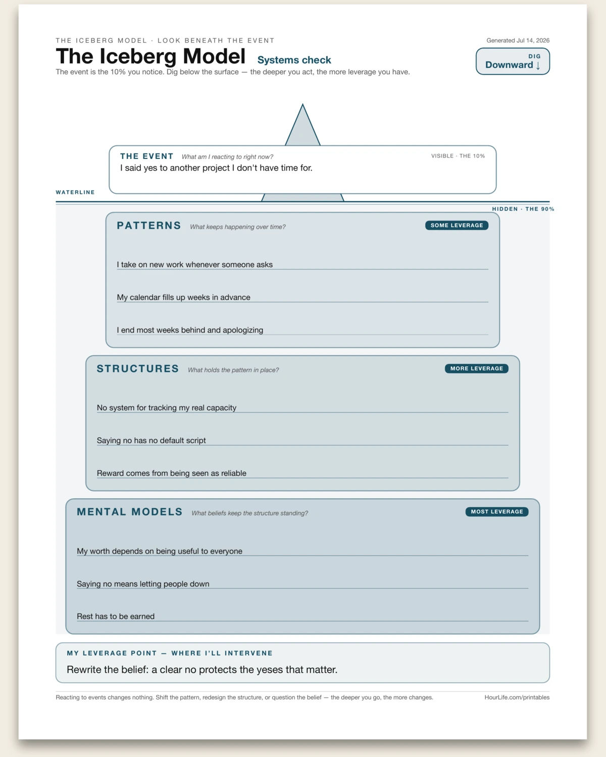
The Iceberg Model
A one-page systems-thinking worksheet drawn as an iceberg — the visible event above a straight waterline, then three widening, deepening layers below it. The event is the 10% you notice; the 90% that drives it is hidden underneath. Name the event, then dig down: the patterns that keep repeating, the structures that hold those patterns in place, and the mental models — the beliefs — the whole thing rests on. Each layer carries more leverage than the one above, so the deeper you write, the closer you get to something worth changing. It closes with the single leverage point where you'll intervene. Reacting to events changes nothing; shift the pattern, redesign the structure, or question the belief. Leave any layer blank to work through by hand.
Best for
Getting under a recurring problem instead of reacting to it — finding the deepest place you can actually change.
Portrait · 1 page
Ladder of Inference
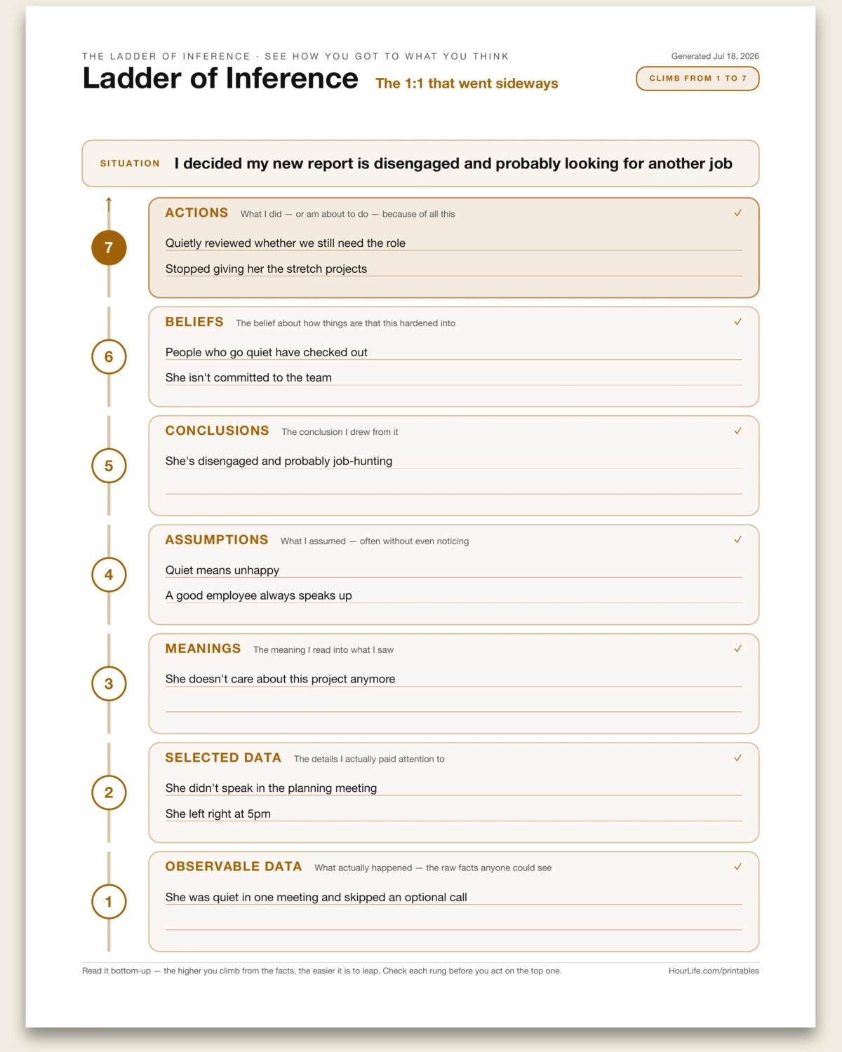
A one-page Ladder of Inference — Chris Argyris' tool for catching how a snap judgment gets built. A reaction feels like plain fact, but it's really the top of a ladder you climbed in a split second: from the raw data anyone could see, up through the details you selected, the meaning you added, the assumptions you made, the conclusion you drew, and the belief it hardened into — until you act on it. This sheet lays the ladder out as seven rungs, action at the top and observable data at the foot, so you can trace a strong reaction back down to what actually happened. Fill it after a conflict, a harsh judgment of someone, or a decision you can't quite justify, and you'll usually find the leap sitting one or two rungs up — a meaning or assumption you never checked. Print it blank to walk a situation down the ladder by hand.
Best for
Slowing down a strong reaction or judgment to see the assumptions and leaps between the facts and your conclusion.
Portrait · 1 page
Hierarchy of Needs
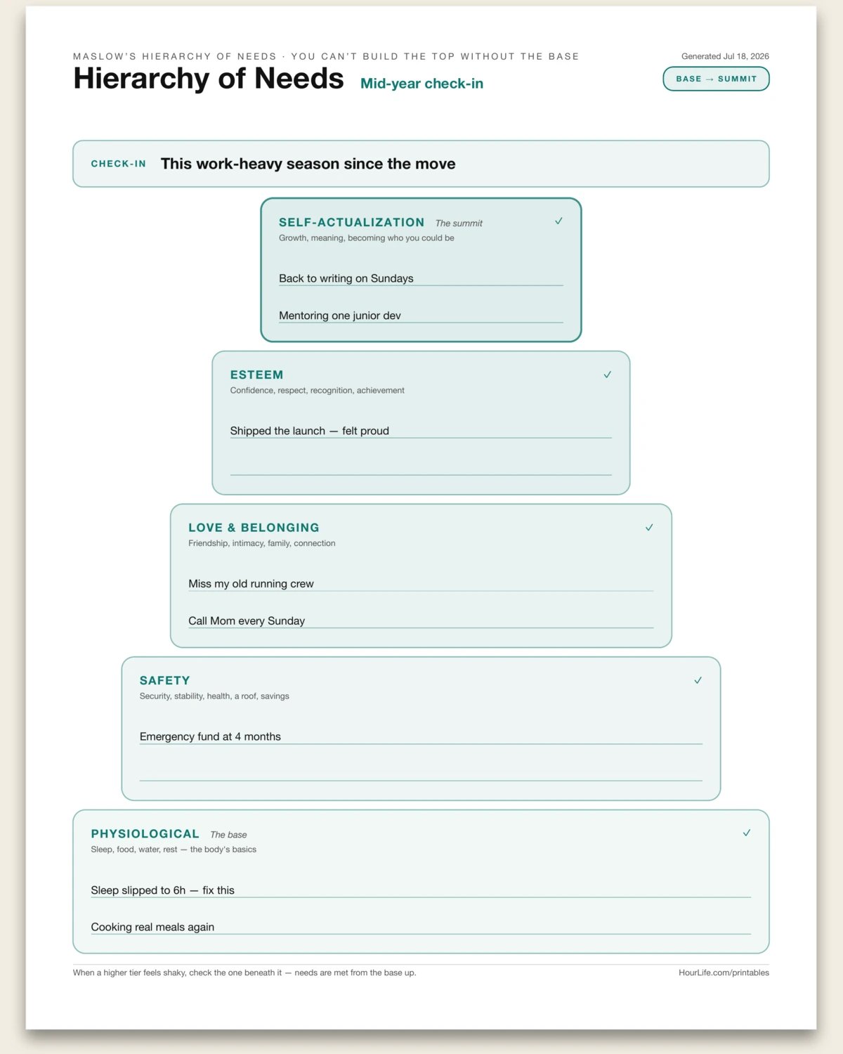
A one-page reflection built on Maslow's Hierarchy of Needs — the pyramid that arranges human needs in order, from the basics of the body at the wide base up to self-actualization at the narrow summit. You name the season you're checking in on, then move up the five tiers: physiological (sleep, food, rest), safety (security, stability, health, savings), love and belonging (friendship, family, connection), esteem (confidence, respect, achievement), and self-actualization (growth, meaning, becoming who you could be). The point of stacking them is that the tiers rest on each other — when something higher feels shaky, the fix usually lives in a tier beneath it. It's easy to chase esteem or purpose while running on six hours of sleep and a frayed support network; laid out this way, the neglected foundation becomes obvious. Use it as a quarterly or mid-year self-check, a therapy or coaching prep sheet, or a calm way to figure out what actually needs attention next. Print it blank to fill in by hand.
Best for
A grounded self-check on where your basic, emotional, and growth needs stand right now — and which foundation to shore up first.
Landscape · 1 page
Comfort Zone Map
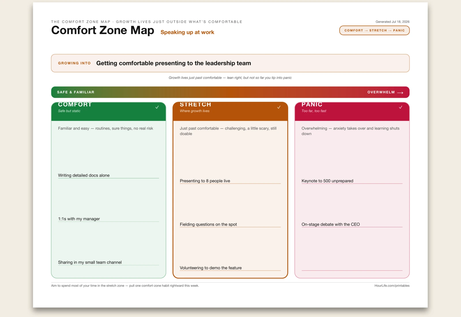
A one-page Comfort Zone Map — the growth model that lays three zones along a single spectrum so you can see where the learning actually happens. In the comfort zone everything feels safe and familiar, but nothing changes there. Just past it is the stretch zone: challenging, a little scary, still doable — the place where you grow. Push too far and you tip into the panic zone, where overwhelm floods in and learning shuts down. You name the edge you're working on — a skill, a goal, a fear — then sort what belongs in each zone right now. Laying it out this way makes the useful move obvious: pick something sitting in your comfort zone and pull it one step to the right, into a stretch, without lurching all the way into panic. It's a calm antidote to both stagnation and burnout — grow on purpose, at a pace you can sustain. Use it before taking on something new, when a goal feels either too easy or terrifying, or as a quarterly nudge to keep expanding. Print it blank to map a challenge out by hand.
Best for
Sorting a skill, goal, or fear into comfort, stretch, and panic — so you grow at the edge without tipping into overwhelm.
Landscape · 1 page
Lifeline
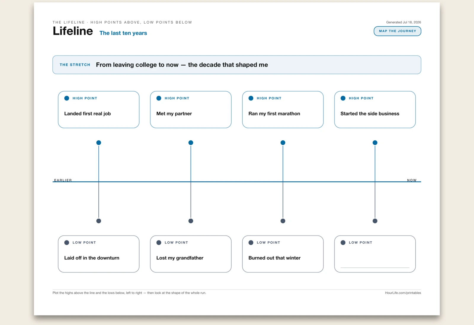
A one-page Lifeline — a way to map a stretch of your life as a single timeline instead of a flat list of things that happened. Told as a list, a life loses its shape; drawn as a lifeline, the pattern shows. This sheet gives you one horizontal line running left to right from earlier to now. Above the line you pin the high points — the moments that lifted you, the wins, the turns that opened something up. Below it you pin the low points — the losses, the setbacks, the seasons that took something out of you. You name the stretch you're looking back on in a single line (a decade, a chapter, since a particular event), then list up to four peaks and up to four valleys, and they plot along the line as cards on pins above and below. Two things make the exercise worth doing. Naming the highs and lows forces you to actually account for the run rather than remember only the last thing that happened. And seeing them together reveals the shape — where the dips clustered, what tended to follow a peak, how much of the story was outside your hands — which is usually more instructive than any single moment. Use it for a year-end review, a birthday or milestone reflection, therapy or journaling prep, or making sense of a chapter that just closed. Print it blank to plot your line by hand.
Best for
Mapping a stretch of life as one timeline — high points pinned above the line, low points below — so the shape of the whole run comes into view, not just the last thing that happened.
Portrait · 1 page
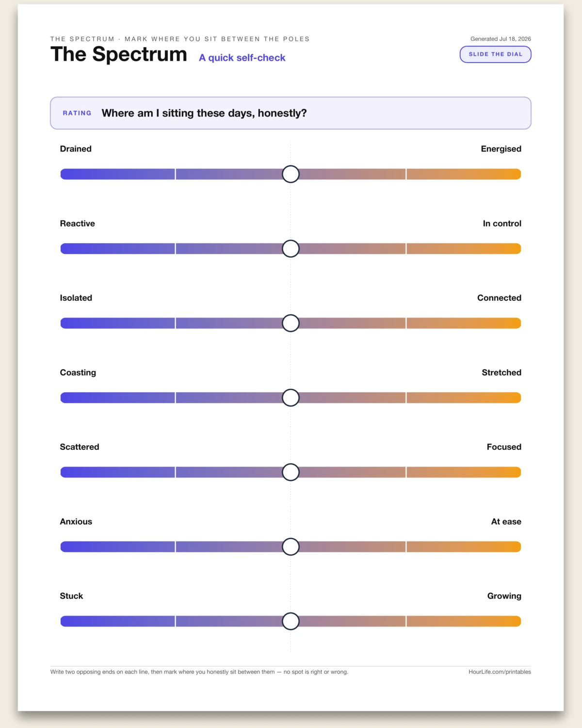
The Spectrum
A one-page self-assessment drawn as a stack of two-pole sliders. A lot of the truth about where you are doesn't sit at yes or no, always or never, this or that — it lives somewhere on the line between two extremes. This sheet makes that line visible. Each row is a spectrum running between two opposing ends — drained to energised, reactive to in control, isolated to connected — with a gradient track, tick marks, and a dial you slide to where you honestly sit. You name what you're reading (a mood, a moment, a relationship, a stretch of work), write the two poles for each of up to seven rows, then mark your spot on each. Two things make it useful. Forcing a single mark on a continuum is more honest than a yes/no box — it admits the in-between, and the exact position often surprises you. And reading several spectrums together turns a vague sense of "off" or "good lately" into a specific, glanceable picture of which dials are low and which are high, so you know where to put your attention. Use it for a weekly self-check, a mood or energy read, a values or personality reflection, a relationship or team temperature check, or before-and-after on a change you're making. Print it blank to name the poles and mark by hand.
Best for
Reading where you honestly sit between opposing extremes across several dimensions at once — a mood, a moment, or a stretch of work — instead of forcing a yes/no answer.
Landscape · 1 page
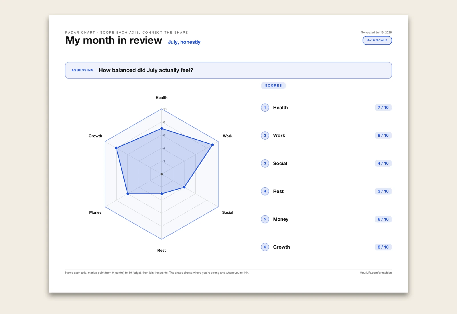
The Radar Chart
A one-page radar chart — also called a spider chart — for rating several things at once and seeing the balance between them in a single shape. A list of scores is hard to feel; a shape isn't. Name three to eight axes, mark each from 0 at the centre to 10 at the outer edge, and join the points. The silhouette tells the story instantly: a big, even shape means you're strong across the board, while a lopsided, spiky one shows exactly where you're thin and which axis is quietly dragging the rest down. Because every dimension shares one picture, it's the fastest way to compare many factors, to weigh two options against the same criteria, or to track how a shape fills out over time. Use it for a life balance check across health, work, money, rest and relationships; a skills audit before a review; a team or project health check; a product or vendor comparison; a habit or wellbeing snapshot month to month. Type a score after each label and the shape is drawn for you; leave the scores off to print a clean web and plot it by hand.
Best for
Rating 3–8 dimensions at once and reading the balance between them as one shape you can take in at a glance.
Portrait · 1 page
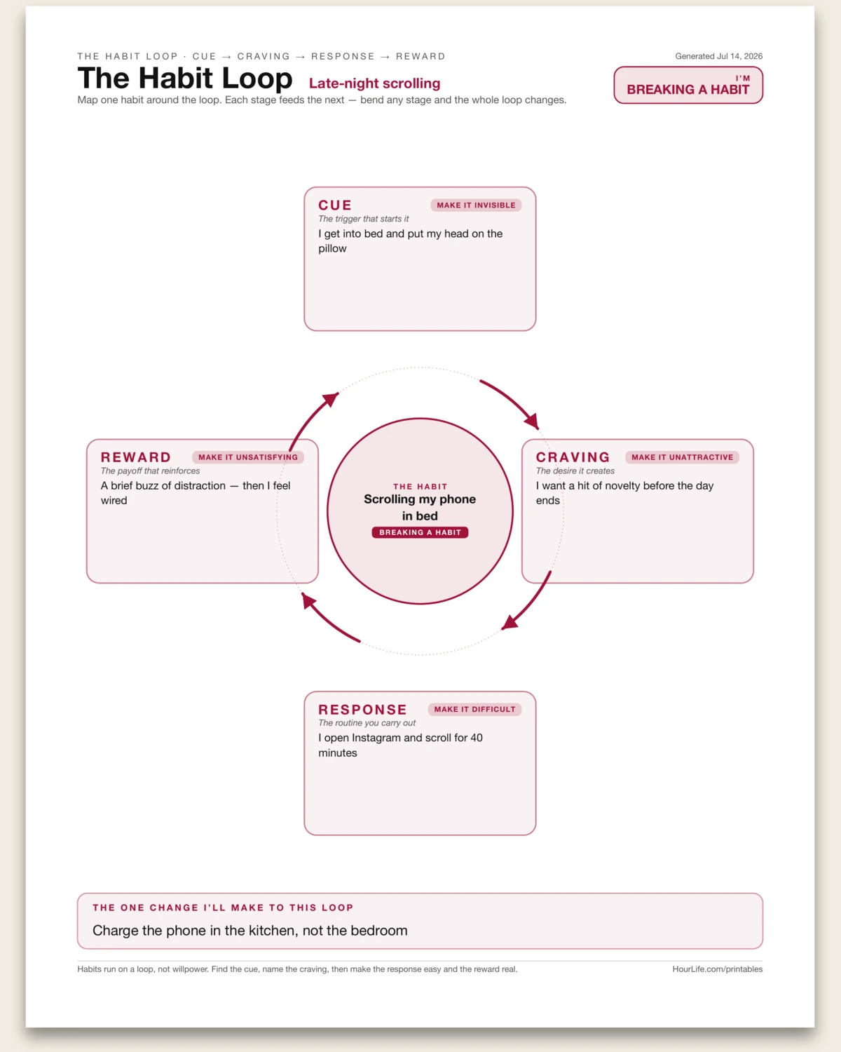
The Habit Loop
A one-page worksheet drawn as the four-stage habit loop — cue, craving, response, reward — laid out as a closed clockwise cycle around the habit at its centre. Name one habit, choose whether you're building it or breaking it, then trace each stage in a line or two. Every stage carries its Law of Behavior Change, flipped for building versus breaking, so the sheet doubles as a menu of levers: make the cue obvious or invisible, the craving attractive or unattractive, the response easy or difficult, the reward satisfying or unsatisfying. It closes with the single change you'll make to the loop. Habits run on a loop, not willpower — see the loop and you can bend it. Leave any stage blank to map by hand.
Best for
Diagnosing why a habit sticks — and finding the one stage to change to build it or break it.
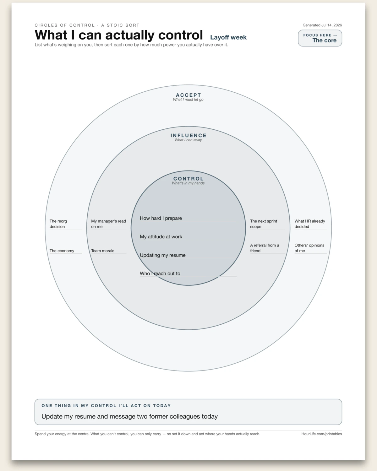
Portrait · 1 page
Circles of Control
A one-page Stoic worksheet drawn as three concentric rings. Dump whatever is weighing on you, then sort each item by how much power you actually have over it: the core is what you control, the middle ring what you can influence, the outer ring what you must accept. A few lines fit in each band, and it closes with the single thing in your control you'll act on today. Anxiety lives in the gap between what you're carrying and what you can actually move — sort your worries by that line and spend your energy at the centre. Leave any line blank to fill in by hand.
Best for
Calming a spiral by separating what you can act on from what you can only carry.
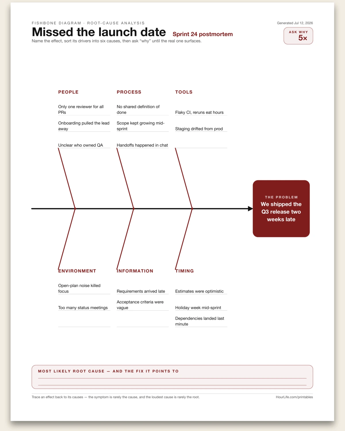
Portrait · 1 page
Fishbone Diagram
A one-page root-cause worksheet drawn as an Ishikawa fishbone. Name the effect you're diagnosing — it becomes the head of the fish — then sort its drivers into six bones branching off the spine: People, Process, Tools, Environment, Information, and Timing. List a few causes under each, then converge on the one most likely root cause and the fix it points to. The symptom is rarely the cause, and the loudest cause is rarely the root — six fixed bones prompt every angle so nothing gets overlooked. Leave any line blank to fill in by hand.
Best for
Diagnosing why something went wrong by sorting the causes before you fix the symptom.
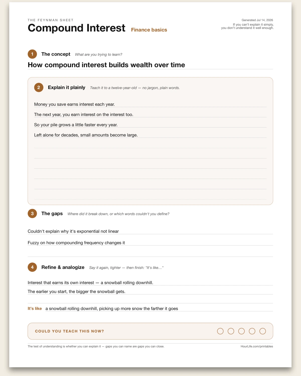
Portrait · 1 page
The Feynman Sheet
A one-page worksheet for learning something by explaining it — the Feynman technique in four descending stages. Name the concept, explain it in plain words as if to a twelve-year-old, mark where your explanation broke down or reached for a word you couldn't define, then refine it and pin it to one everyday analogy. It closes with a confidence check: could you teach this now? The gaps you can name are the gaps you can close, and the test of understanding is whether you can explain it. Leave any line blank to work through by hand.
Best for
Studying a hard idea by teaching it back until the gaps show themselves.
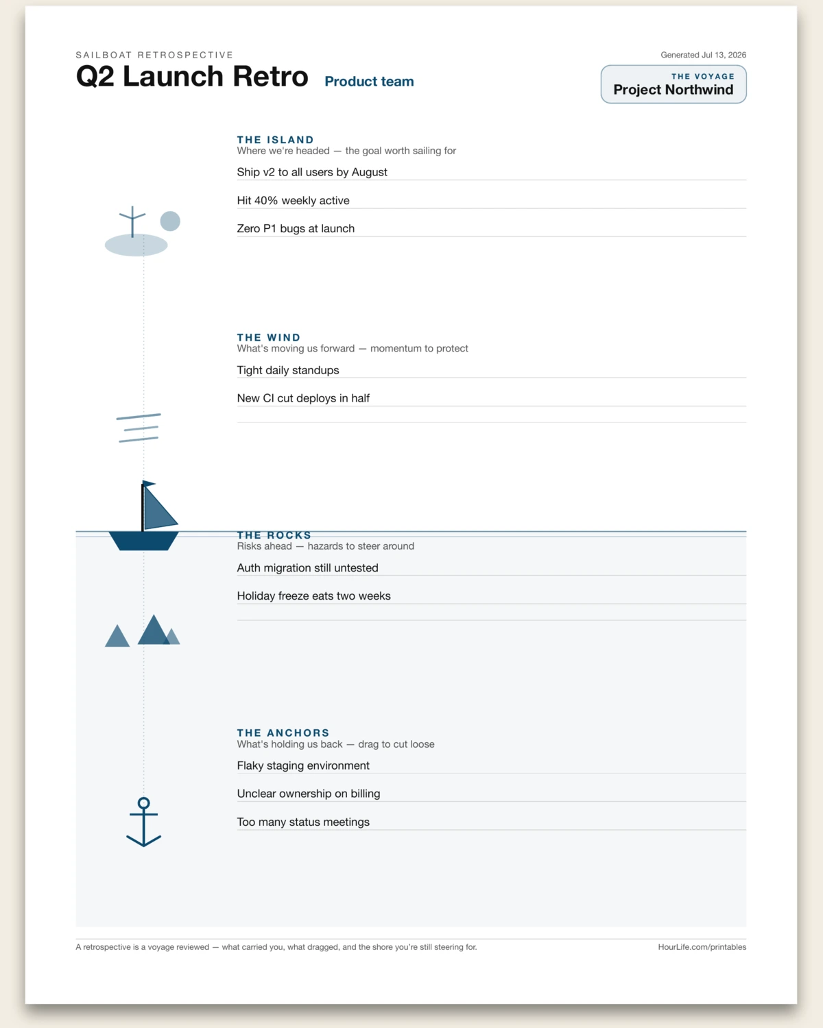
Portrait · 1 page
Sailboat Retrospective
A one-page retrospective told as a sea voyage. Name the boat for your project, sprint, or goal, then chart four zones down a single nautical scene: the island you're sailing toward, the wind at your back, the rocks ahead, and the anchors dragging behind. Sky and water read apart, and each stratum carries a few lines to fill. A retrospective is a voyage reviewed — what carried you, what dragged, and the shore you're still steering for. Leave any line blank to write by hand.
Best for
Running a team or personal retrospective through a shared visual metaphor.
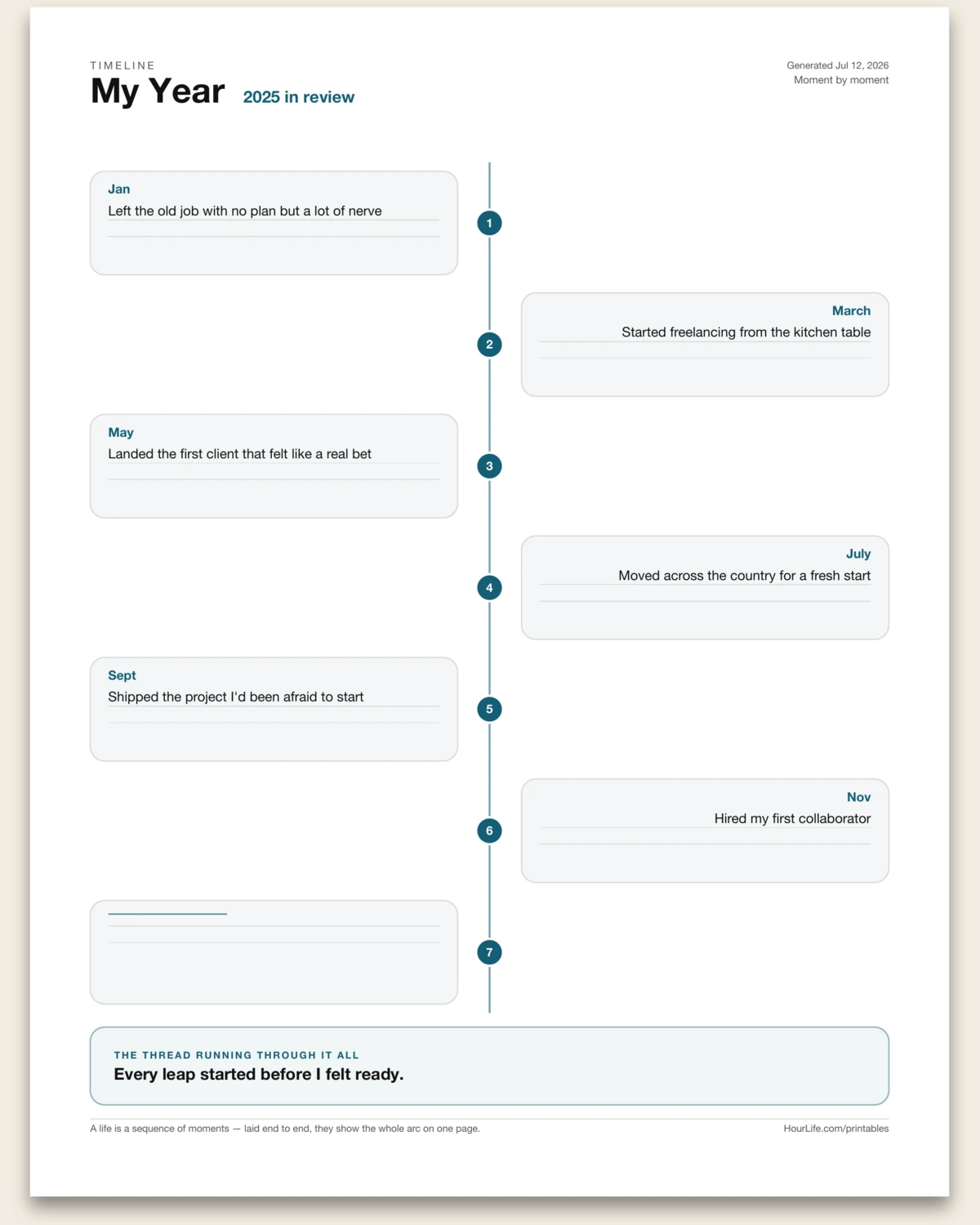
Portrait · 1 page
Timeline
A one-page reflective timeline — a look-back, not a plan. Type your moments as "date | what happened" and they lay out down a single vertical spine, numbered in order, with the cards alternating left and right so the whole arc reads at a glance. Map a project's arc, a trip, a year, or a chapter of your life, then close by naming the one thread that runs through them all. A life is a sequence of moments — laid end to end, they show the shape of the story. Leave any node blank to fill in by hand.
Best for
Seeing how a project, a year, or a chapter of your life actually unfolded.
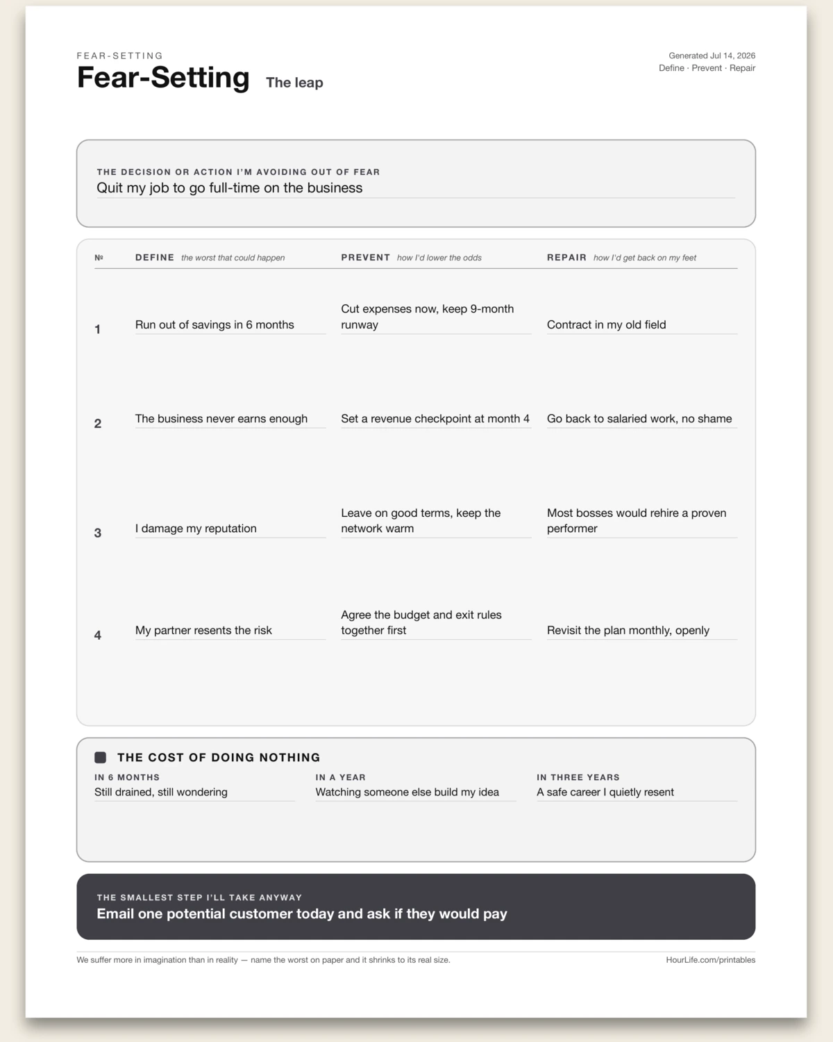
Portrait · 1 page
Fear-Setting
A one-page worksheet for the decision you keep avoiding out of fear — Seneca's premeditatio malorum by way of Tim Ferriss. Name the action, then work each worst case across three columns: Define it in full, Prevent it by lowering the odds, Repair it if it happens anyway. Weigh all of that against the quiet cost of doing nothing — in six months, a year, three years — then commit to the smallest step you'll take regardless. We suffer more in imagination than in reality; naming the worst on paper shrinks it to its real size. Leave any row blank to work out by hand.
Best for
Talking yourself into a decision fear has you avoiding.
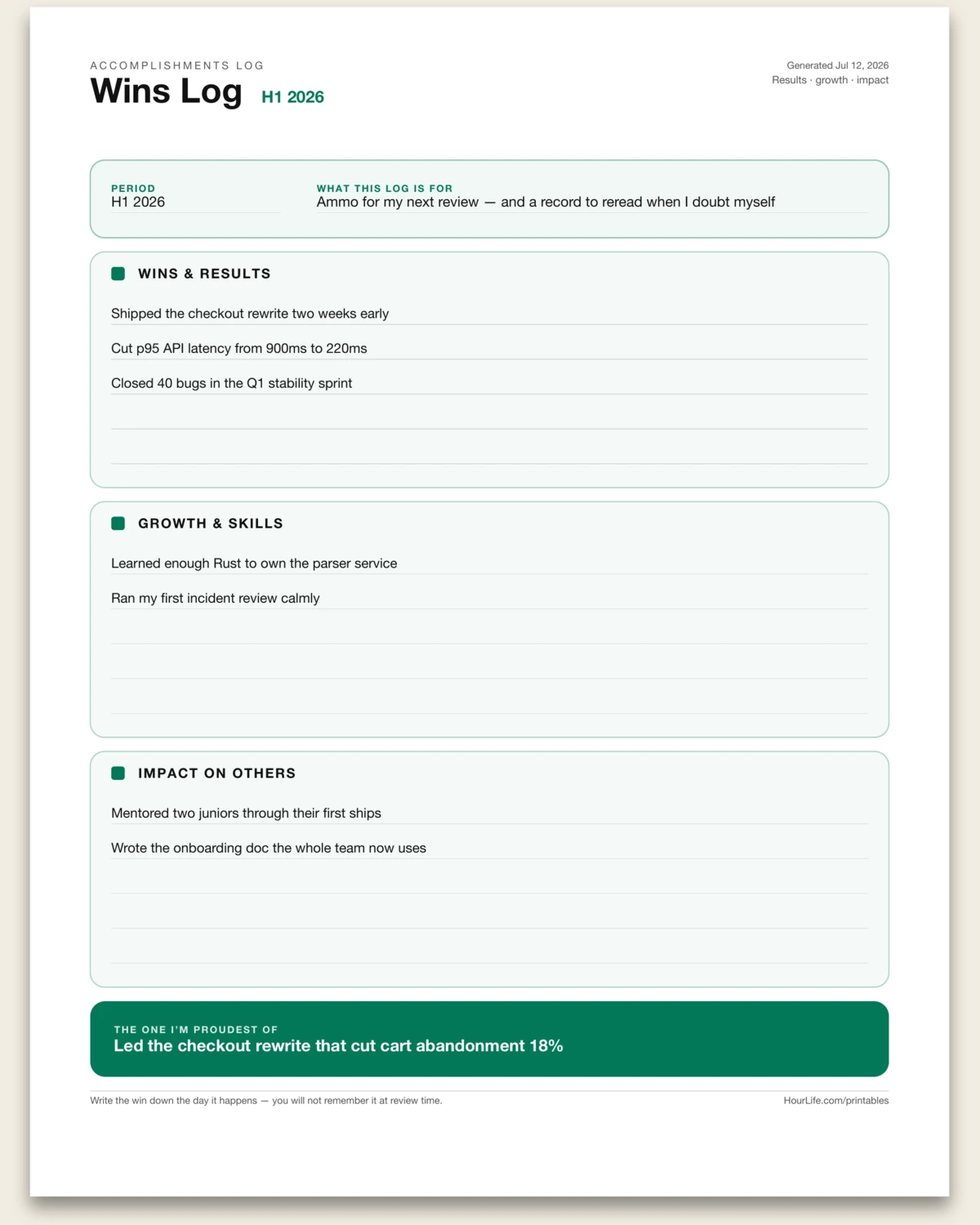
Portrait · 1 page
Wins Log
A one-page brag sheet for your own work: log your wins as they happen, grouped into three themes — results delivered, skills grown, and impact on others — then name the single one you're proudest of. When review season or self-doubt arrives, you'll have the record instead of a blank memory. Leave lines blank to keep adding by hand.
Best for
Building the case for your next review, raise, or bout of impostor syndrome.
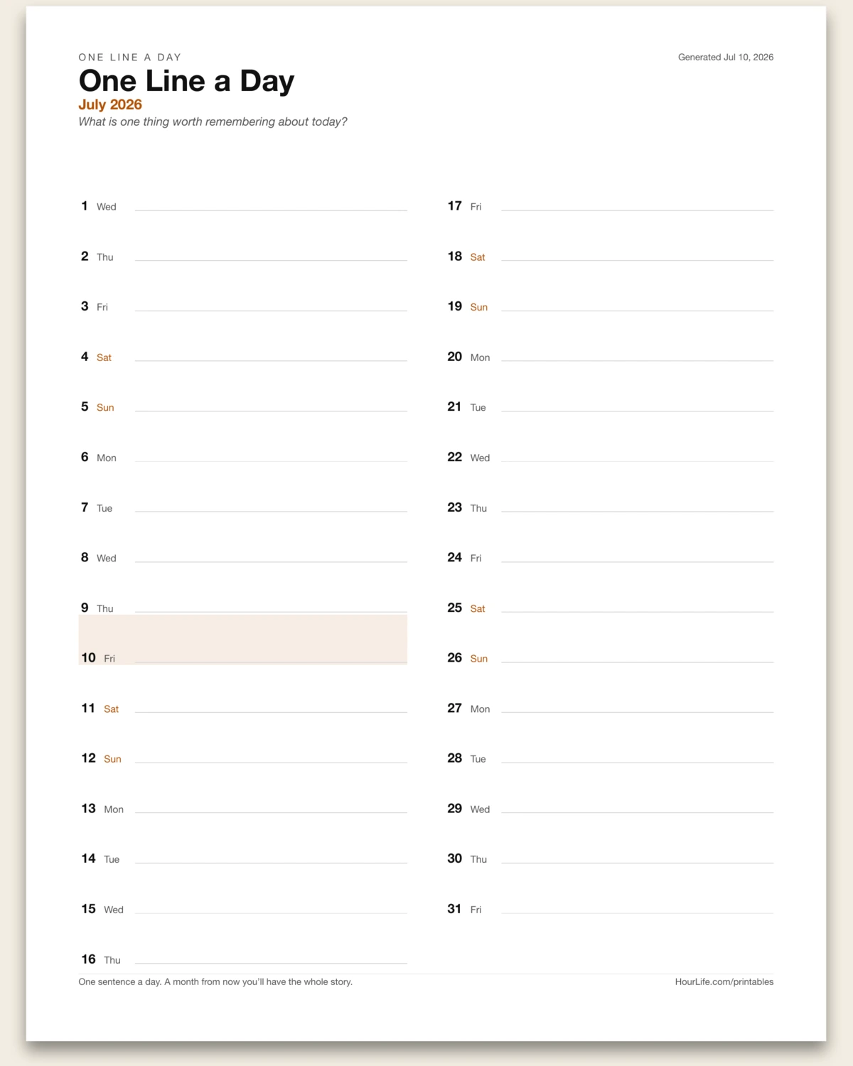
Portrait · 1 page
One Line a Day
Pick a month and an optional prompt, and get a dated writing line for every day, split into two columns. One sentence a day builds a month you can actually reread.
Best for
Keeping a journal habit that takes under a minute a night.
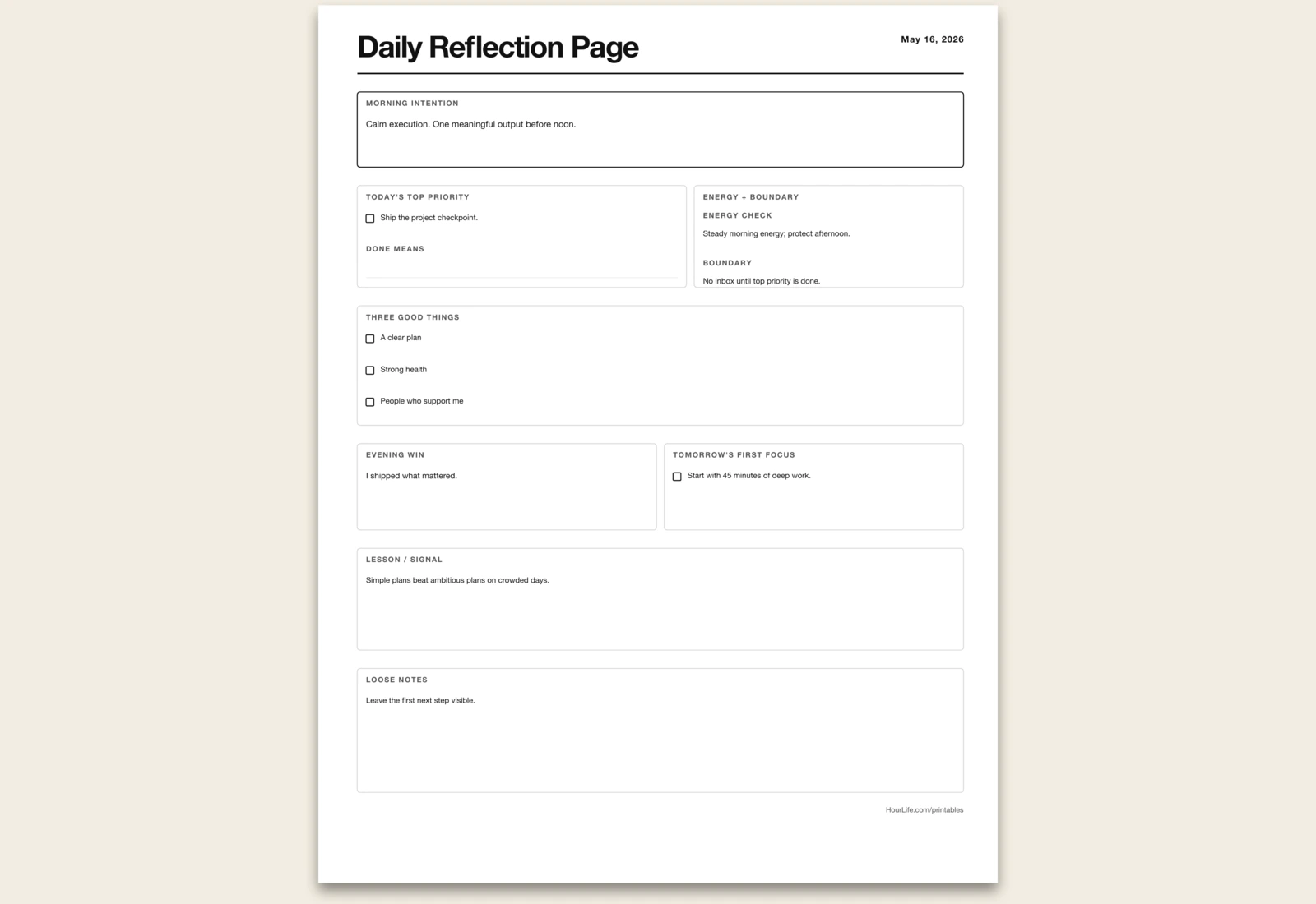
Portrait · 1 page
Daily Reflection Page
Morning and evening prompts for intention, wins, lessons, and tomorrow's focus.
Best for
Closing each day with clarity instead of noise.
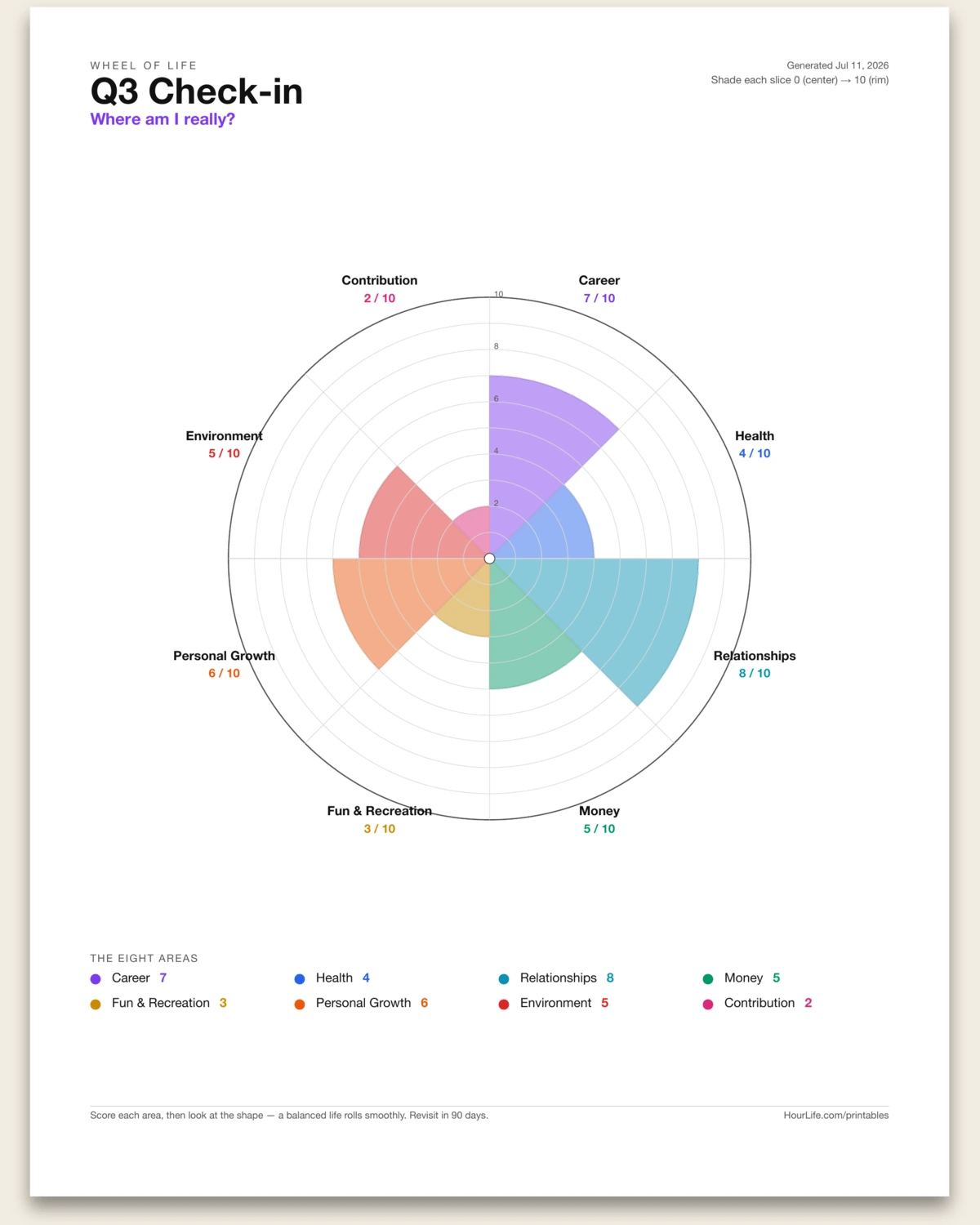
Portrait · 1 page
Wheel of Life
Rate up to eight life areas from 0 to 10 and get a color-coded balance wheel — each slice shaded to its score, with concentric rings and rim labels. Leave the scores off to print a blank wheel and fill it in by hand.
Best for
Seeing your whole life at a glance and spotting where to lean in next.
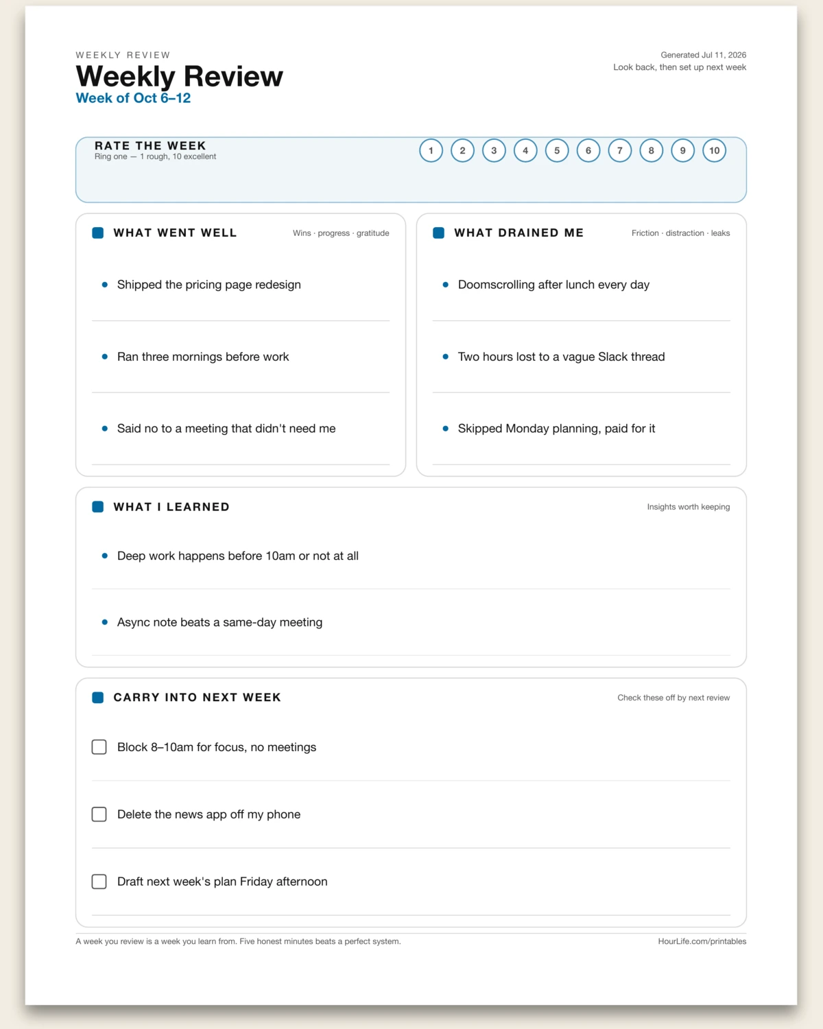
Portrait · 1 page
Weekly Review
Close the week in four honest prompts — what went well, what drained you, what you learned, and what carries into next week — plus a rate-the-week strip. Leave any box blank to print ruled lines and reflect by hand.
Best for
A five-minute Friday ritual that turns a busy week into lessons and a plan.
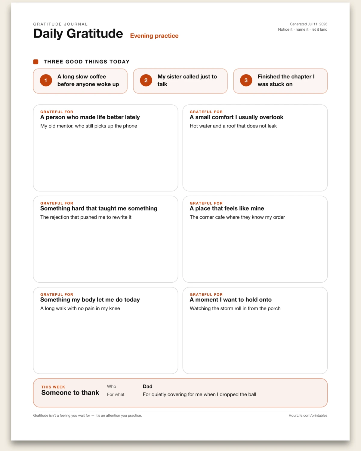
Portrait · 1 page
Gratitude Journal
A gratitude practice on one page: three quick good things up top, six deeper prompts to slow you down, and one person to thank this week. Gratitude isn't a feeling you wait for — it's an attention you practice. Leave anything blank to write by hand.
Best for
A few grounding minutes each evening to notice what's already good.
Vision
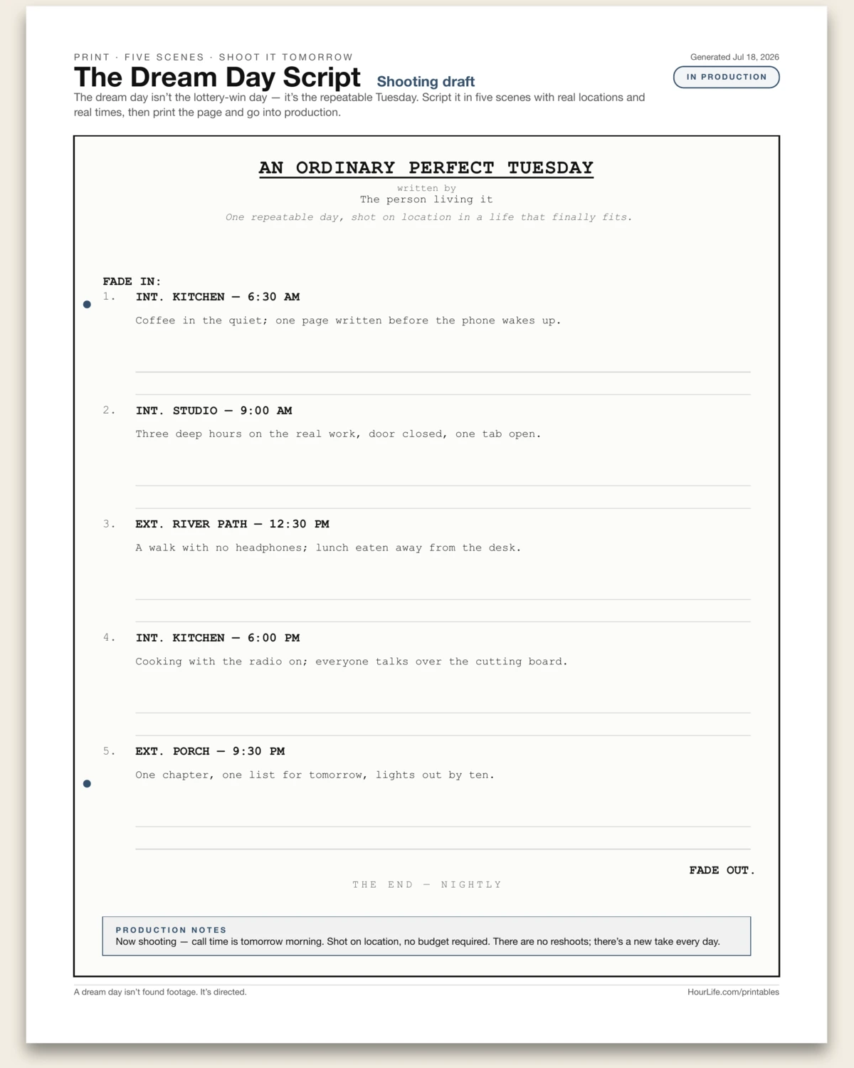
Portrait · 1 page
The Dream Day Script
Your ideal ordinary day, written as a one-page film screenplay. A typewriter-set title card names the movie of your day, a logline sums it up in a sentence, and five numbered scenes run from FADE IN to FADE OUT — each with a slugline you set (INT. KITCHEN — 6:30 AM), a one-line scene description in type, and blank action lines for pen. The trick is the constraint: not the lottery-win day, the repeatable Tuesday — real locations, real times, five moments you could actually shoot tomorrow. A production-notes strip closes the sheet: call time is tomorrow morning, shot on location, no budget required, and there are no reshoots — there's a new take every day.
Best for
Designing the ordinary day you actually want to repeat, concretely enough to start living it tomorrow.
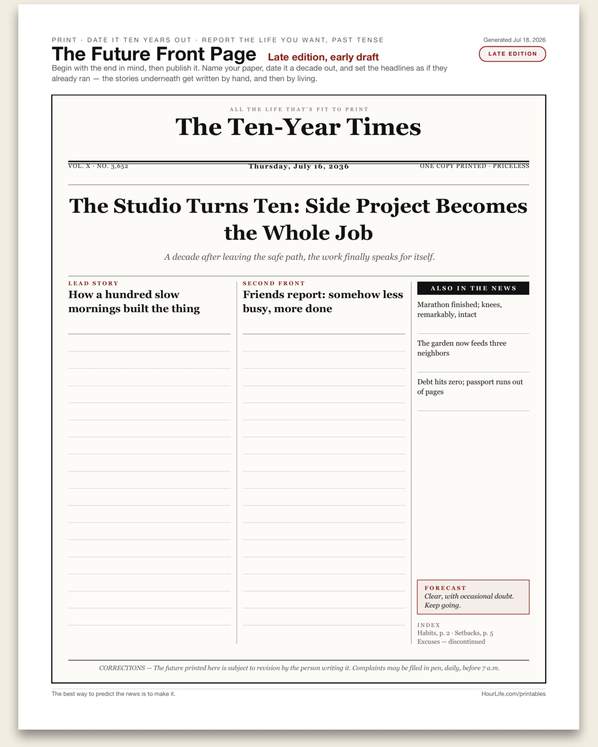
Portrait · 1 page
The Future Front Page
A broadsheet newspaper front page dated ten years from now, reporting the life you want in past tense. You name the masthead, set the dateline a decade out, and write the banner headline as if it already ran — with a standfirst beneath it, two story columns whose headlines are set in type but whose body lines stay blank for pen, and an also-in-the-news sidebar of three smaller wins. A fixed forecast box (clear, with occasional doubt), a tongue-in-cheek index, and a corrections notice round out the paper. Vision boards collage what you want; a front page makes you commit to what happened. Begin with the end in mind, then publish it.
Best for
Turning a ten-year vision into concrete, past-tense headlines you then have to go live up to.
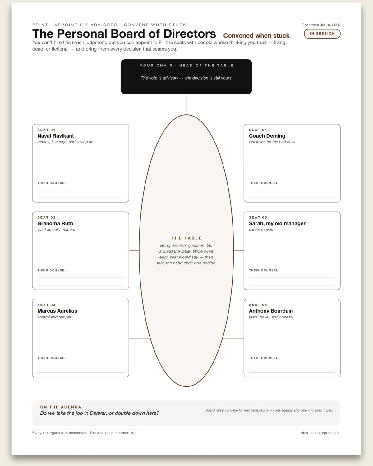
Portrait · 1 page
The Personal Board of Directors
A boardroom one-pager for borrowing better judgment. An oval table runs down the center of the page with six advisor seats around it, three a side — each seat holding someone you appoint: a mentor, an author, a relative, a dead philosopher. Every seat card carries a name, the domain they cover, and blank counsel lines you fill in pen when a real question is on the table. Your own chair sits at the head with the fine print — the vote is advisory, the decision is still yours — and an on-the-agenda strip at the bottom holds the decision currently before the board. It turns 'what would they say?' from a platitude into a page you actually convene.
Best for
Working a scary decision through six borrowed perspectives before making the call yourself.

Portrait · 1 page
The Skill Tree
A video-game-style progression tree for learning anything. Your skill sits in the trunk; nine ability nodes climb through three tiers — Foundations, Practice, Mastery — connected by branch lines with a tier gate on every crossing, up to a crown holding the endgame: the real-world moment all of this buys you. Every node has an unlock circle and a date line, checked in pen, bottom to top, no skipping tiers. A current-quest strip at the base names the one node you're grinding right now. Games got progression right — one visible unlock at a time — and this steals it for deliberate practice.
Best for
Turning a vague ambition to learn something into a visible, checkable progression you level up over months.
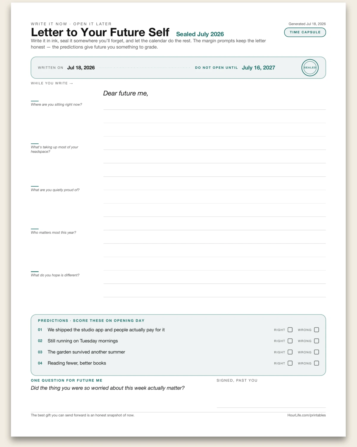
Portrait · 1 page
Letter to Your Future Self
A one-page time capsule. The seal strip carries the written-on date, a do-not-open-until date, and a stamped seal; the letter body prints as ruled paper with a margin rail of prompts — where are you sitting, what's taking up your headspace, what are you quietly proud of — so the writing stays honest instead of drifting into resolutions. Then the part future you will actually flip to first: a predictions block with right/wrong checkboxes to score on opening day, one question only future you can answer, and a signature line for past you. Type the date, predictions, and question; the letter itself is written in ink, sealed, and hidden somewhere you'll forget.
Best for
Sending an honest snapshot of now one year forward — and giving future you something to grade.
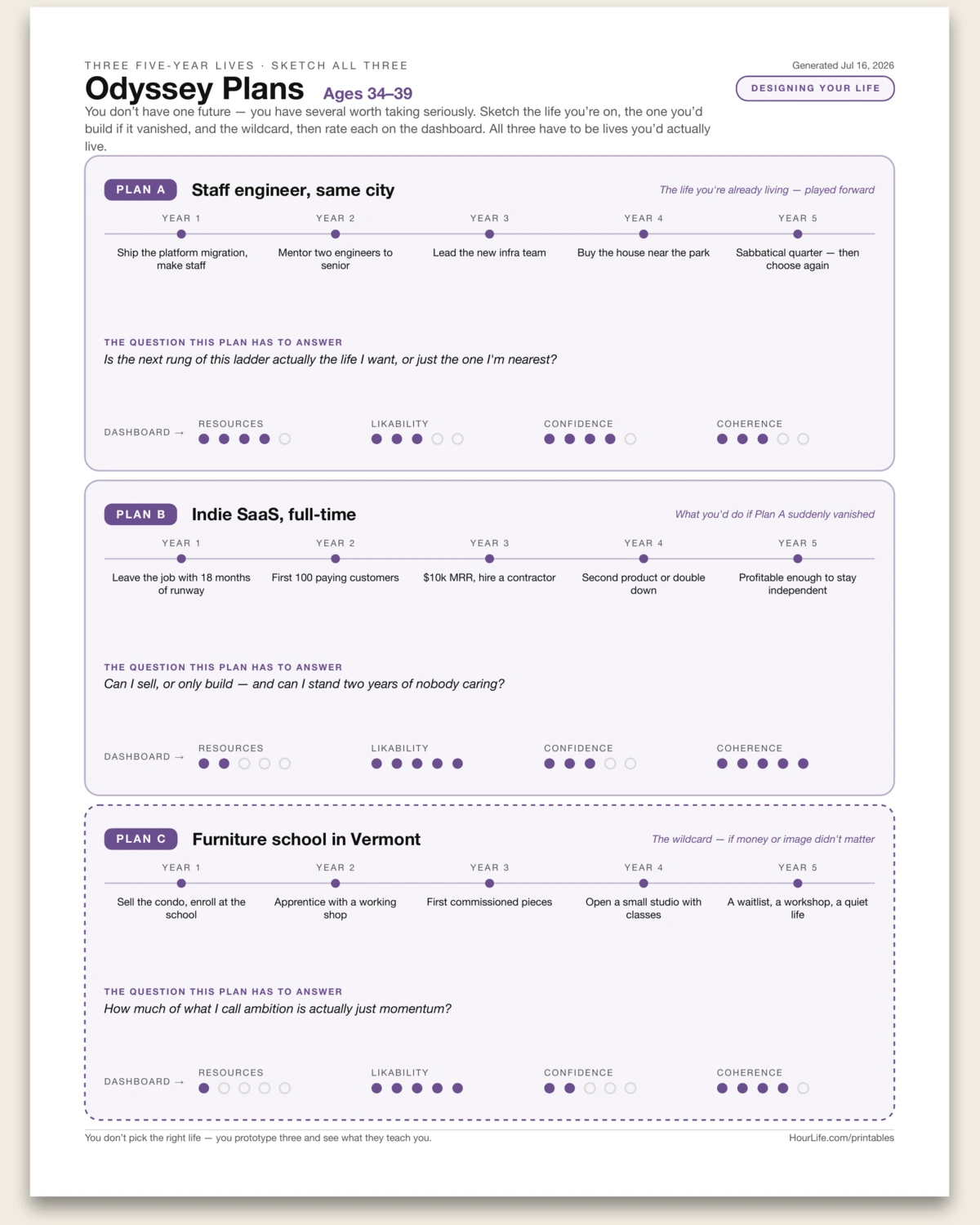
Portrait · 1 page
Odyssey Plans
The three-alternate-lives exercise from Designing Your Life, laid out as parallel tracks you can compare at a glance. Plan A is the life you're already living, played five years forward. Plan B is what you'd build if that path suddenly vanished. Plan C is the wildcard — what you'd try if money or image didn't matter. Each track gets a name, a milestone rail for years one through five, the question that plan has to answer, and a four-gauge dashboard: resources, likability, confidence, coherence. The point isn't picking the right life — it's discovering that you have several worth taking seriously, and seeing what the comparison teaches you. Fill in all three, or print it blank and sketch by hand.
Best for
Anyone at a crossroads — sketching three genuinely different five-year futures side by side instead of agonizing over one.
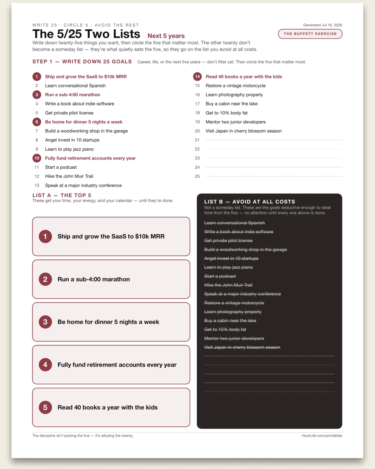
Portrait · 1 page
The 5/25 Two Lists
The focus exercise attributed to Warren Buffett, laid out as the derivation it is. Step 1: write down 25 goals — career, life, the next five years — without filtering. Step 2: circle the five that matter most. Then the twist that makes the exercise work: the other twenty don't become a someday list. They become List B — avoid at all costs — because they're the goals seductive enough to steal time from the five. The sheet shows the whole exercise on one page: the numbered 25-slot brainstorm up top with your picks circled, List A below with the top five in full weight, and List B struck through in a dark panel beside it, where you can see exactly what you're refusing. Star your picks with a leading !, or print it blank and do the circling by hand — the discipline isn't picking the five, it's refusing the twenty.
Best for
Cutting a sprawling list of ambitions down to the five that get your actual time — and making the refusal of the rest explicit.
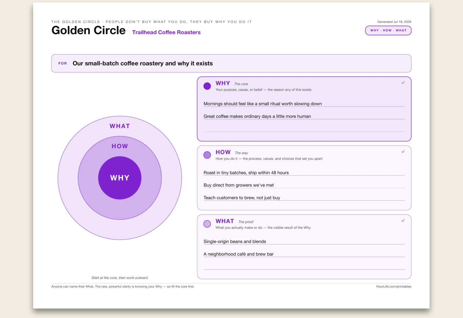
Landscape · 1 page
Golden Circle
A one-page Golden Circle — Simon Sinek's tool for finding the purpose behind what you do. Every person, team, and company can say WHAT they do; some can explain HOW they do it; but almost none can clearly say WHY — the belief or cause that makes it matter. The circle is drawn inside out for a reason: you start at the core with your Why, then wrap it in the How that makes you different, and only then the What you actually make or sell. This sheet pairs the three concentric rings with room to write each one, so you can pin down a Why that's more than a slogan and check that your How and What actually flow from it. Use it for a business, a product, a team's mission, or your own career — anywhere 'people don't buy what you do, they buy why you do it' applies. Print it blank to work it out by hand.
Best for
Clarifying the purpose behind a brand, product, team, or career — starting with Why, then How and What.
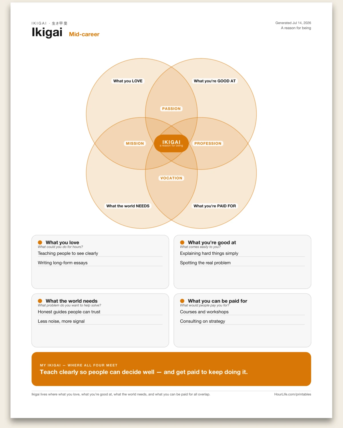
Portrait · 1 page
Ikigai
A one-page worksheet for finding your ikigai — 生き甲斐, the Japanese idea of "a reason for being" that sits where four things overlap: what you love, what you're good at, what the world needs, and what you can be paid for. The four domains print as a true overlapping-circle Venn diagram, with the pairwise overlaps named — Passion, Mission, Profession, Vocation — and your ikigai at the centre where all four meet. Fill in a line or two per domain, then name the one sentence where they converge. Leave any domain blank to reflect on paper.
Best for
Finding the work that's worth getting up for, where four circles meet.
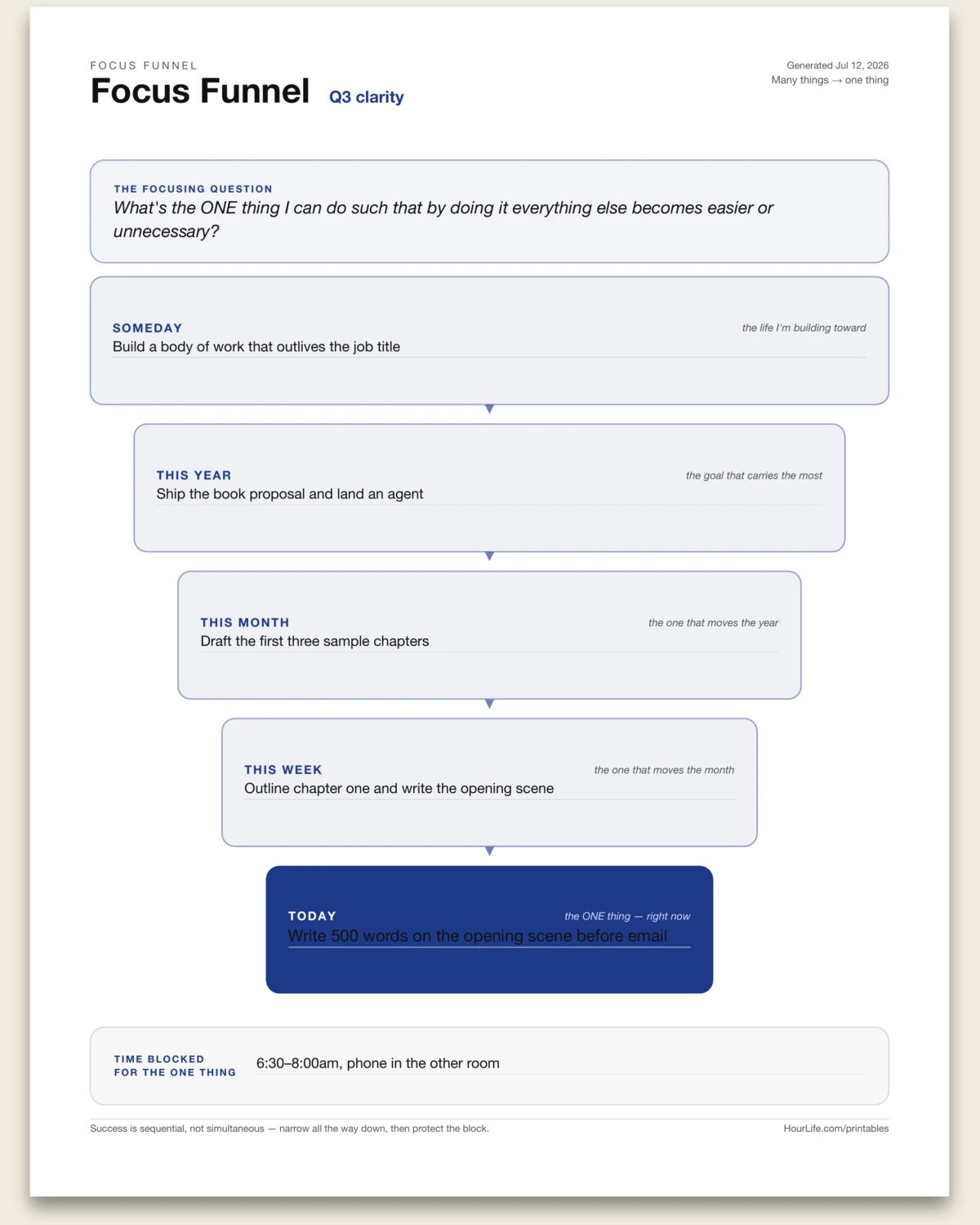
Portrait · 1 page
Focus Funnel
A one-page cascade that narrows a life's worth of ambition down to the one thing to do today. Anchored by the focusing question, five horizons stack and physically narrow — Someday, this year, this month, this week, today — each holding a single line that points at the one below it. A closing time block names when today's one thing actually gets protected. Success is sequential, not simultaneous: narrow all the way down, then guard the block. Leave any horizon blank to fill in by hand.
Best for
Turning a vague sense of what matters into the single thing to do right now.
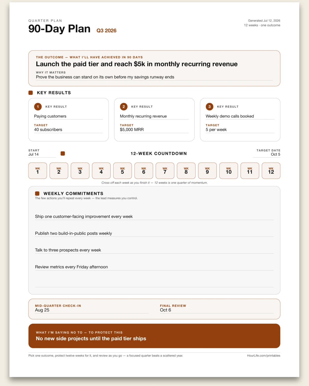
Portrait · 1 page
90-Day Plan
A one-page plan for the next 90 days — one quarter, one outcome. Name the single result you'll have achieved, back it with up to three key results and their targets, and list the few commitments you'll repeat every week to get there. A fixed 12-week countdown strip prints to cross off as momentum builds, with checkpoints and the one thing you're saying no to. Twelve weeks is long enough to change something real and short enough to stay urgent.
Best for
Turning a big goal into one focused quarter you can actually run.
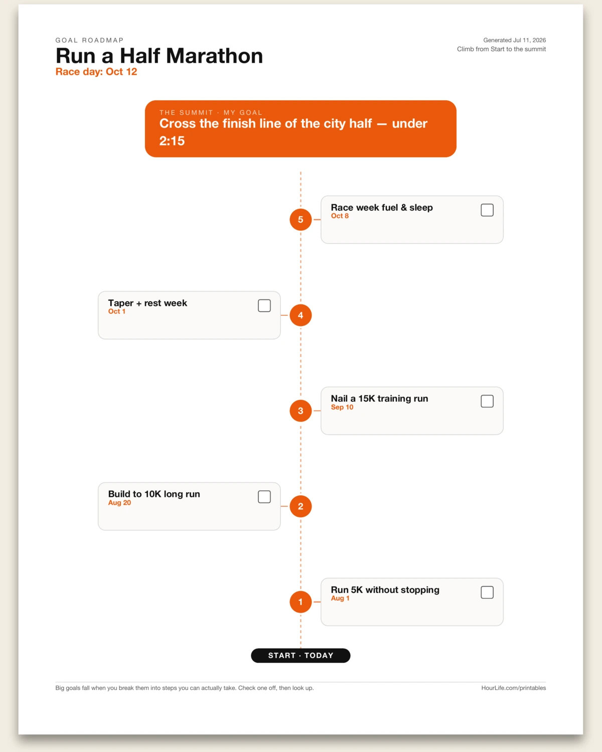
Portrait · 1 page
Goal Roadmap
Put your goal at the summit and lay the milestones out as stepping-stones climbing toward it — numbered, dated, and checkable. A big goal stops feeling impossible when you can see the next step.
Best for
Breaking one big goal into a visible path you can actually climb.
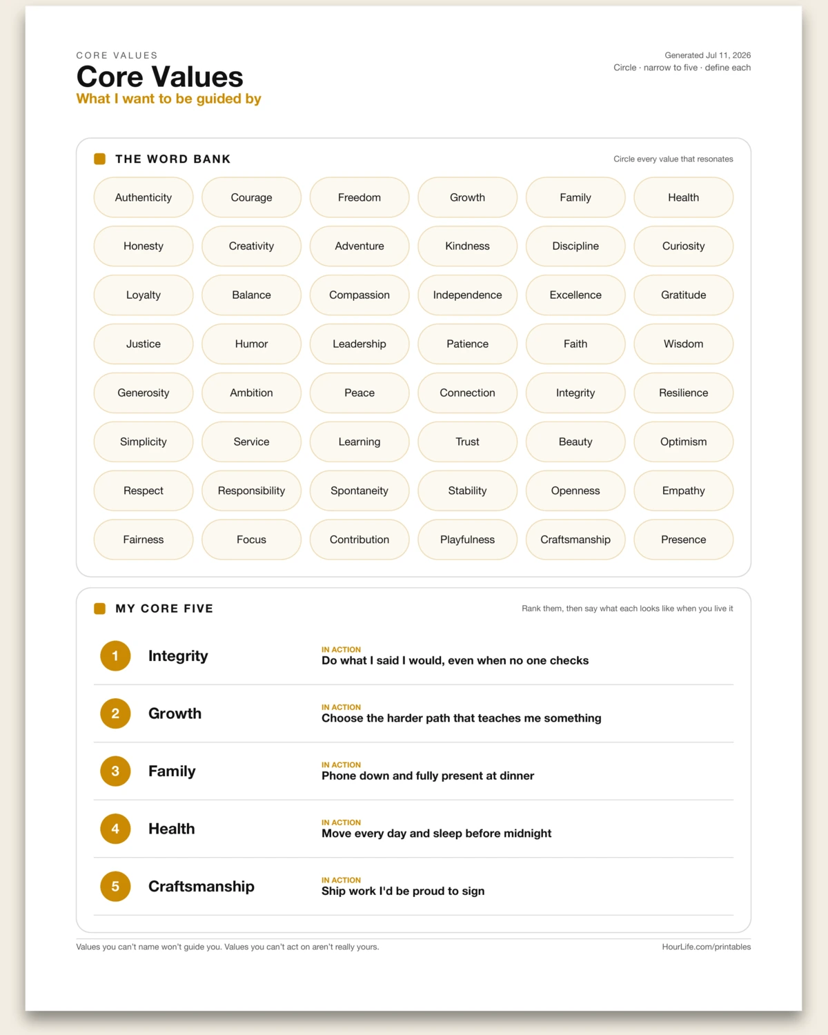
Portrait · 1 page
Core Values
A values-clarification sheet: circle what resonates from a 48-word bank, narrow to your core five, and pin down what each one looks like when you actually live it. Leave the ranking blank to work through on paper.
Best for
Getting clear on what you stand for so decisions get easier.
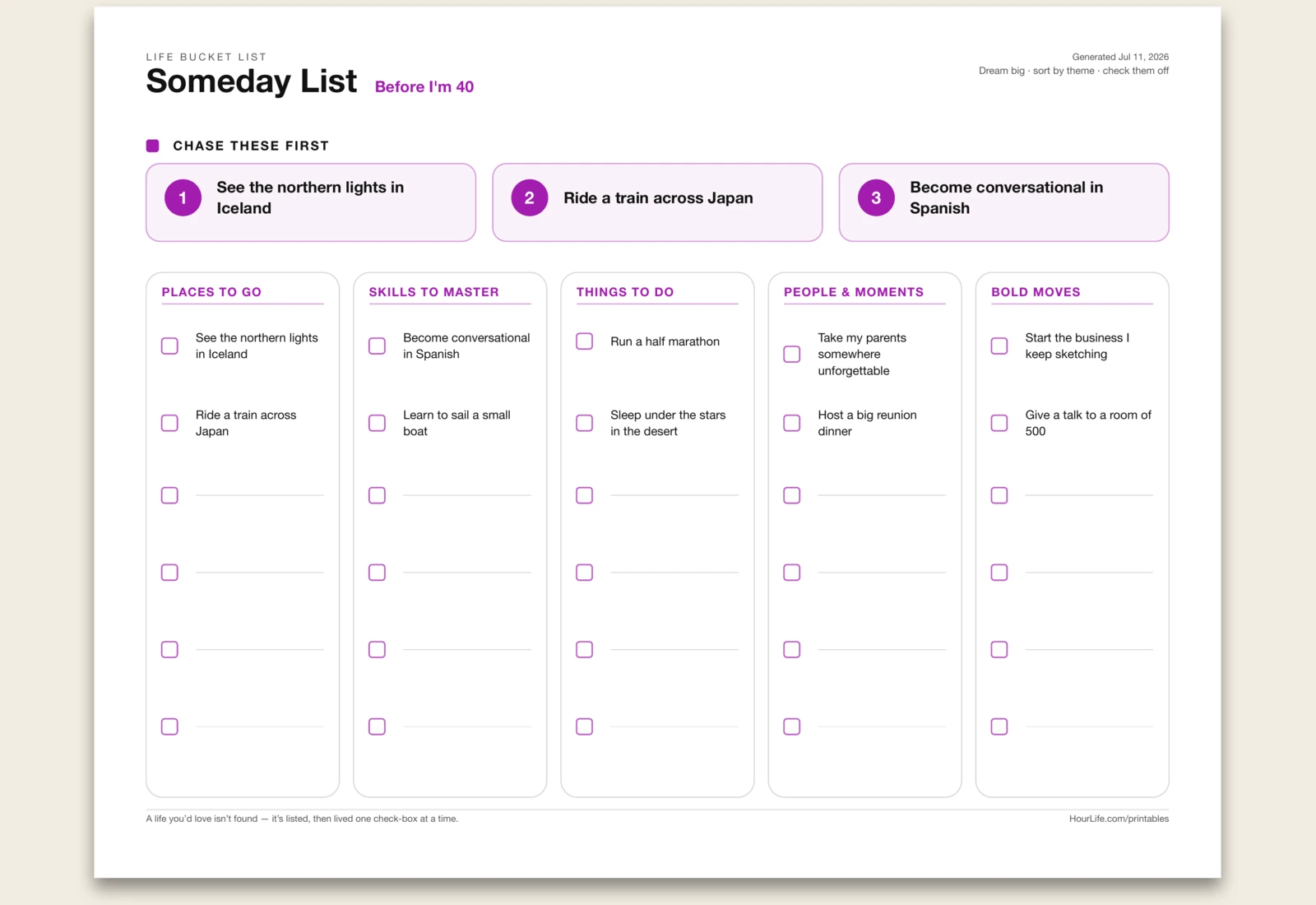
Landscape · 1 page
Bucket List
Get every someday-dream out of your head and onto one page, sorted into five themes — places to go, skills to master, things to do, people & moments, and bold moves — with the three you'll chase first up top. A life you'd love isn't found; it's listed, then lived one check-box at a time.
Best for
Turning a lifetime of vague someday-dreams into a checklist you'll actually start.
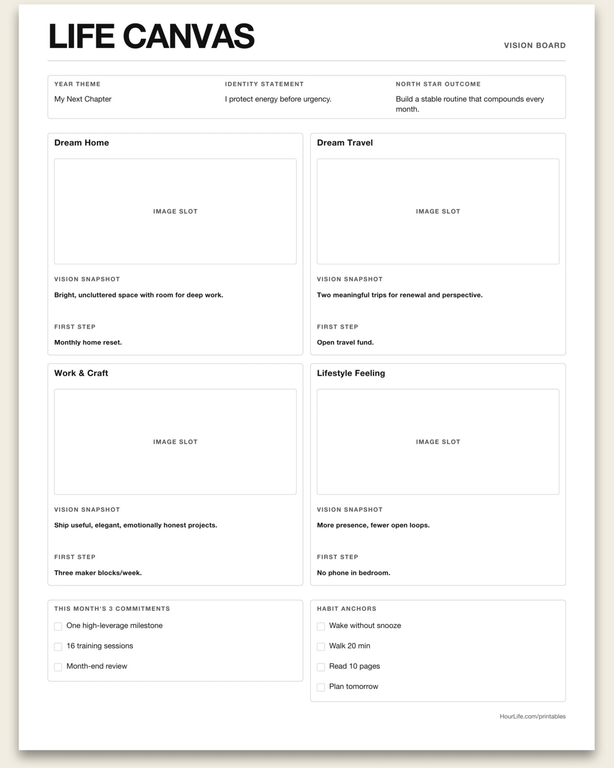
Portrait or Landscape · 1 page
Life Canvas
A guided vision-board worksheet with image slots, life direction prompts, and a weekly action bridge.
Best for
Turning dreams into a visible plan you can execute this week.

Landscape · 1 page
Life Canvas (Lean)
A Lean-style life strategy map that connects purpose, value, skills, mission, and measurable outcomes.
Best for
Designing your life direction with clear tradeoffs and practical execution.
Tracking
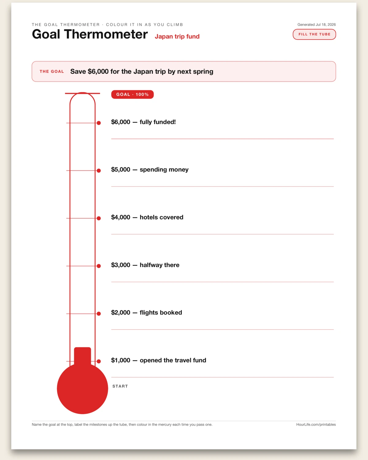
Portrait · 1 page
Goal Thermometer
A one-page Goal Thermometer — the classic fundraising gauge, turned into a visual progress tracker for any countable goal. A number written on a page is easy to ignore; the same number given a rising red column is hard to look away from. This sheet draws a tall graduated tube with a bulb at the bottom and a goal cap at the top. You name the goal in a single line — and, crucially, how you'll count it (dollars saved, pounds lost, miles run, books read, pages written, days done) — then label up to six milestones climbing the tube from just above the bulb to just below the goal. The bulb is where you start; the cap is 100%. Each time you close a little more of the gap, you colour in the mercury up to the mark you've reached, and the filled-in red becomes a progress bar you actually want to grow. Two things make it work. Fixing the milestones in advance turns a vague target into a sequence of near, reachable checkpoints, so momentum comes from passing the next mark rather than staring at the far one. And colouring it in by hand — on a sheet stuck to the fridge, the wall, the studio door — keeps the goal in daily view in a way an app buried on your phone never manages. Use it for savings goals and debt payoff, fitness and weight targets, reading or writing counts, fundraising drives, team quotas, or a kid's chore-and-reward chart. Print it blank to label and colour by hand.
Best for
Tracking steady progress toward any countable goal — dollars, pounds, miles, pages — by labelling milestones up a thermometer and colouring in the mercury as you close the gap.
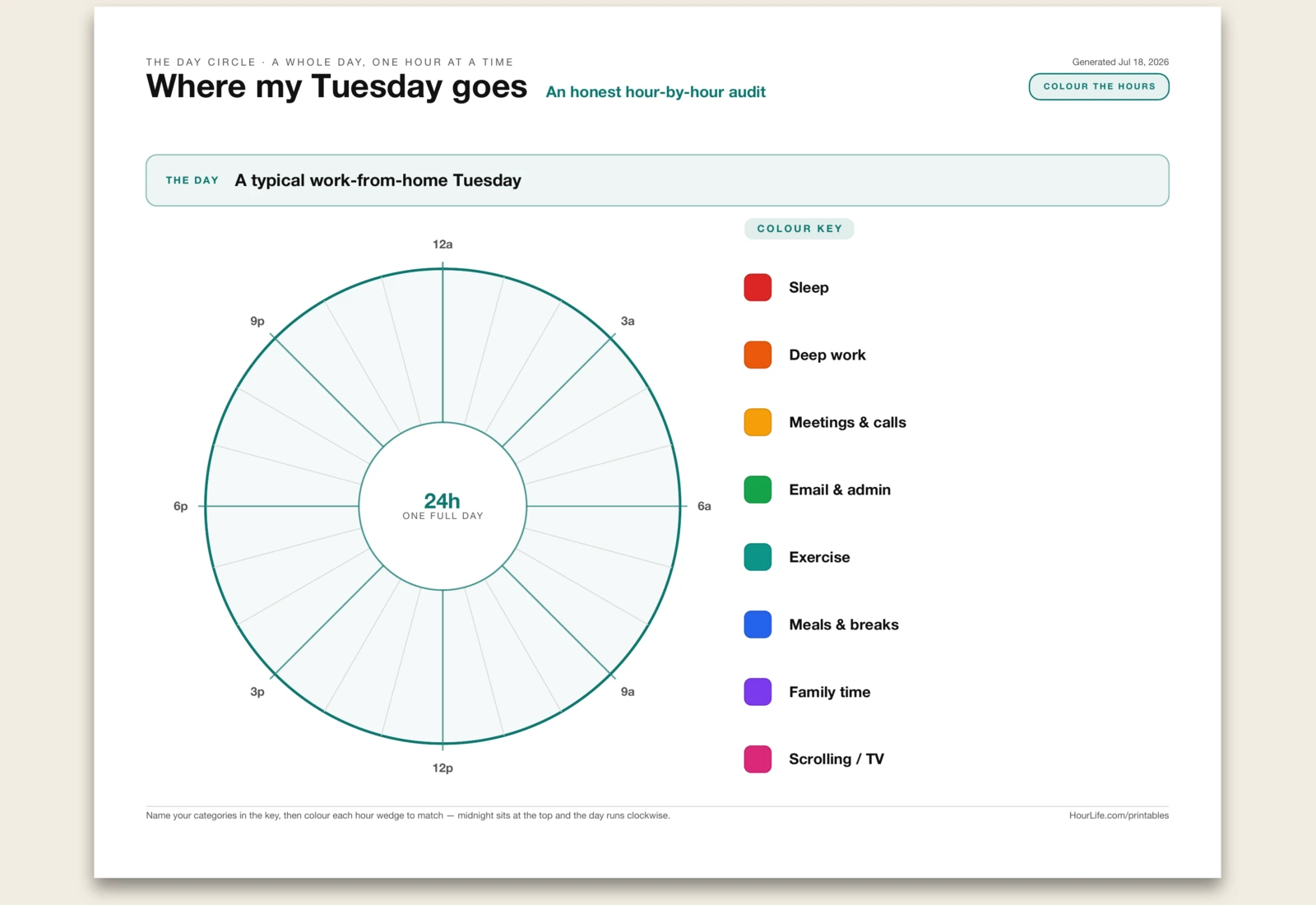
Landscape · 1 page
The Day Circle
A one-page time audit drawn as a 24-hour clock. A to-do list tells you the tasks; it can't show you the shape of a day — how much of it went where, and where it quietly leaked away. This sheet turns a full day into a dial: a donut split into twenty-four wedges, one per hour, with midnight at the top and the hours running clockwise. You build a colour key of up to eight activity categories — sleep, deep work, meetings, admin, exercise, meals, family, scrolling — each tied to a swatch, then colour every hour wedge to match what you actually did with it. Two things make it worth drawing rather than listing. Colouring hour by hour forces an honest account of the whole day, including the in-between hours a list never captures, and the finished circle is glanceable in a way a schedule isn't — a solid block of one colour, or a scatter of another, tells you immediately where your time concentrates and where it fragments. Use it to audit a real day after the fact, to design an ideal day on purpose, to compare a workday against a weekend, or to help a child or a client see their time. Print it blank to name your own categories and colour by hand.
Best for
Seeing where a whole day actually goes by colouring each of its twenty-four hours on a clock face.
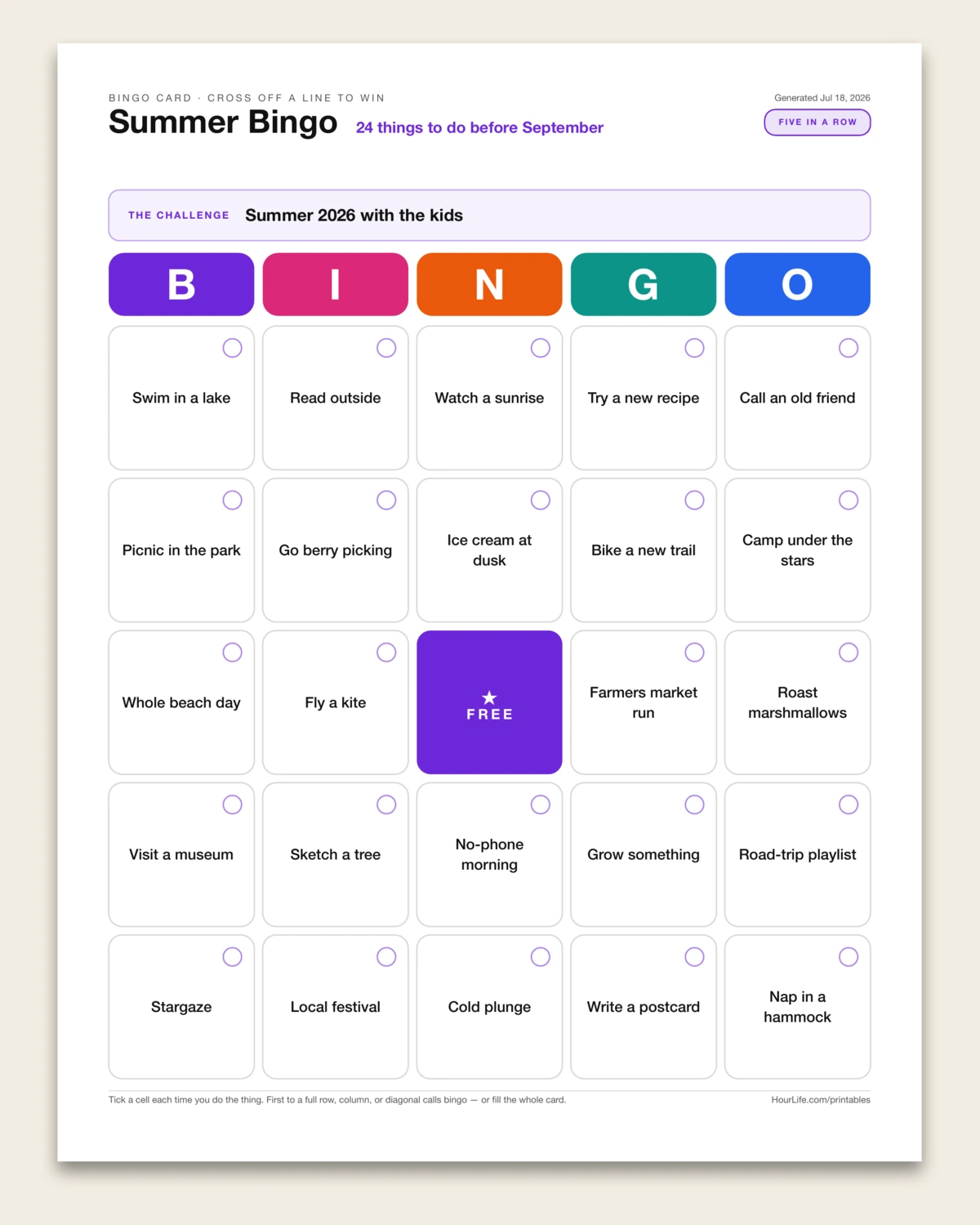
Portrait · 1 page
The Bingo Card
A one-page 5x5 bingo card that turns a goal into a game. A plain checklist is a chore; a bingo card is a small dare you actually want to finish. Twenty-five squares sit under colourful B-I-N-G-O column headers with a free space in the middle, and the rule is simple — tick a square every time you do the thing, and race to complete a full row, column, diagonal, or the whole board. That framing is the trick: turning tasks into a game reframes effort as play, a near-complete line pulls you toward the squares you'd otherwise skip, and the grid quietly rewards variety instead of grinding the same easy win. Fill in up to twenty-four short challenges and they drop into the grid in order around the free centre. Use it for a summer bucket list, a reading dare, a month of trying new things, a fitness or habit streak, a family rainy-day list, a team or classroom icebreaker, a travel or date-night card — anywhere a little friendly competition beats a to-do list. Print it blank to write your own squares by hand, then pin it up and start crossing them off.
Best for
Turning a bucket list, habit streak, or challenge into a playable 5x5 card you tick off square by square.
Landscape · 1 page
The Gauge Dashboard
A one-page gauge dashboard — a row of speedometer dials that turns a handful of scores into a picture you can read in a second. Name what you're measuring, then list up to six things you want to track and give each a score from 0 to 100: readiness, confidence, a habit's consistency, a project's health, a team's morale. Each metric becomes a semicircular dial that fills from left to right, with a needle on the reading and a colour that runs red when it's at risk, amber when it needs watching, and green when it's on track — and the header averages the whole set into one overall score. A column of percentages all looks the same; dials don't. The one sitting in the red draws your eye before you've read a single label, so you always know where to put your attention first. Use it for a launch or go/no-go readiness check, a weekly self-review across your pillars, an OKR or goal-progress snapshot, a project health check, a team pulse, or any scorecard where you'd rather see the numbers than read them. Type a value for each metric and the dials fill and colour themselves, needle and all; leave a value off to print an empty dial and fill it in by hand.
Best for
Turning a handful of 0–100 scores — readiness, confidence, habits, project health — into a row of colour-coded speedometer dials you can read at a glance.
Landscape · 1 page
The Calendar Heat Strip
A one-page calendar heat strip for seeing one dated sequence as a narrow run of intensity cells. Every cell is one date, sorted chronologically, and its colour shows how that day's value compares with the rest of the range. It is intentionally not a full heatmap grid: the point is a scanable strip that shows streaks, spikes, quiet gaps, and momentum without making you read a table or inspect a month calendar. Use it for deep-work minutes, pages written, workouts, sleep quality, mood ratings, symptoms, spending, calls made, outreach, lessons studied, habit streaks, or any daily measurement where the sequence matters. Choose whether high values or low values should be darkest, add one dated value per line, and the strip scales itself. Leave it blank to print an empty sequence and shade it by hand.
Best for
Tracking one dated sequence as a compact intensity strip — deep-work minutes, pages written, workouts, sleep, mood, symptoms, spending, outreach, or habit streaks.
Landscape · 1 page
The Violin Plot
A one-page violin plot for comparing grouped distributions by shape, not just by a five-number summary or a stack of bars. Each group takes raw observations and turns them into a mirrored density silhouette on one shared vertical value axis. Where the shape gets wide, values pile up; where it narrows, readings are sparse. A median crossbar keeps the middle visible without flattening the whole story into one number. Use it for response times across teams, test scores across classes, prices across stores, sleep duration across weeks, workout results across programs, survey ratings across cohorts, delivery lead times across vendors, or any grouped measurements where spread and clustering matter. Unlike a histogram, it compares several distributions side by side; unlike a box plot, it keeps the distribution silhouette visible. Type one group per line with its raw observations and the violins compute themselves. Leave it blank to print clean mirrored frames and sketch by hand.
Best for
Comparing grouped distributions by shape — response times, scores, prices, sleep, survey ratings, lead times, or any raw observations split by group.
Landscape · 1 page
The Bump Chart
A one-page bump chart for seeing how rankings change across ordered rounds. Each contender gets a line that moves through rank lanes, with rank 1 fixed at the top and lower positions beneath it. The crossings are the useful part: they show overtakes, sudden drops, stubborn leaders, and quiet climbers without pretending the gaps between ranks are measured values. Use it for quarterly priorities, product ideas, book candidates, sales regions, habits, risks, search terms, workout metrics, or any set of things competing for position over time. Unlike a slopegraph, it is not a two-column before-and-after value comparison; it is a multi-round race for rank. Type the round names once, then list each contender with its rank in each round. Leave it blank to print rank lanes and draw the race by hand.
Best for
Tracking rank changes across repeated checkpoints — priorities, candidates, regions, habits, risks, keywords, or any list whose order changes over time.
Landscape · 1 page
The Streamgraph
A one-page streamgraph — the flowing stacked-area chart for seeing how several streams swell, shrink and trade weight across ordered periods. Each row is a period and each named series becomes a coloured layer, but instead of stacking from a hard zero baseline like a bar chart, the whole stack floats around a centreline. That floating baseline makes the shape read like current in a river: surges, dips, handoffs and quiet fades stand out before you read the numbers. It is best when the story is not one exact value but the changing mix over time — hours shifting between deep work, meetings, recovery and play; revenue moving between product lines; topic volume by month; effort by workstream; attention across a season; energy across a week. A stacked bar compares period by period, but a streamgraph makes continuity visible. Type the stream names once, then list each period with a value for each stream; the layers centre, scale and colour themselves. Leave it blank to print the flowing frame and sketch the streams by hand.
Best for
Showing how several parts swell and recede across ordered periods — time audits, revenue mix, topic volume, project effort, or attention streams.
Landscape · 1 page
The Candlestick Chart
A one-page candlestick chart — the compact market chart that shows not just where a number ended, but the full fight between its high, low, open and close. Each row becomes one candle: a thin wick spans the period's low-to-high range, while the thicker body runs from open to close. Green bodies closed higher than they opened, red bodies closed lower, and grey bodies finished flat. A line chart can show the close, but it hides the volatility inside each period; a candlestick keeps the extremes visible, so long wicks, narrow bodies, reversals and tight ranges all stand out immediately. It is natural for stocks, ETFs and crypto, but it also works for any ordered range log: weekly product prices, inventory level swings, blood glucose ranges, project burn ranges, or anything with a start, a high, a low and an end. Type one ordered period per line as label, open, high, low and close; the sheet fits the shared price axis, colours each candle and summarizes the net move. Leave it blank to print a trading frame and mark candles by hand.
Best for
Tracking ordered open/high/low/close movement — stock or ETF snapshots, weekly price ranges, crypto logs, inventory swings, or any period with a start, extremes and an end.
Landscape · 1 page
The Ternary Plot
A one-page ternary plot — the triangle for choices with exactly three ingredients. Each row is one point, and its three numbers are normalised to 100% before being placed inside the field: more of the first component pulls it toward the top corner, more of the second pulls it toward the bottom-left, and more of the third pulls it toward the bottom-right. That makes it ideal for patterns that disappear in a table: months in a 50/30/20 budget, meals across protein/carbs/fat, investments across stocks/bonds/cash, project time across build/review/admin, or weeks split between work/rest/play. Put several points on the same triangle and the cluster tells you the habit immediately — stable near the centre, drifting toward one corner, or scattered because the mix is not under control. Unlike a pie chart, which shows one composition at a time, a ternary plot lets many three-part compositions share one page without multiplying charts. Type three corner names, then list each point as a label and three values; raw amounts and percentages both work because every row scales itself. Leave it blank to print the triangle and mark the points by hand.
Best for
Comparing many three-part mixes at once — budget needs/wants/savings, macros, portfolio splits, or work/rest/play — as points inside one triangular field.
Landscape · 1 page
The Sankey Diagram
A one-page Sankey diagram — the flow chart that answers "where does it all go." A quantity leaves a column of sources on the left and arrives at a column of destinations on the right, and the width of every ribbon between them is proportional to how much flows along it, so the fat bands and the thin ones show at a glance where the weight of the total actually lands. Each node's height is the sum of everything passing through it, and because the ribbons stack edge to edge inside every node nothing is wasted or double-counted — the diagram is honest by construction. It is the right picture the moment a single total fans out into parts that each have their own story: a month's take-home pay into housing, food, savings and fun; website visitors into signups, browses and bounces; job applicants through screen, interview and offer; a country's energy into the sectors that burn it. Where a stacked bar flattens the split into one column and a pie hides the connections entirely, a Sankey keeps both ends visible at once, so you see not just how big each destination is but which source fed it — and ribbons coloured by their source read as families as they cross. List one flow per line as a source, a destination and a value and the ribbons size, colour and stack themselves; leave it blank to print an empty frame and sketch the flows by hand.
Best for
Showing where a total splits and goes — a budget into categories, traffic into outcomes, applicants through stages, energy into uses — as proportional ribbons from sources on the left to destinations on the right.
Landscape · 1 page
The Histogram
A one-page histogram — the chart that takes a heap of raw readings and shows you their shape. Paste a column of numbers — response times, test scores, order values, ages, delays — and the tool sorts them into evenly-spaced ranges along a number line and counts how many land in each, then draws a bar for every range as tall as its count. Where the numbers pile up the bars stand tall; where they thin out the bars shrink; and the silhouette across the top tells you at a glance whether the data is bunched or spread, symmetric or lopsided, single-peaked or split in two. It picks a tidy round bin width for you — 1, 2, 5, 10 and the like — so the axis edges stay legible, or you can ask for a rough number of bins and it fits the nearest clean width. The mean is drawn as a solid line and the median as a dashed one, laid straight over the bars, so you can see how the average sits inside the spread and how far a long tail has dragged it off the middle. Unlike a bar chart, whose bars are separate labelled categories with gaps between them, a histogram's bars touch, because the axis underneath is one continuous number line cut into slices — which is exactly why it is the natural partner to a box plot: the box plot boils a distribution down to five numbers, the histogram shows its whole outline. Paste your numbers in any layout — a column, a row, comma- or space-separated — and they sort, bin and count themselves; leave it blank to print an empty frame and tally by hand.
Best for
Seeing the shape of a pile of raw numbers — where they cluster, how they spread, whether they lean — as a row of touching bars over a number line, with the mean and median drawn on top. Response times, test scores, order values, ages, delays.
Landscape · 1 page
The Rose Chart
A one-page rose chart — a polar area diagram, the kind Florence Nightingale made famous — the mirror image of a pie. On a pie the slice's angle carries the value and every slice reaches the same distance out; here every wedge takes an equal slice of the circle and the value is carried by how far it reaches from the centre. That swap is exactly what you want when the thing you're plotting runs around a cycle, because then the position on the dial means something in itself: the twelve months of a year, the seven days of a week, the twenty-four hours of a day, the points of a compass. Laid out this way the shape tells the story at a glance — a fat lobe where the summer rain falls, a lean stretch across the quiet weekend, a spike at the morning rush — the way a plain row of bars, stripped of its circle, never quite does. The biggest value fills the outer ring and the rest scale against it, dotted rings mark the scale, each wedge is labelled around the rim, and the peak category is called out to the side with the sector count and running total. It works best for a value measured once for each step around a repeating cycle — rainfall or sales by month, focus hours or steps by day, calls or traffic by hour, wind or moves by direction. List a label and its value per line and the wedges fan out, size, colour and label themselves; leave it blank to print an empty dial and shade it in by hand.
Best for
Showing a value around a repeating cycle so its rhythm reads as a shape — rainfall by month, focus hours by day, calls by hour, wind by compass point — as equal wedges whose reach from the centre is their size.
Landscape · 1 page
The Box Plot
A one-page box plot — the box-and-whisker chart — the one picture that compares whole distributions instead of the averages that hide inside them. Paste a raw list of readings for each group and the tool works out the five-number summary — the minimum, the lower quartile, the median, the upper quartile and the maximum — and draws the familiar box: it spans the middle half of the data, a line marks the median, and whiskers reach to the furthest points still inside one-and-a-half times the interquartile range. Anything past that is drawn as an outlier ring. Because every group shares one horizontal axis you can read four things at a glance that a single number can't tell you: where the typical value sits (the median line), how spread out the group is (the box width), whether it leans high or low (a median sitting off-centre in its box), and which readings are unusual (the rings). It's the right chart the moment "what's the average?" stops being enough — test scores across classes, response times across servers, prices across stores, delivery times across days, salaries across roles. Unlike the other charts here it takes the raw observations, not pre-totalled figures, so you can drop in a column of numbers straight from a spreadsheet. List a label and its list of numbers per line and the boxes, whiskers and outliers all compute themselves; leave it blank to print a bare axis and sketch by hand.
Best for
Comparing the spread and skew of several groups from their raw readings — test scores by class, response times by server, prices by store — as boxes with a median line, whiskers and outlier rings on one shared axis.
Landscape · 1 page
The Marimekko
A one-page marimekko — a mosaic or Mekko chart — the one chart that shows how big each category is and how its make-up differs, at the same time. Every category becomes a vertical column, and the columns tile the full width, so a column's width is that category's share of the grand total: a wide column is a big category, a narrow one is small. Each column is then split top to bottom into coloured segments, one per series, every column running the full height so the bands read as shares of that category. Together you can see a region that dominates the revenue and, in the very same column, that it leans on a single product; a small channel whose mix looks nothing like the big ones. A plain stacked bar can only show the mix, every bar the same width — the marimekko adds the size for free, because the eye reads a wide-and-tall block as genuinely large. The series are named and colour-coded through a shared legend, each column carries its total and width share up top, and wide-and-tall segments show their percentage. It works best for a handful of categories whose sizes really differ — revenue by region split by product, spend by channel split by campaign, market by segment split by brand, headcount by department split by role. List your series once, then a category and its values per line, and the widths, heights, colours and labels all place themselves; leave it blank to print an empty frame and fill it by hand.
Best for
Comparing categories that differ in size and in mix at once — revenue by region split by product, spend by channel split by campaign — as columns whose width is the total and whose height is the breakdown.
Landscape · 1 page
The Pictograph
A one-page pictograph — the isotype or unit chart your school textbooks used — that turns each amount into a row of little squares, every square worth the same fixed quantity, so a bigger number is simply more squares. It trades the length of a bar, which your eye has to measure against an axis, for a count, which you read the way you read a tally: ten squares beats six, and you never had to glance at a scale to know it. That makes it friendlier than a bar chart for anyone skimming the page, and it is the classic way to make a statistic land — one square per thousand people, per hour, per dollar — because the quantity sits right there to be counted. One shared "each square equals" scale runs across every row, picked automatically as a round number so your biggest row fits neatly, or set by hand when you want a specific unit; the last square in a row part-fills to show the leftover. Each row keeps its exact value on the right and the header totals them up. It works best for a handful of categories you want to compare at a glance — hours by activity, sales by product, servings by food group, spending by category, headcount by team. List a label and an amount per line and the squares, scale and part-fills all place themselves; leave it blank to print an empty grid and shade the squares in by hand.
Best for
Making a handful of amounts easy to compare by counting instead of measuring — hours by activity, sales by product, servings by group — as rows of equal-value squares on one shared scale.
Landscape · 1 page
The Dumbbell Chart
A one-page dumbbell chart — a connected dot plot — that lines your categories down the page and puts every one on a single shared value axis: a dot for the start reading, a dot for the end reading, and a bar joining them. The bar's length is the gap between the two, and its colour is the direction — green where the number climbed, red where it slipped — so a whole page of rows sorts itself into gainers and losers before you have read a single figure. It is the cleaner cousin of two bars side by side: rather than making your eye compare two heights, it draws the change itself as one horizontal stretch, and because every row shares the same axis, a long bar really is a big move and a short one really is small. It is built for a before-and-after story told across many items at once — key metrics at the start of a program versus ninety days in, this year against last across regions, planned versus actual by project, a survey scored at two points, prices then and now. Each dot carries its exact value, ticks mark the scale along the bottom, a signed change pill sits at the end of every row, and the header tallies how many rose against how many fell. It reads best when the rows share a unit and a rough scale, so the bars stay comparable at a glance. List a label and its two readings per line and the dots, bar, colour and pill all place themselves; leave it blank to print the bare axis and plot the pairs by hand.
Best for
Showing the change in many items at once — start vs now, this year vs last, plan vs actual — as paired dots on one shared axis, so the gaps and directions line up for a clean before-and-after read.
Landscape · 1 page
The Heatmap
A one-page heatmap that lays your numbers out as a grid — rows down the side, columns across the top — and shades every cell by its value against one shared scale, so the hot spots and the cold spots jump off the page before you have read a single figure. It is the fastest way to find the pattern hiding in a table: the morning column that is always dark, the one region that never lifts, the day of the week that quietly sags. Where a wall of numbers makes you compare cells one pair at a time, colour sorts them for you — your eye lands on the darkest tile and the palest tile in an instant, and everything in between ranks itself by tone. Every cell still carries its exact number when there is room, and a gradient key below the grid ties the colours back to the values, so it reads as both a picture and a table at once. You choose which way the scale runs: high values dark, for the thing you are watching grow, or high values light, for the thing you want to shrink — cost, errors, wasted hours. Blank cells stay empty rather than pretending to be zero, so a half-filled grid stays honest. Name the columns once, then give each row a label and a value per column, and the grid shades, scales and labels itself. Use it for focus by day and time block, habit consistency week by week, scores by person and skill, sales by month and region, or any table where the shape of the numbers matters more than the digits.
Best for
Finding the pattern in a table of numbers — hours by day and time, scores by person and skill, sales by month and region — by shading every cell on one shared scale so the hot and cold spots stand out at a glance.
Landscape · 1 page
The Donut Chart
A one-page donut chart that takes one whole — a budget, a day, a portfolio, a project's effort — and splits it into wedges, each drawn to its share of the total and laid clockwise from twelve o'clock, so the biggest part is the first thing your eye meets. It answers the question a column of numbers makes you work out in your head: what actually dominates, and by how much. In donut style the hole in the middle holds the running total, so you read the parts against the sum without any arithmetic; in pie style the wedges meet at the centre for the plainest possible picture. Because the whole point is proportion, every wedge carries its share as a percentage right on it when it is wide enough, and a legend down the right names each colour with its exact value and share so even a thin sliver stays readable — the largest part is called out at the top. It works best with a handful of parts, from two to eight, where each is a clean piece of a single whole; when there are many small pieces a treemap or a bar reads better, but for a few big shares nothing beats the circle. Use it for a monthly budget by category, where your day's twenty-four hours go, an investment portfolio by holding, revenue by product line, website traffic by source, a vote or survey split by option, or storage by folder — any whole you want to break into a few proportional parts. List a label and a value per line and the wedges size, colour, order and label themselves; leave it blank to print a guide ring and shade it in by hand.
Best for
Breaking one whole into a few proportional parts and seeing what dominates — a budget by category, a day's hours, a portfolio by holding — as colour-coded wedges, donut or pie, each carrying its share.
Landscape · 1 page
The Stacked Bar Chart
A one-page stacked bar chart that takes several categories — months, quarters, teams, people — and draws each as one horizontal bar broken into coloured segments, one per named series, so you compare not just the totals but the make-up behind them. In share mode every bar fills the width and the segments show each series' slice of the whole, which is the cleanest way to see a mix shift — rent creeping up as a share of the budget, one product taking a bigger cut of revenue, meetings eating more of the week. In value mode the bars scale to the largest total instead, so length shows magnitude and the segments still show the split, giving you size and mix in one picture. It beats a table of numbers because the eye adds and divides for you: a fat coloured block is an obvious chunk, a sliver is an obvious minority, and a colour that grows bar over bar tells the story at a glance. The series are named and colour-coded through a shared legend, each wide segment carries its own value or share, and the row total trails each bar. Use it for a budget by expense type across months, revenue by product line across quarters, where your time goes by activity across the week, headcount by team across departments, a survey's answers by option across groups, or any parts-of-a-whole you want to compare across categories. Name your series once, then list a category and its values per line, and the bars, colours and labels draw themselves; leave it blank to print empty tracks and shade them in by hand.
Best for
Comparing the make-up of several categories at once — a budget by expense across months, revenue by product across quarters, where the week goes by activity — as bars split into colour-coded series, in share or absolute mode.
Landscape · 1 page
The Funnel Chart
A one-page funnel chart that stacks the stages of a sequence — visitors to signups to paid, leads to demos to deals, applicants to hires — and draws each as a band whose width scales to its value, centred on a spine so the whole thing tapers as people fall away. Because every band is measured against the top stage, you read the drop-off as a shape: a gentle slope means most carry through, a sharp pinch shows exactly where you are losing them, no arithmetic required. It beats a column of counts because it does the dividing for you — each stage carries its own value, its share of the top stage in bold, and the step conversion and loss from the stage above in the right rail — so the leak is impossible to miss and easy to talk about. Stages keep the order you type them, since a funnel is a sequence and not a ranking, the bands deepen in colour as they narrow for depth, and an optional unit turns raw counts into dollars of pipeline or percentages. It works best when each stage is a subset of the one before it. Use it for a marketing or signup funnel, a sales pipeline by deal value, a hiring or recruiting funnel, a checkout or onboarding flow, a fundraising ladder, a content or ad funnel, or any drop-off you want to see stage by stage. List a label and a value per line, widest first, and the bands, colours, percentages and drop-offs draw themselves; leave it blank to print an empty funnel and fill it in by hand.
Best for
Seeing where a sequence leaks — visitors to signups to paid, leads to deals, applicants to hires — as a tapering stack of bands, each carrying its share of the top and the drop from the stage above.
Landscape · 1 page
The Diverging Bars
A one-page diverging bar chart that lines up two sides of the same set — this vs that, ours vs theirs, then vs now — and draws each category as a matched pair of bars growing out from a shared centre spine: one to the left, one to the right. Because both sides ride the same magnitude axis, the bars are directly comparable — the longer one wins the row, and the whole comparison reads as a shape the way a population pyramid tilts. It beats two columns of numbers because it does the comparing for you: no subtracting in your head, just longer-bar-wins, row after row, with the winning value picked out in bold. The two sides are named and colour-coded — teal on the left, rose on the right — each bar carries its value at the tip, and the header tallies the running total for each side so you can see which one leads overall. It works best when both sides share a scale — dollars against dollars, counts against counts, percentages against percentages, hours against hours. Use it for a budget planned against actual, head count by department across two years, revenue this year versus last, votes for against a motion, time you meant to spend versus what you did, men versus women or age groups in a population, survey agree versus disagree, or any set you measured on two sides and want to weigh against each other. List a label and its two numbers per line and the bars, colours, values and totals draw themselves; leave it blank to print the empty tracks and fill them in by hand.
Best for
Weighing two sides of the same set against each other, category by category — planned vs actual, this year vs last, us vs them — as mirrored bars on one shared axis where the longer bar wins.
Landscape · 1 page
The Bullet Graph
A one-page bullet-graph scorecard: each metric is a single horizontal bar read against a target tick, laid on a track of graded qualitative bands, so you see not just the number but whether it is short, fair or good. It is the compact, honest cousin of a gauge — stack several metrics down the page and you have a one-glance review where a green bar cleared its target and a red bar fell short, no squinting at needles. Because each row keeps its own scale, metrics in completely different units — dollars of revenue, a satisfaction score, tickets closed, active users, uptime — still line up neatly and read the same way, with the exact value and the gap to target spelled out beside each bar; leave the scale off same-unit rows and they share one axis so their bars compare directly. The graph reads higher-as-better, so track the thing you want to grow. Use it for a quarterly OKR or KPI check, a weekly review of your own numbers, a fundraising or sales dashboard, a fitness or training scorecard, a reading or writing pace, a savings-goals panel, or any handful of measures you want to grade against their marks in one picture. List a label and a value per line, add a target and a scale where you have them, and the bars, bands, ticks and read-outs draw themselves; leave it blank to print empty tracks and mark them up by hand.
Best for
Grading a handful of metrics against their targets in one glance — a quarterly KPI check, a weekly review, a goals dashboard — as horizontal bars with target ticks and graded bands.
Landscape · 1 page
The Slopegraph
A one-page slopegraph that takes two snapshots of the same set of things — start vs now, plan vs actual, last quarter vs this one — and draws each item as a single line sloping from its first reading to its second. The slope is the whole story: a line that climbs went up, one that falls went down, and where two lines cross, they swapped rank. It is the chart for a before-and-after conversation, because two columns of numbers make you do the subtraction in your head while a slopegraph makes the winners and losers pop off the page. One shared axis fits both columns, so it works best when your values share a scale — survey scores, percentages, prices, times, ratings — and each end is labelled with its number so nothing is lost. Green lines mark what rose and red lines what fell, the change is spelled out as a coloured pill on the right, and the header tallies how many climbed against how many dropped. Use it to compare an engagement survey quarter over quarter, prices this year against last, your habits at day 1 versus day 90, budget planned against actual, exam scores before and after a course, team rankings across a season, or any set you measured twice and want to see move. List a label and its two readings per line and the lines, dots, colours and pills draw themselves; leave it blank to print two bare columns and slope by hand.
Best for
Comparing the same set of things across two moments — before vs after, plan vs actual, Q1 vs Q2 — as sloping lines that climb or fall so the movers stand out at a glance.
Landscape · 1 page
The Trend Chart
A one-page line chart that plots a single number across an ordered set of readings and joins them into a trend line, so a column of figures — your weight each Monday, the savings balance each month, a mood or energy score each week, weekly sales — turns into a shape you can read left to right. A table tells you where you are; the line tells you where you're heading, and whether the last dip was a blip or the start of a slide. The axis fits itself to your data rather than forcing a zero baseline, so a weight that only ever wanders between 182 and 198 still fills the frame and shows every wobble instead of flatlining in a corner. An optional target draws a dashed line to aim for, the low and high points and the first and last readings are called out, and the header states how far the number travelled from start to finish. A soft fill under the line makes the overall drift easy to see even from across the room. Use it for a weigh-in log, a savings or debt-payoff curve, a run of test scores, a mood tracker, a habit streak count, a page-count or word-count climb, blood pressure or resting heart rate, or any single figure you take again and again and want to watch move. List the readings in order and the line, dots, labels and fill draw themselves; leave them blank to print an empty grid and plot the points by hand on the wall.
Best for
Plotting one number over an ordered series of readings — weight, savings, a mood score, weekly sales — as a connected line with an auto-fitting axis and an optional target.
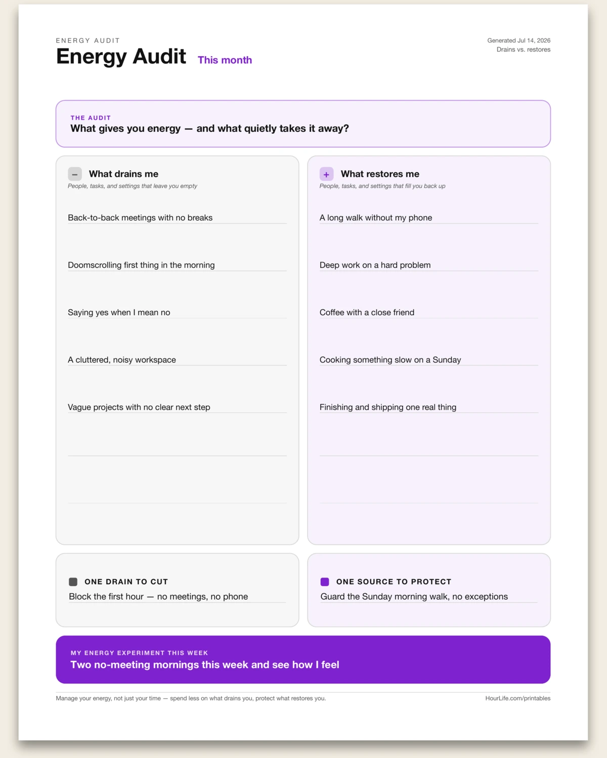
Portrait · 1 page
Energy Audit
A one-sitting audit — not a daily tracker — of what drains your energy against what restores it, laid out as a balanced two-column ledger. List the people, tasks, and settings that leave you empty on one side and the ones that fill you back up on the other, then commit to one drain to cut, one source to protect, and one experiment to run this week. Manage your energy, not just your time: seeing the two columns side by side makes the trade obvious. Leave any line blank to fill in by hand.
Best for
Seeing at a glance what drains you and what restores you, so you can spend less on one and more on the other.
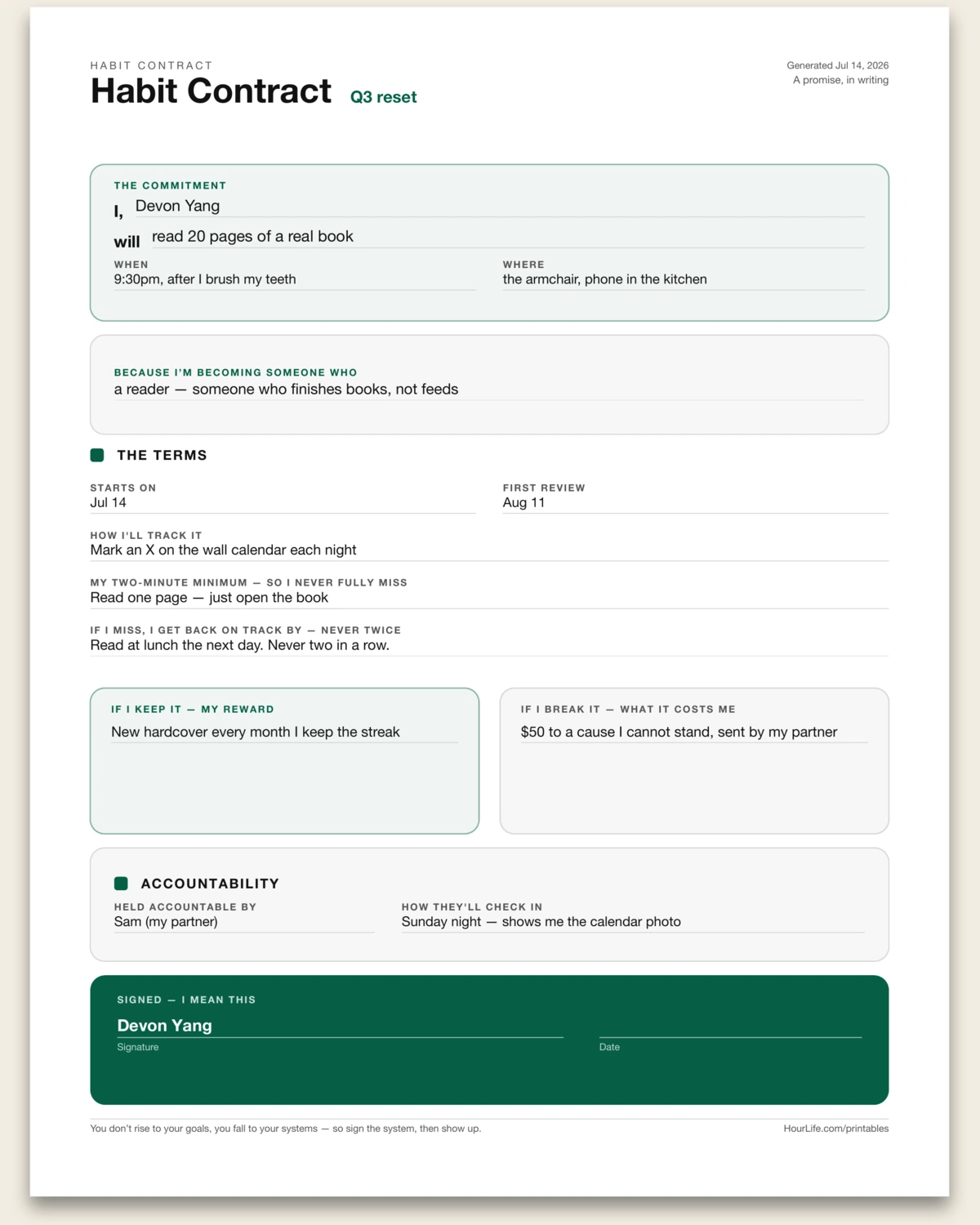
Portrait · 1 page
Habit Contract
A one-page commitment device you fill in and sign by hand. State the habit as a plain intention — I will do this, at this time, in this place — name the identity behind it, then set the terms: how you'll track it, the two-minute minimum so you never fully miss, and the recovery rule so a slip never becomes a spiral. Put real stakes on both sides, name who's holding you accountable, then sign and date it. A habit you've signed for is harder to walk away from than one you merely meant to keep. Leave anything blank to write in by hand.
Best for
Turning a habit you keep meaning to start into one you've put your name to.
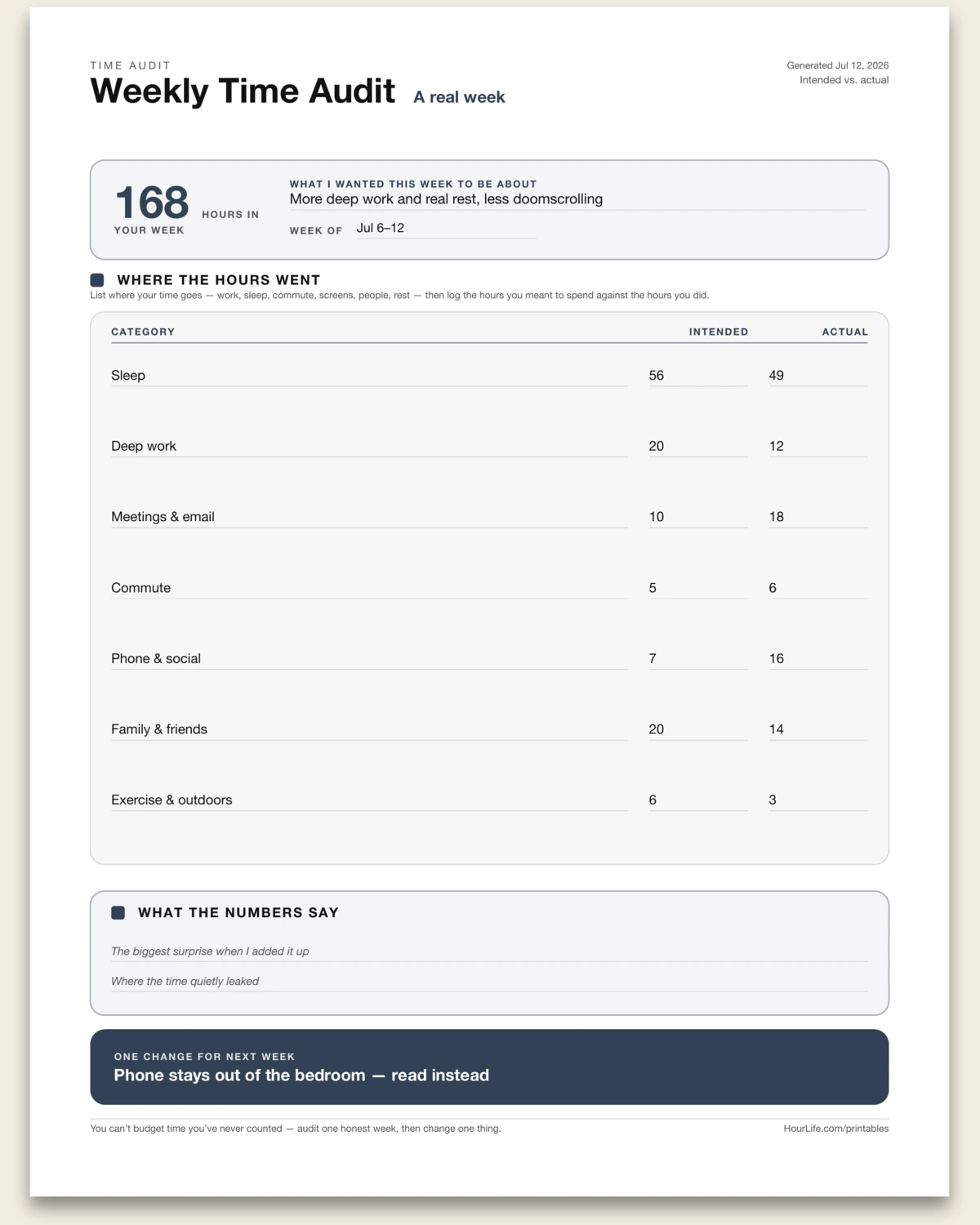
Portrait · 1 page
Weekly Time Audit
A one-page reckoning with where your week actually went. Everyone gets the same 168 hours — name the categories yours splits into, then log the hours you intended against the hours you spent, side by side. Two prompts help you read the gap, and a closing callout names the one change worth making next week. Unlike a habit grid, this is an honest audit, not a streak. Leave hours blank to tally by hand.
Best for
Finding out where the hours really go before trying to spend them better.
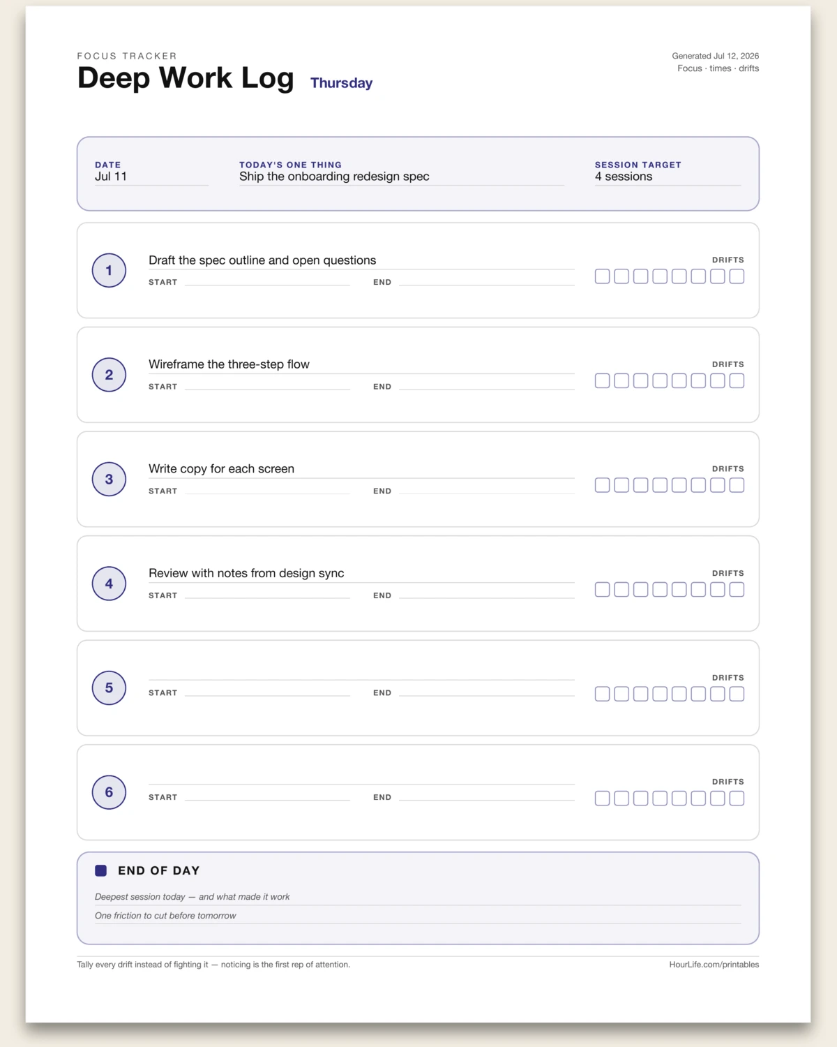
Portrait · 1 page
Focus Session Log
A one-page log for a day of deep work: name what each focus block is for, then log your start and end times and tally every time your attention drifts. Six numbered session cards, blank times and a drift strip to fill in by hand, and two end-of-day prompts to close the loop. Noticing the drift is the first rep of attention.
Best for
Running a focused, timeboxed workday and seeing where attention leaks.
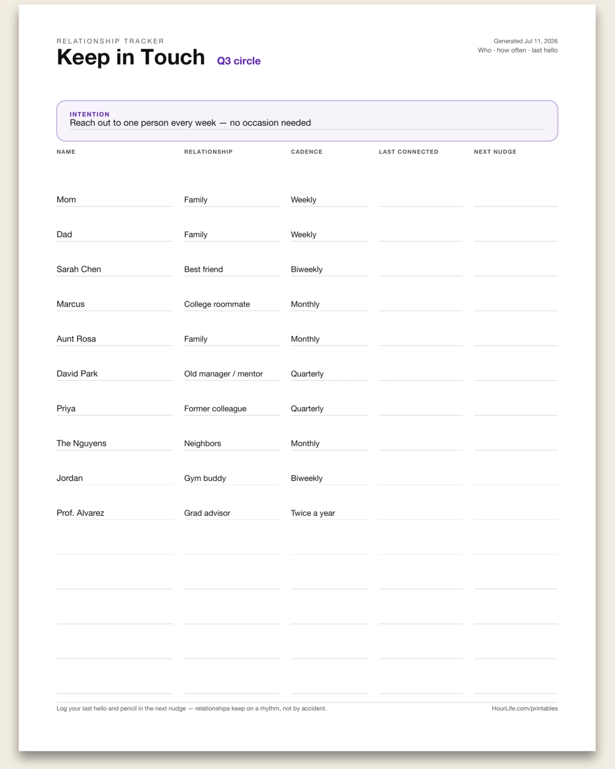
Portrait · 1 page
Keep in Touch
A one-page relationship tracker: list the people you want to stay connected with — name, relationship, and a cadence for each — then use the blank last-connected and next-nudge date columns to log your last hello and pencil in the next one. Relationships keep on a rhythm, not by accident. Leave rows blank to add people by hand.
Best for
Staying in touch with the people who matter on purpose.
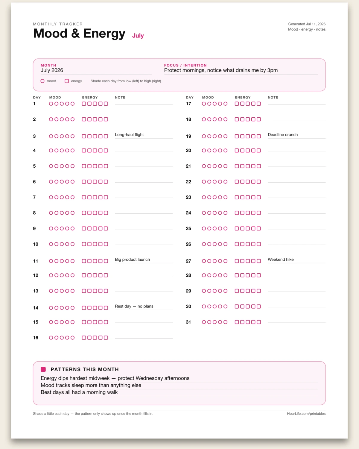
Portrait · 1 page
Mood & Energy Tracker
A one-page, one-month mood and energy tracker: a row for every day with five mood circles and five energy squares to shade from low to high, plus a note for the day. Set the month and a focus, pre-print known events on any day, and close with a three-line patterns band. Shade a little each day and the trend surfaces by month's end. Leave anything blank to fill in by hand.
Best for
Spotting how your mood and energy move across a whole month.
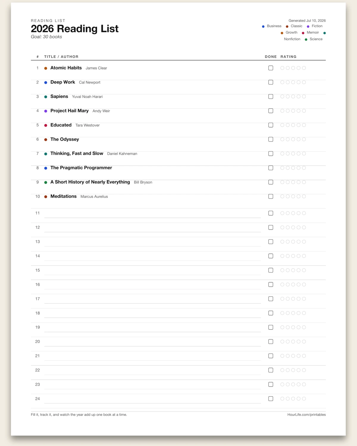
Portrait · 1 page
Reading List
Type the books you want to read and get a clean, numbered list — genre-tagged, with a done box and a five-dot rating for each.
Best for
Keeping a year of reading in front of you on one page.
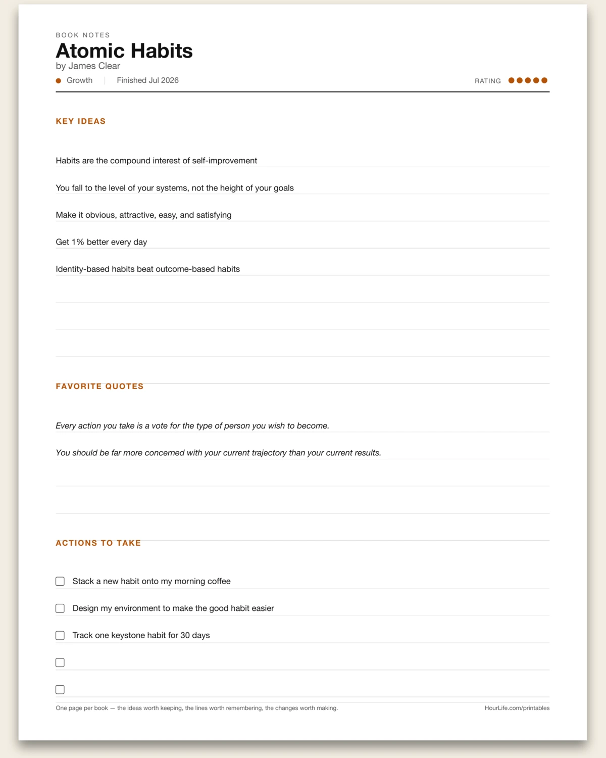
Portrait · 1 page
Book Notes
One page per book — capture the key ideas, favorite quotes, and actions to take, with a rating and ruled lines to finish by hand.
Best for
Remembering what a book actually changed for you.
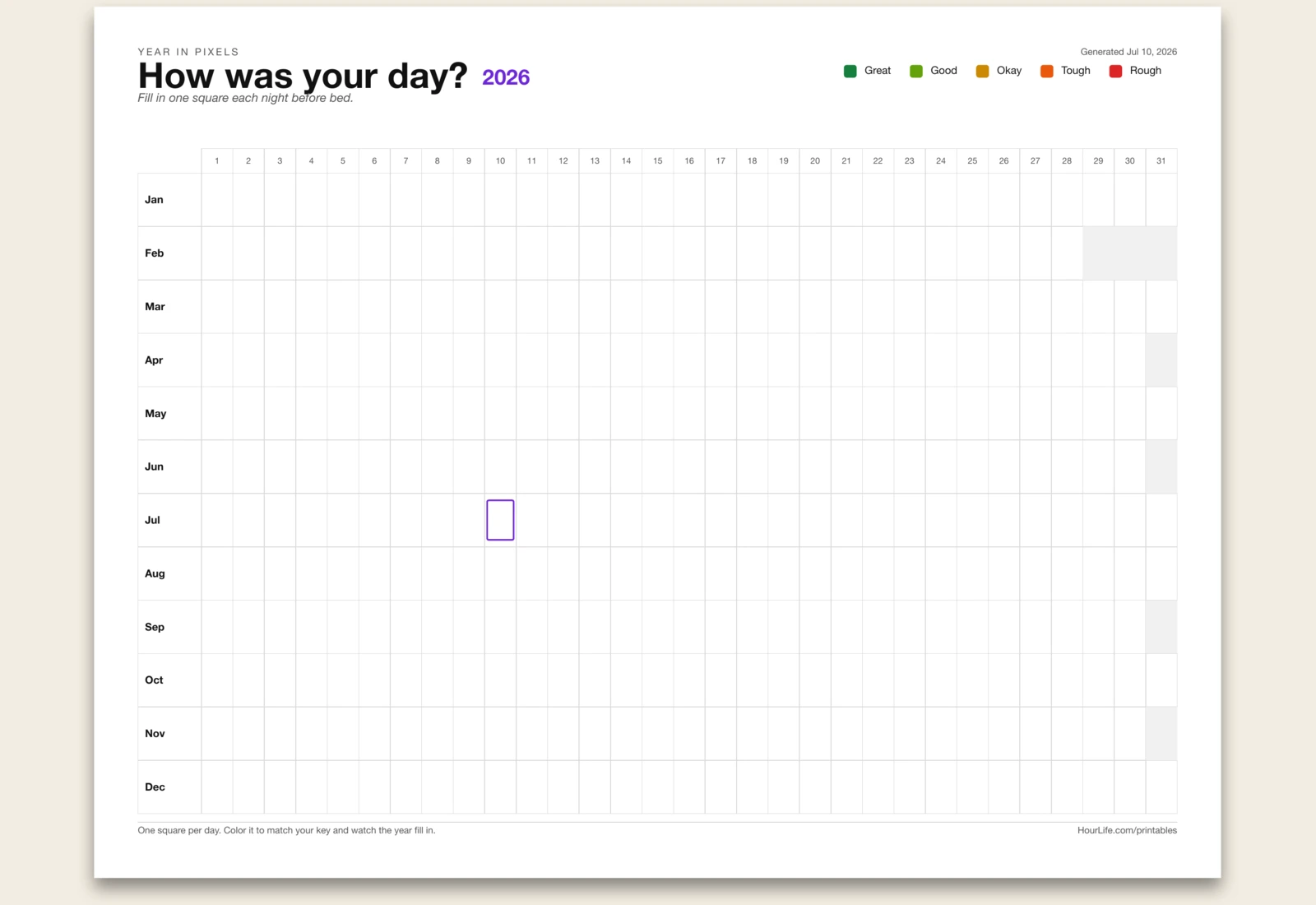
Landscape · 1 page
Year in Pixels
A 12-month by 31-day grid with one square for every day — pick what to track, write a color key, and fill in a square a day.
Best for
Seeing a whole year of moods or habits on one page.
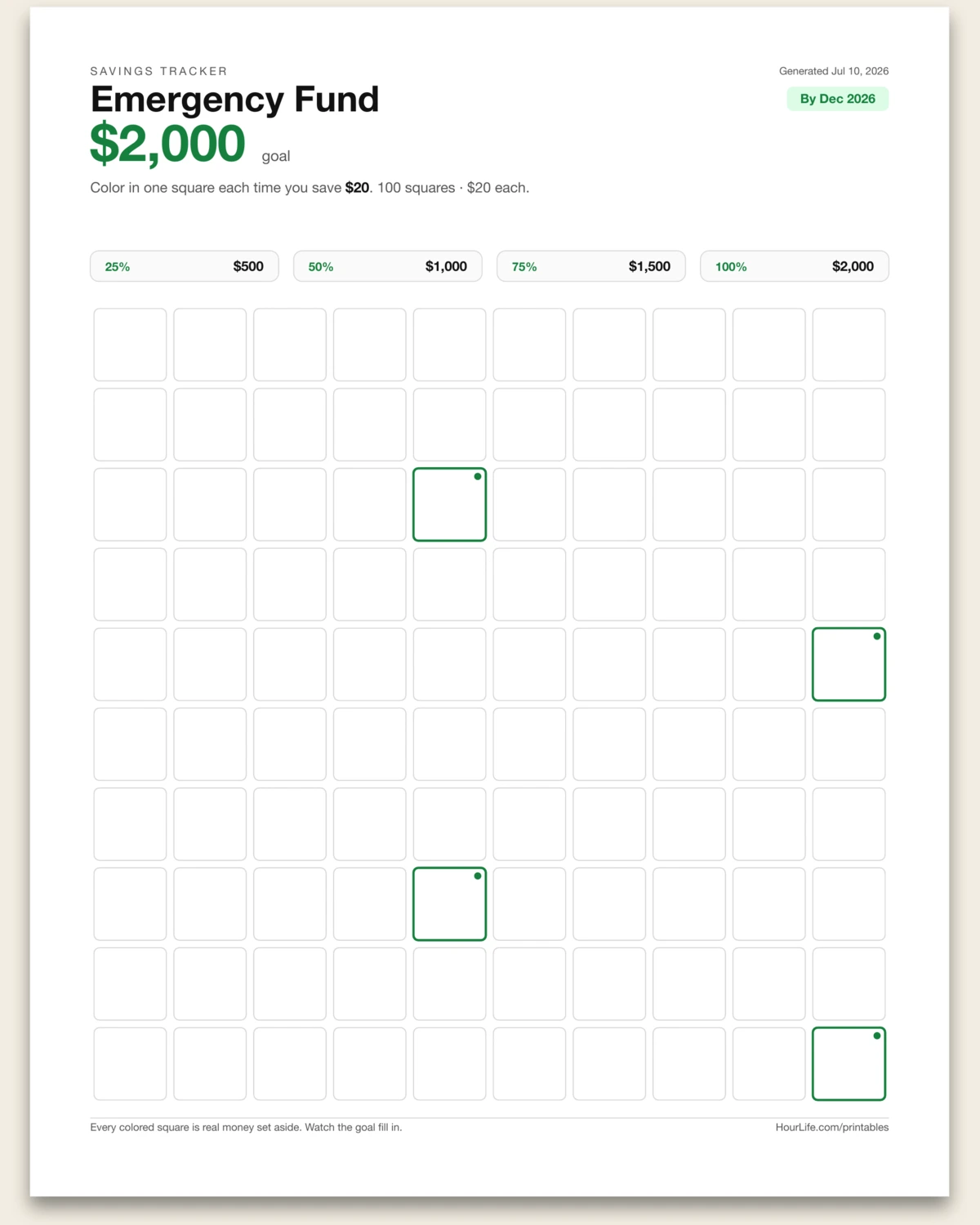
Portrait · 1 page
Savings Tracker
Set a goal and what each square is worth, then color one in every time you save — with quarter-point milestones marked for you.
Best for
Making a savings goal visible so you actually hit it.
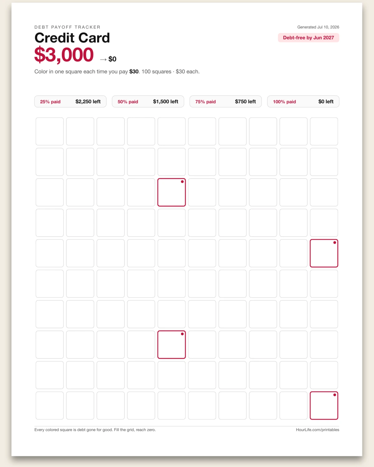
Portrait · 1 page
Debt Payoff Tracker
Enter your balance and what each square is worth, then color one in with every payment — with milestones counting the balance down to zero.
Best for
Making a payoff feel real so you keep the momentum going.
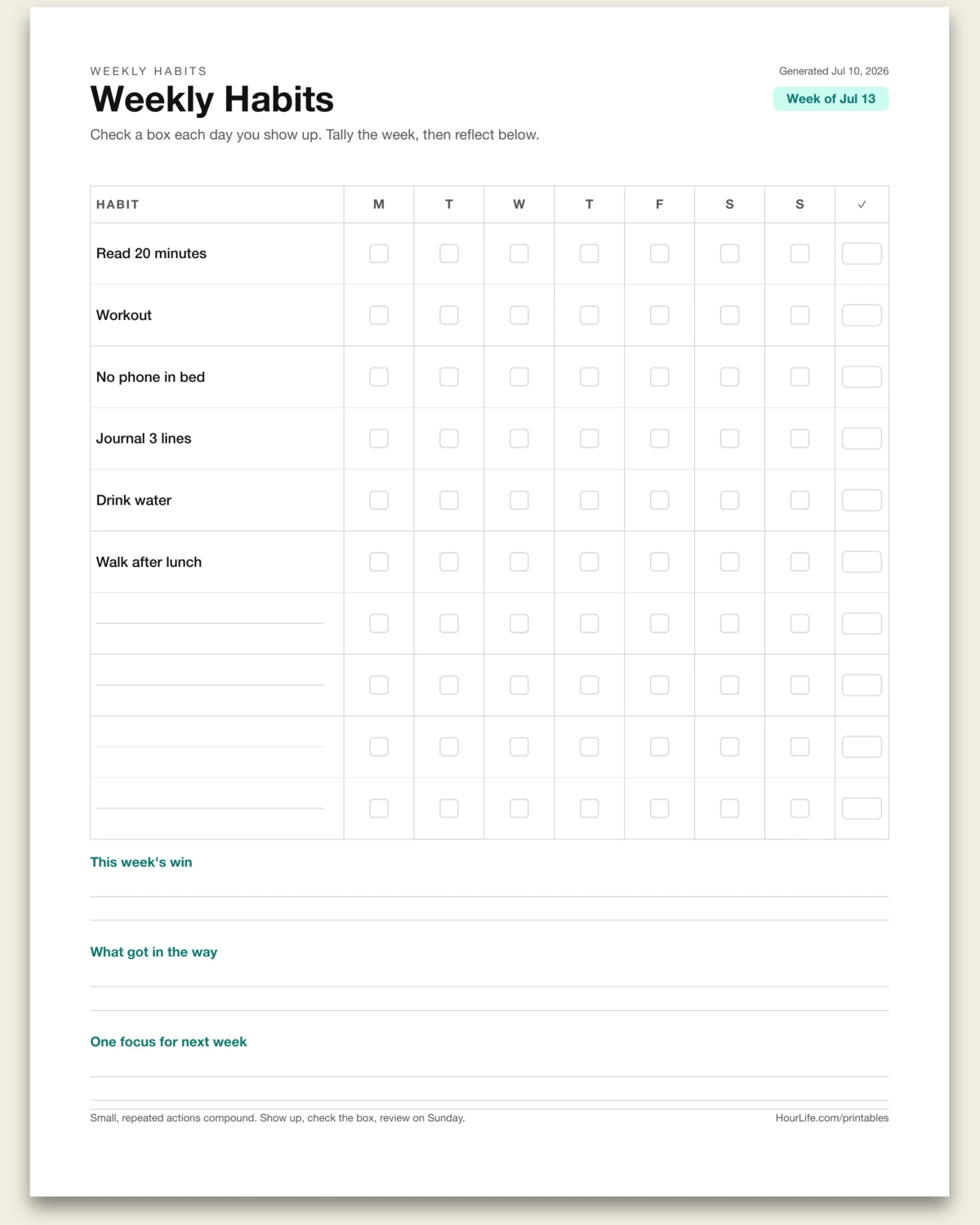
Portrait · 1 page
Weekly Habits
Type the habits you're building and get a Mon–Sun check grid with a weekly tally, plus three reflection prompts to close the week.
Best for
Running one focused week of habits with an honest Sunday review.
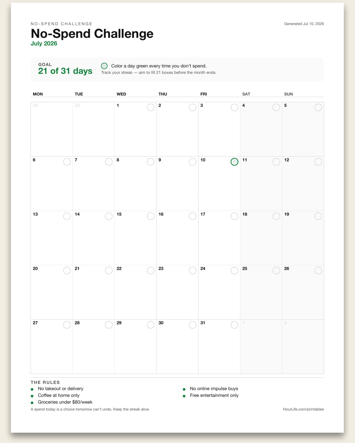
Portrait · 1 page
No-Spend Challenge
Pick a month, set a target number of no-spend days, and get a calendar you color in — one circle per day. Add your own rules and watch the streak build.
Best for
Running a focused month of curbed spending with a visible streak.
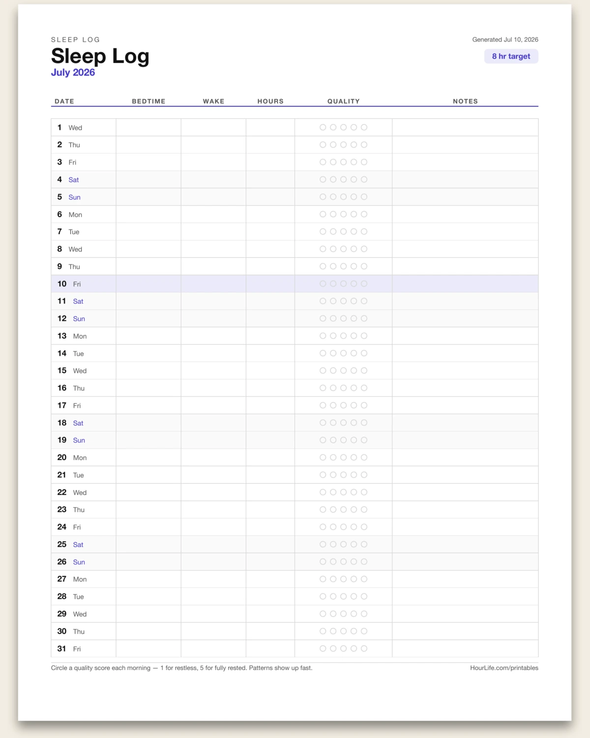
Portrait · 1 page
Sleep Log
Pick a month and an optional nightly target, and get a row-per-day log — bedtime, wake, hours, a 1–5 quality score to circle, and notes. Weekends shaded so patterns jump out.
Best for
Spotting what actually drives a good night's sleep over a month.
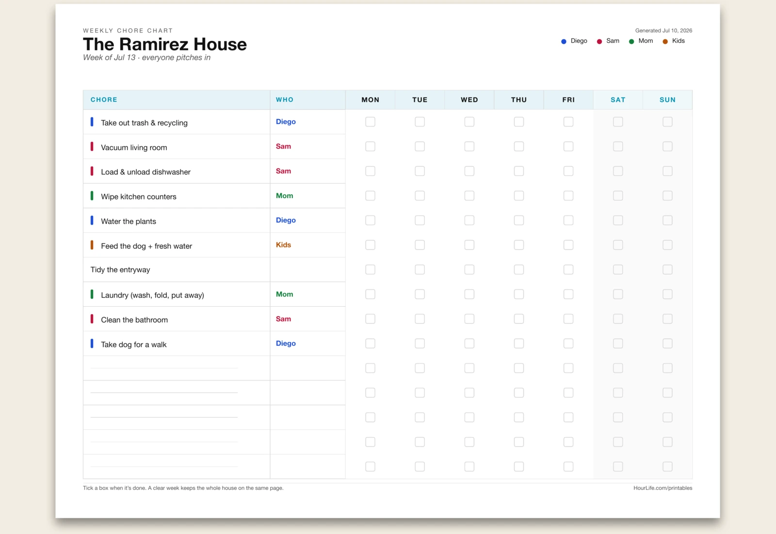
Landscape · 1 page
Weekly Chore Chart
List your chores and get a weekly grid — a row each, Monday–Sunday tick-boxes, and a color-coded assignee column. Add “| Name” to a line to assign it and each person gets their own color.
Best for
Sharing the household load so everyone knows what's theirs.
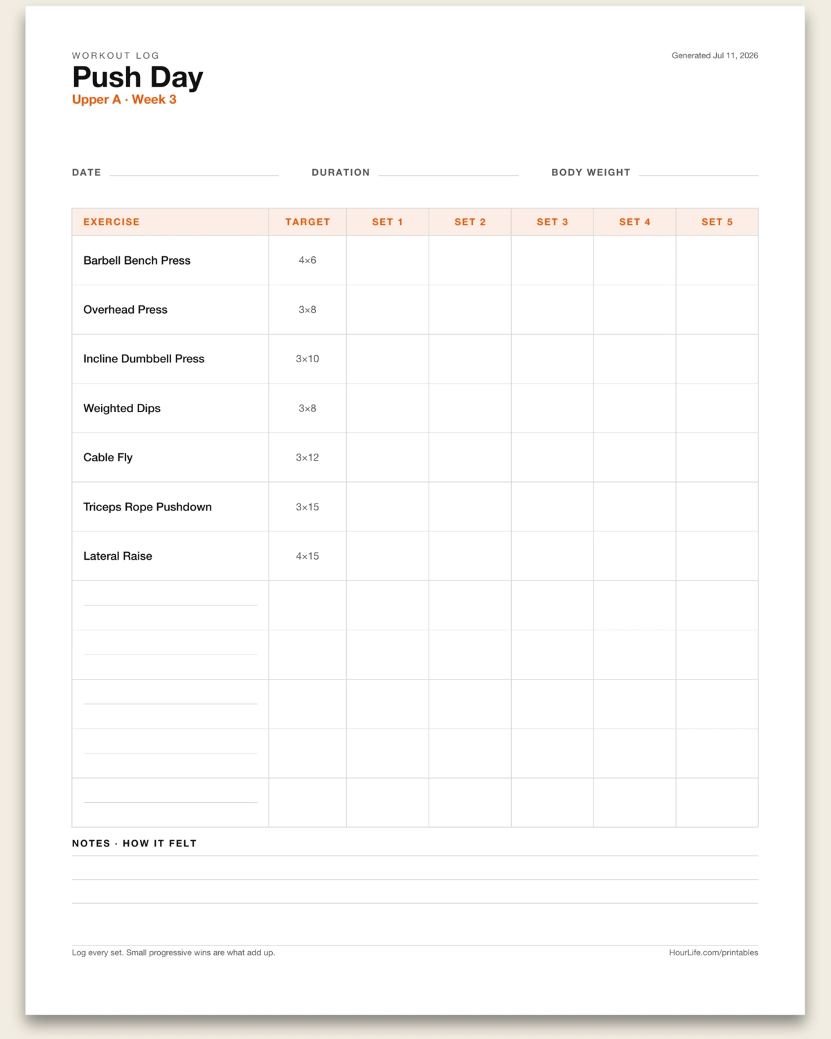
Portrait · 1 page
Workout Log
List your exercises and get a strength session sheet — a row each with five set columns to fill weight×reps, a date/duration/bodyweight strip, and a notes band. Add “| 4×8” to note a target.
Best for
Tracking every set so progressive overload actually happens.
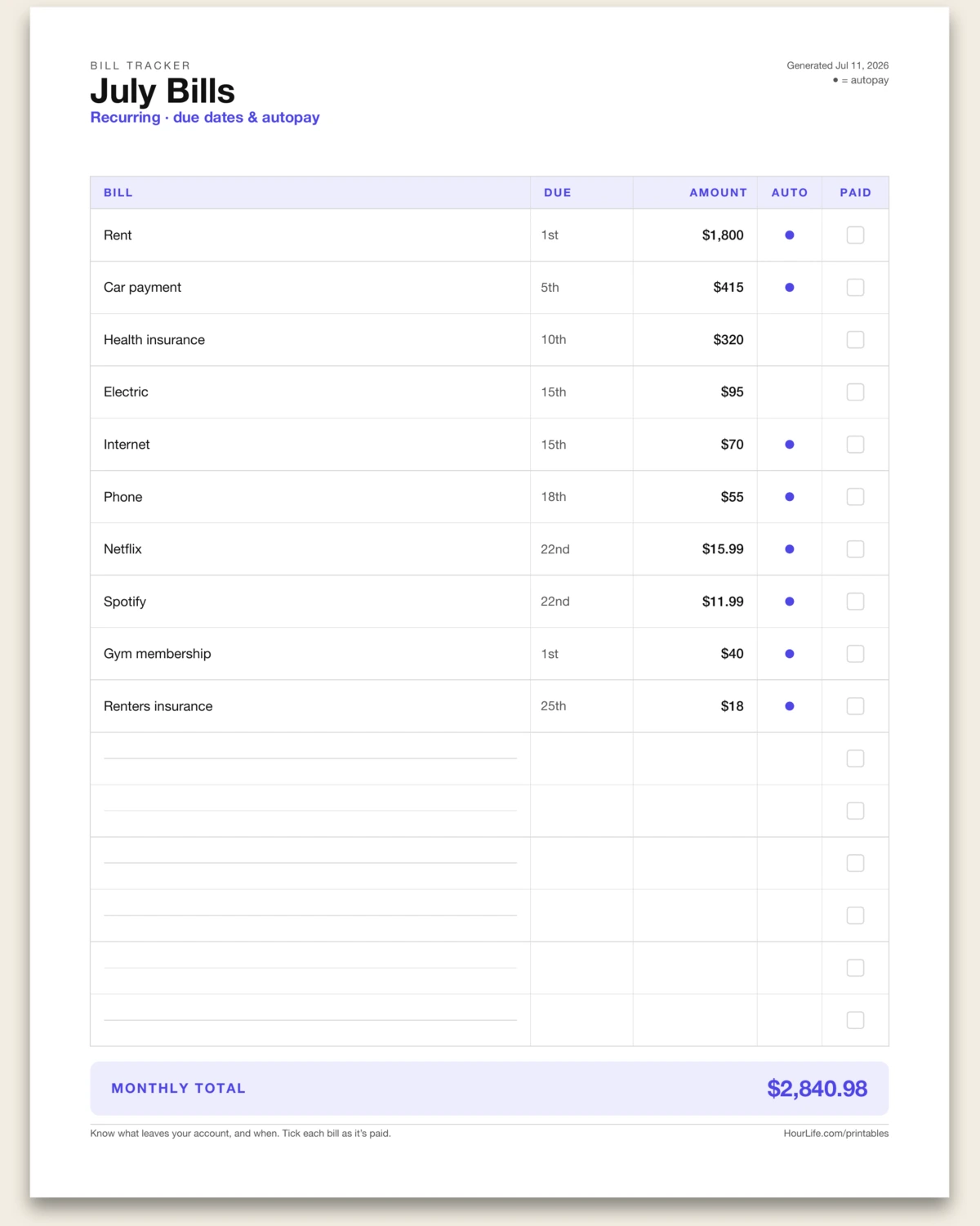
Portrait · 1 page
Bill Tracker
List your recurring bills and get a monthly ledger — a row each with due date, amount, an autopay dot, and a paid box, plus the monthly total summed for you. Add “@auto” to flag autopay.
Best for
Knowing exactly what leaves your account, and when.
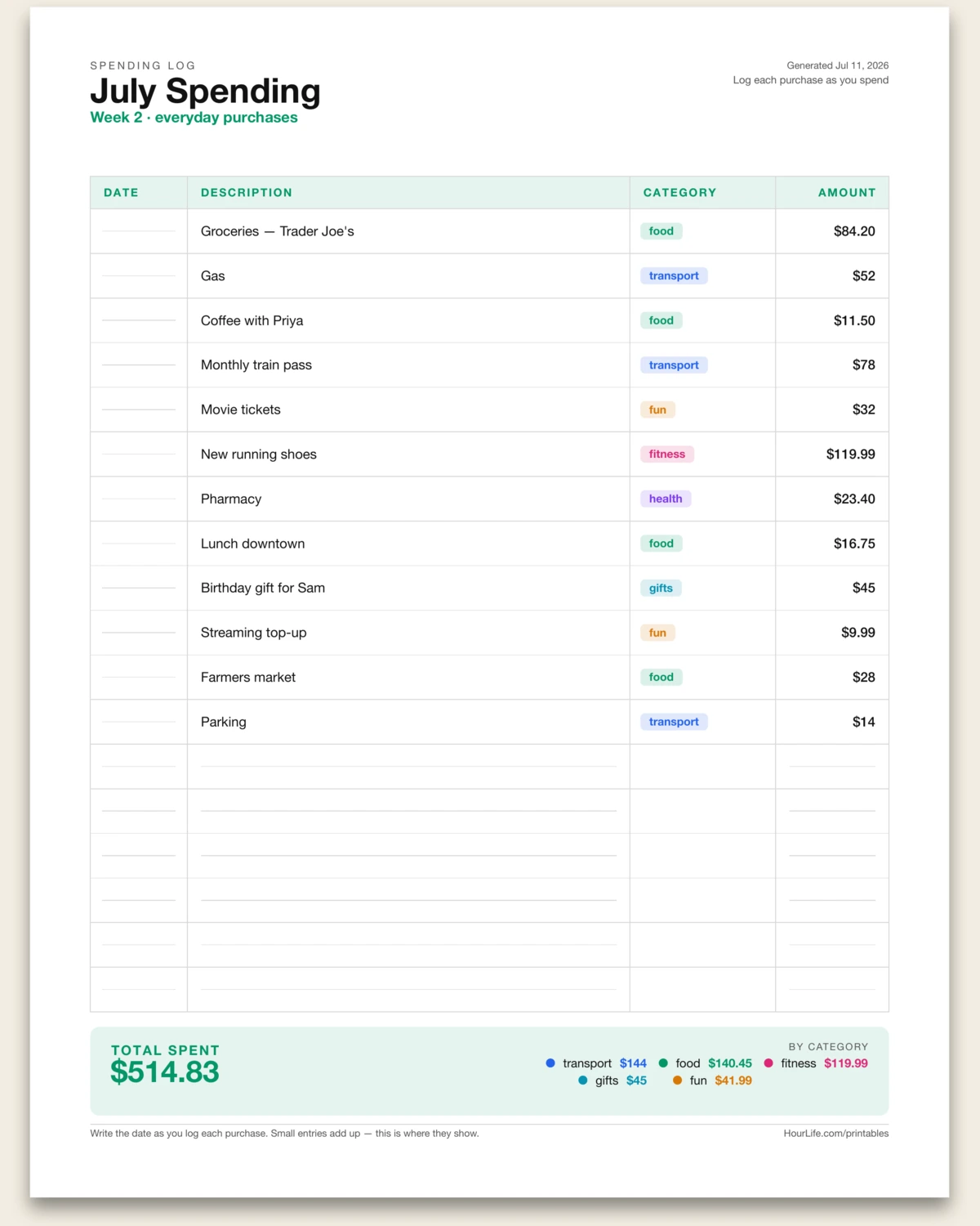
Portrait · 1 page
Spending Log
Log what you actually spend and get a dated ledger — a row each with a fill-in date, a color-coded category chip, and the amount — with your total and a per-category breakdown summed for you. Tag a line “@food” to color it.
Best for
Seeing where the money really goes, one purchase at a time.
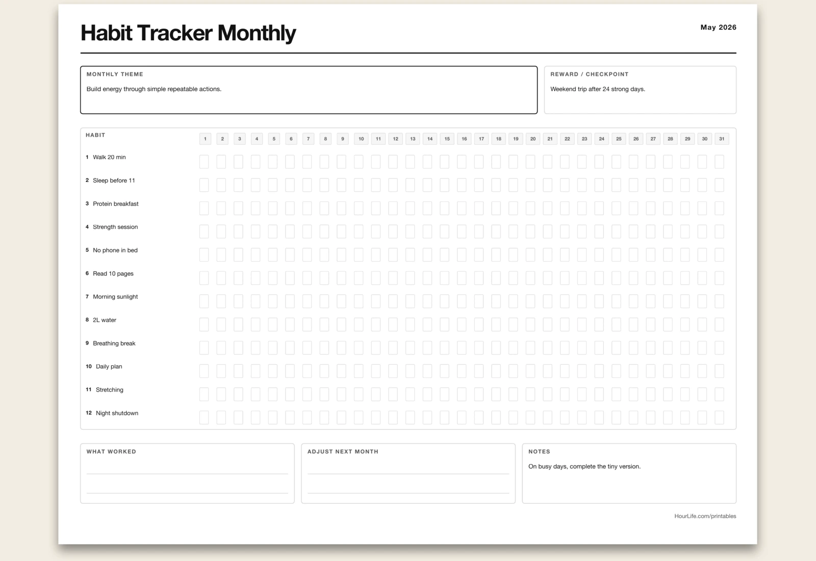
Landscape · 1 page
Habit Tracker (Monthly)
A 31-day grid for up to 12 habits with streak visibility and monthly momentum tracking.
Best for
Making consistency visible at a glance.
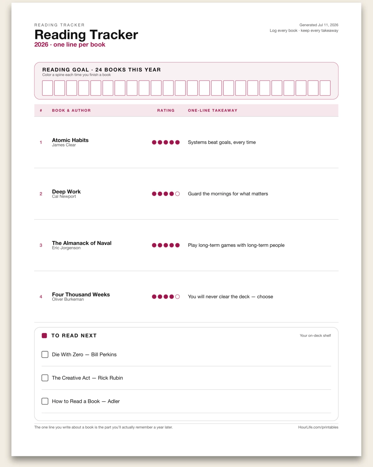
Portrait · 1 page
Reading Tracker
A one-page book log: rate each read with fill-in pips, capture a single-line takeaway, color a spine toward your yearly goal, and keep your next books on deck. Leave rows blank to log by hand.
Best for
Remembering what you read — and keeping a shelf you actually finish.
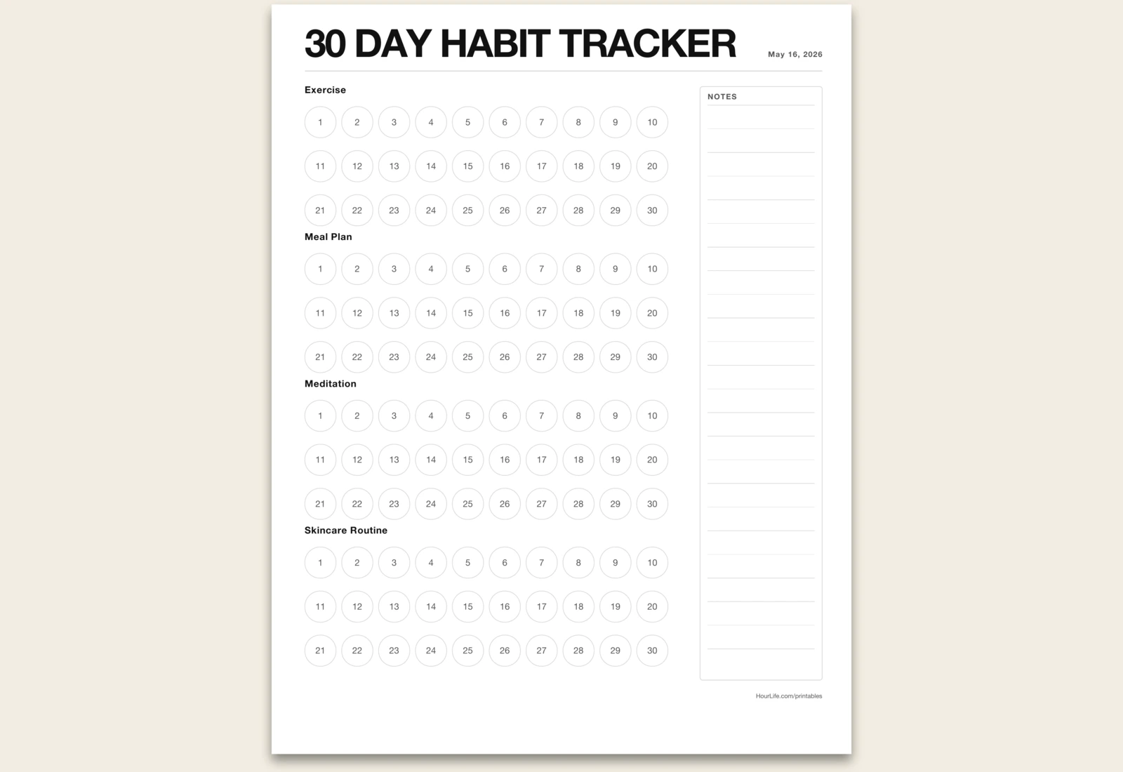
Portrait · 1 page
30 Day Habit Tracker
A focused 30-day circle tracker with four customizable habit rows designed for quick daily marking.
Best for
Building one-month streaks you can see at a glance.